|
by Dave Scrimgeour and Kevin McCluskey   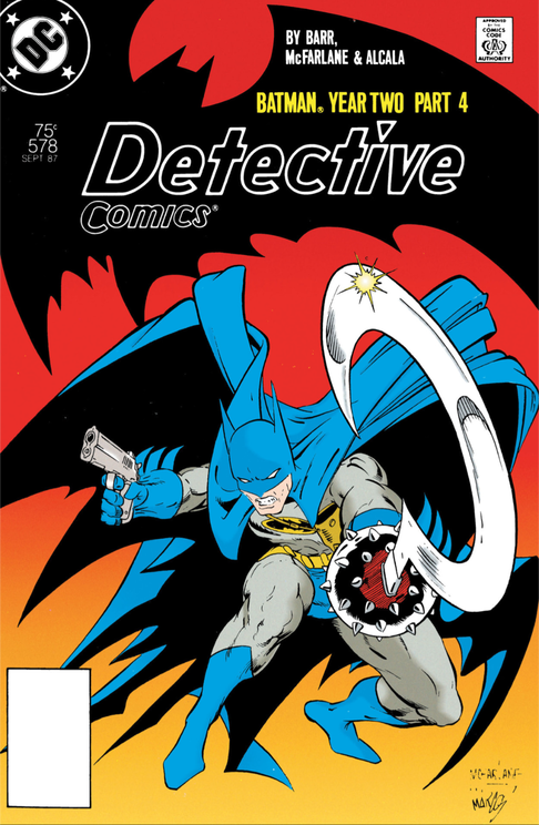 Written by- Mike W. Barr Art by- Todd McFarlane Letters by- Todd Klein Colours by- Steve Oliff with Gloria Vasquez/Olyoptics SynopsisBruce Wayne proceeds to make arrangements for life after Batman, a life that involves marriage to Rachel Caspian. Jim Gordon's plan to trap The Reaper goes sideways, resulting in his life requiring to be saved by a Batman whose morals he has questioned of late. The life saving twofer includes Batman also saving the life of Joe Chill, who he then confronts and reveals his identity to, in the exact location upon which Chill took the lives of Bruce's parents. However, despite Bruce hesitating to shoot Chill in the head, The Reaper believes he has seen enough, and that Batman is a worthy successor to him as Gotham's vigilante, removing the burden from Thomas and Martha's orphaned son, by executing their murderer himself. Unsurprisingly, this leads to another round of conflict between The (increasingly ridiculously oversized) Caped Crusader and The Reaper, where The Reaper ultimately plummets to his death, resulting in his daughter Rachel, Bruce's soon-to-be-bride, to fall back upon her original plans to join the nunnery and, consequently, Bruce to recommit to his oath to his parents to fight crime in their honour. Dave So, here we are, on the fourth and final chapter of 'Year Two,' 'So Shall We Reap.' We get yet another dramatic looking cover in this series, with another striking Batman pose. He is fully equipped with Joe Chill's gun and Reaper’s scythe weapon, and I can't help thinking this is a metaphor for him going full circle in this series. It's been building to this over the four issues. Kev That's a good point about it feeling like a completed, full circle journey. Perhaps it is no coincidence then that title of the follow-up story is, 'Full Circle.' I think the cover is alright, if a bit generic. It’s just an image of Batman against a blank orange background, but the blue of the cowl and cape contrast well against it, and the pose is dynamic enough. Plus, Bats with the handgun in one hand, and The Reaper’s mace and scythe combo over the other, is enticing us with enough storytelling to make me want to turn the page. Dave I quite like the 3rd panel on page 84. The one of a profile view of Chill, smoking his cigarette. But somehow Chill looks different to how he was drawn in the last issue. Kev Yeh, right away you can see that McFarlane is inking his own pencils here. The lines are thinner and there are a lot more of them. It’s also more detailed, messy, and almost chaotic looking. Dare I say it even has a more underground comic style to it, as opposed to one published by “The Big Two," and as a result, even some of our main characters, like you said with Chill, have a bit of a different look to them. Todd is certainly leaning more into his love of horror in this issue, and yet, his style also manages to be more cartoonish at the same time. There’s something to be said about being able to pull that off. That takes a certain amount of skill. Dave Yeah, he is making it a kind of a cartoonish horror, much like a comic variation on Sam Raimi's horror style. Raimi was gruesome and comical at the same time, it wasn't about the scares as such, it was more about this heightened gore. Kev And the sheer OTT ridiculousness of it all. 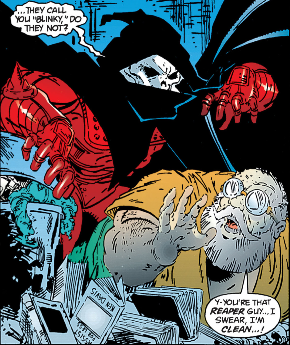 "Blinky?" Sounds like someone's emotional support stuffed animal. "Blinky?" Sounds like someone's emotional support stuffed animal. Dave The middle panel on page 85, with The Reaper hovering over Sutton, is so reminiscent of how he drew Venom in the Spidey series. His poses are actually quite similar, and so is the panel composition as well. Kev And very much how he went on to make his 'Spawn' comic look. Dave He's having fun with the caricatures of his characters, such as Sutton, much like the mobsters he drew in previous issues. Kev He really is, eh? I think they look fun though. Dave McFarlane SPLASH PAGE 86 (not subtle at all). Kev Ha, ha! Interestingly, this page was between chapters in the edition I have, and was not part of the interiors of this issue. Dave I see what you mean about the amount of detail on the faces, it shows on Caspian’s face on this. He has a very unique style of drawing, does McFarlane, and by this stage you can see he has been given more and more freedom to express his own style, which is chaotic and frenzied and cartoonish and ghoulish all in one. I guess the art represents the mind of the artist as well. Kev Ha, ha, yeh! Apparently one of the reasons he took this gig, was for the chance to ink his own pencils. Dave It's like the past couple of issues he has been kept on a leash, and was slowly getting freed from it, until this issue when he was completely off it. Kev I thought exactly the same thing. Dave The change in dynamics between Leslie and Bruce as we get into this issue is interesting, as she is no longer giving him grief. Kev Yeh, that’s a nice piece of tension between Bruce and Leslie there. Bruce assumes Leslie is disapproving of his relationship with Rachel, whereas all she really wants is for him to be happy, and is pleased as punch that he is. More of that surrogate mother/son dynamic that we’ve referenced in previous issues. (Insert Editorial Note caption box here) Dave The inside of Wayne manor looks bright, and really highlights the look of high society. Kev Yep. Wayne Manor certainly looks lavish, alright. Dave That's the word I was looking for to describe it, "lavish.” Kev This scene with the proposal is really well done too. There’s a lot going on in there; the bit with Judson loathing Chinese food (No wonder he’s a miserable old, serial killing, villain. Who in their right mind doesn’t like Chinese food?), the fact that Bruce now has a pet name for Rachel (Rae), and, of course, the ominous fortune in Bruce’s cookie. That sounds dirtier than I intended it to. Dave Haha, I think there's a caption in that, “Bruce's Cookie!!!!” Also when Bruce and Rachel are in the Chinese restaurant the colours throughout are also very bright and eye catching. I suppose it represents the heightened feeling that those two have with each other, the brightness of their world right now. Kev Definitely. The perceived brightness of their future together. Oliff and Vasquez are playing a blinder here too. The use of colour across these pages has been superb. So far we’ve had teals, fuchsias and now taupes, all telling their own part of the story, and adding to the atmosphere of the issue. The warm reds of the restaurant contrast so well against the cool greens of Wayne Manor. The 3rd panel, of Gordon’s face, on page 89 is excellent, as is the last panel, of the SWAT team ready to move in. 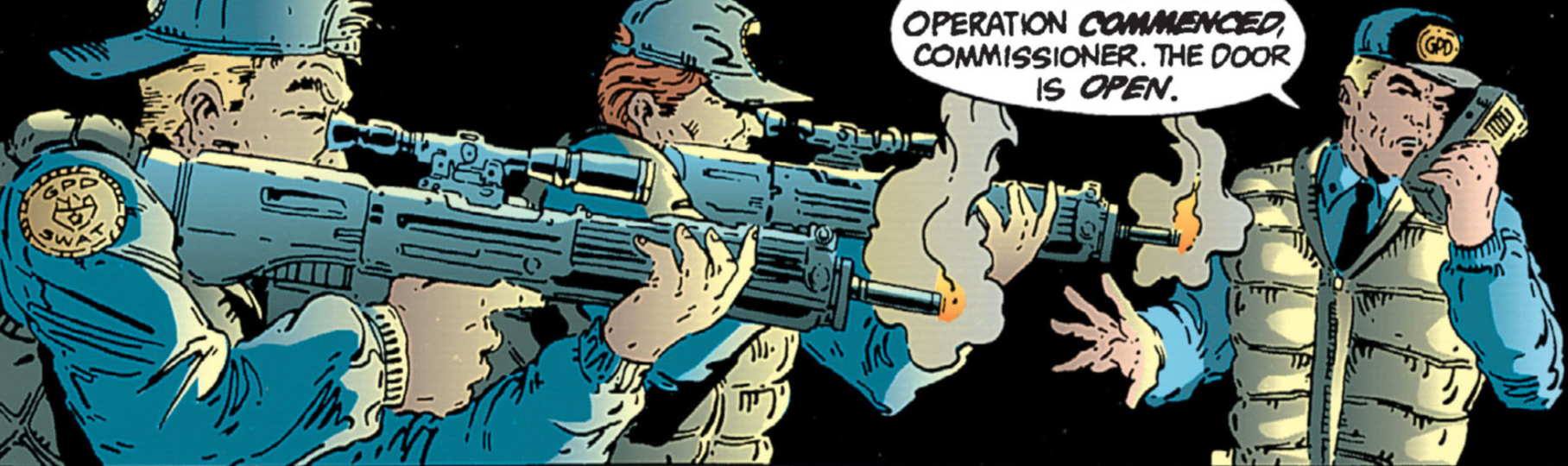 Talk about a blow-by-blow account of an operation in real time. Dave The contrast from page 88 to 89 in terms of visuals and colours is excellent again, highlighting the differences in these peoples "worlds." I use this term as a way of saying the places they inhabit, of course. That's a good panel of Gordon indeed. Kev No, I think you're absolutely spot-on with the use of "worlds." The streets of Gotham are a billion miles away from the obscene wealth of the Waynes and the Caspians. At least a billion dollars too, I'd bet. Dave A billion dollars?!?! Three I reckon. Oh wait, that's next year’s story. Kev Ha, ha! Yeh, we'll get there. Come to think of it, I need to look those issues out. Dave Over the next couple of pages, we start to see McFarlane going for a kill count that's trying to top 'Commando' and 'Rambo 2.' He really is going for the gore. Kev For sure. That 4th panel on page 91 is delightfully OTT in its violence and gore. 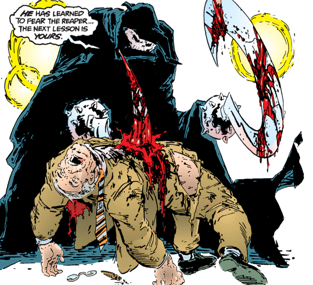 Anyone else fancying a kebab? Dave This issue is keeping the pace of the action going here. There're a lot of bodies to get through, so kill the heavies quickly I suppose. Kev Oh yeh, the pace is breakneck, to say the least. Dave On page 92, that's a nice little panel of Bat's with the giant wings swinging across Gotham. Come to think of it; could you imagine 'Gotham By Gaslight' if McFarlane had got his mitts on it? Kev NOW that'd be interesting. The colours on that panel are, once again, fantastic. Dave And on the same page, when Batman clunks the two SWAT cops heads together, he is deliberately hidden by shadows, which adds a great colour contrast to that panel. Kev Yep. Just like the man he’s trying to stop, Batman is now assaulting police officers. Not in quite the same fatal manner, but still….. Bruce saves Jim’s life with the police van here. One more second and I reckon the good Commissioner would’ve been skewered on The Reaper’s scythes like a shish kebab. Dave So much is happening so fast here, I had to go back and look at it again. How quickly did he get into that van???? Kev Ha, ha, yeh. He was in that van like a shot. I don't know if it’s because we are now racing towards our climax, but it seems like there is just so much going on, and so much story being told in each and every panel. It’s relentless. You're right, man, McFarlane’s art is wild, particularly in this sequence. He really is off the lead here. Dave Yeah, it's the realisation for Jim that Bat's methods are not following the path that he expected, but he also realises he still is on his team. I think the breakneck speed was done on purpose. McFarlane probably wanted this not to plod on at anytime. There's so much detail in these panels it's starting to get cluttered a bit. Kev Yeh, they had so many things to wrap-up in this issue. As controversial as it may be to say this; I often preferred McFarlane's pencils when they were inked by someone else. Dave I'm just surprised it took so long for that warehouse to go up in flames on page 95. Come to think of it, I'm surprised it has not collapsed by now. Kev True. It's got to be structurally unsound at this point, and should be condemned, right? Every time Joe Chill calls Batman “Partner,” it must be like a dagger through Bruce’s heart. Dave Yeah, I bet. It's not until we hit page 96 that the story starts to take a well-earned breather, and this is where it's building to the climactic finale with Bruce and Chill. Kev Yep, now that Batman has also saved Joe’s life from the explosion of the police van, things are getting very complicated for Bruce, in this respect. McFarlane’s Bruce on page 96 is a perfect example of what you’d said before about him looking very close to his Peter Parker, which was soon to come. I totally understand why he thought it would be a good idea to draw him this way, to try to make Bruce look a bit more contemporary, but that wardrobe, and that hairstyle are just not Bruce Wayne for me. You can get away with a Peter Parker update like that, I reckon, but Bruce Wayne should always look a bit more classic, if you ask me. Which nobody is, of course. Style over fashion all the way, for me. 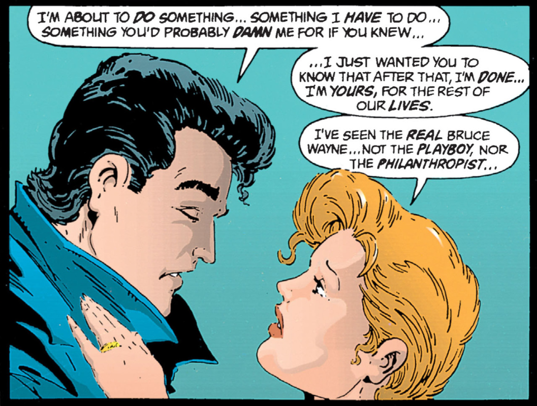 Peter, I mean, Bruce, and Rachel are so in love, they're even copying each other's hairstyle. Dave This was his pre-Peter Parker experimentation look, I think. Kev You could very well be right there, yeh. I always hate when male heroes make this declaration to their female love interests, that he has to do something that she might not like, and that he hopes it won’t change her opinion of him. Don’t burden her with that. That’s a pretty selfish, dick move. Interesting though that Rachel believes that she has seen the real Bruce Wayne. What a shame for her. I do like that she claims that the philanthropist is not the real Bruce Wayne though. Like his acts of charity are disingenuous. Like they’re all an act. Which, of course, they kind-of are. Dave Plus, why did she not want to know what he was up to? I'm thinking saying that would raise a few alarm bells. Kev Ha, ha! I thought exactly the same thing. Nary a question was asked. It is beautiful, the way he trudges forlornly into the night to answer the call of the Batsignal though. He doesn’t race in the Batmobile, he doesn’t fly in the Batwing, he doesn’t even swing through the buildings of Gotham, no, he reluctantly walks, hunched over. Performing his duty against his will, almost. Dave That's a good couple of panels with Batman standing over Chill's bed. The shadows are great, and the gun to his head also, simple use of colours but so effective. Kev Yep, Batman standing over a sleeping Joe Chill, in Bruce’s shithole of a “hideout”, with the gun to his head, desperate to, but unable to pull the trigger. It's all excellent stuff. And I agree, the blue palette used by Oliff and Vasquez is outstanding. The last two panels on page 96 are fantastic as well. 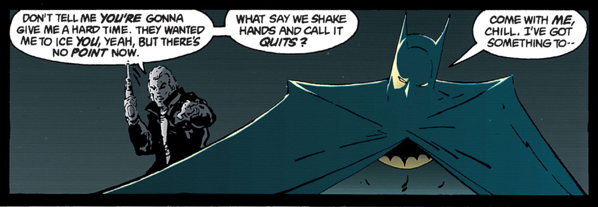 "Cold, cold eyes upon me they stare, people all around me and they're all in fear." Dave And on page 98, in any panel with Batman in the same room as Chill, his face is deliberately hidden by shadows. Also, it's interesting how he quickly snaps back into his working mode with Chill, after having that intense moment with the gun to his head. The bottom panel of him taking Chill to the street where it all started is excellent, a real stand out panel. Kudos to all involved in creating that panel. 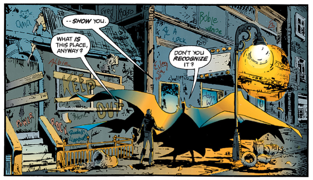 Apparently someone called Al (?) is "a cock." Kev I think that whole page is cracking, actually, now that I'm looking at it again. Dave Yeah, I really like that page. It's a real standout, especially as a contrast to the chaotic frenzy earlier in this issue. Kev That's a good point. We've got a lot of the action out of the way now, and we're giving some of the character moments a bit of time to breathe. That panel of Chill’s head exploding is something else though, isn’t it? Dave Yeah, I knew Chill wasn't going to live once Bruce revealed his identity, and yeah, there was the internal conflict of could he actually kill him, but The Reaper saved his bacon identity-wise. On page 99, the 2nd last panel before he removes his mask, is "The Batman Catalogue pose.” You wouldn't get that in the clubby book back then. Kev Ha, ha! God, I've not heard anyone mention a "clubby book" in years. Yeh, do I find it odd that if Caspian wanted Bruce to be “a replacement” for him, and now "knows" Bruce is a killer, then why did he shoot Chill in the head? Why didn’t he let Bruce do it, and be sure that he was a killer? Is it because he knew that Bruce would never actually go through with it, so wanted to leave the possibility, the doubt, that he just might have in Bruce’s mind? Dave Yeah, it's like he wanted Chill out of the picture quickly. Like he wanted this moment with him and Bruce to be cherished almost. He probably wanted to take that away from Bruce, so that he would never know if he could actually go through with the killing of Chill. Kev Yep, I reckon that just might be it. I do like the “Chin” sound effect, as Batman removed the lower half of The Reaper’s mask with his own scythe. I wonder which of the Todds made that choice, McFarlane, or Klein? And this fight between Batman and The Reaper puts me in mind of the one between Dragon and Slaughterhouse in ‘Dragon’s Claws’ #2. They have very similar settings. And outcomes as well. Dave That's true about the 'Claws' reference as well, well noticed on that one. I can see the 'Claws' setting here for Dragon and Slaughterhouse. Gotham City has turned into "The Pool." I wonder if Bruce was planning to quit being Batman, as he talks about this being the last fight of his "career," much like a prizefighter quitting once it's done. Was he ready to stop being the Bat, as he is fairly confident he can take The Reaper? To be fair, he does a good job of disarming him quickly. Kev Yeh, he was definitely ready to hang up the cowl, and go live a "normal" (as "normal" as you can get for a billionaire, I suppose) life with Rachel. To go and live that "happy" life that Leslie and Alfred wanted for him. Dave Again, the tail end of this fight takes on a more cartoon-like feel, with the colours being very bright and visceral, and the cartoonish looking faces on Gordon. It takes on a lighter tone for a final showdown, especially after building up to this point in the past 3 issues. Caspian almost has the look of a proud father as he plummets to his death. I like how he puts the gun away in a box to be locked away, like the Ark of the Covenant at the end of 'Raiders of the Lost Ark,' never to be opened again. I like that panel on page 103, as he walks away to the door, with the lights shining in our face/the reader. 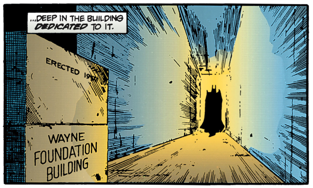 Bruce Wayne's impressive erection. Kev You're right about Caspian, I think. We've said throughout this run, that he could have been the father figure for Bruce that Joe Chill robbed him of, so it kind-of makes sense at this point that Judson would see Bruce as the son he never had, I suppose. Dave Actually, I've just had a thought about the panel of Batman walking into the light; it could be a metaphor for him walking away from his own darkness into his new found light with Rachel. Kev THAT is an excellent point. That had not occurred to me, but that sounds spot-on. And only to have it snatched from him in the end, which puts him right back into the darkness. Especially considering that, on the very next page, he is walking into the light, AWAY from Rachel, with a full-on "Shadow of the Bat." All this only serves to make his final line in this story, "I can always find my way in the dark," even more poignant and profound. I totally misremembered this bit with the gun; I thought he'd put the gun into the wet concrete that they were using to make the foundations of the building. Just goes to show how unreliable your memory is. Well, certainly how unreliable mine is getting as I get on a bit. Dave I don't know what it is, but there's something comical about that panel of Caspian plummeting to his death. It kind-of seems like the cheap way to bump him off. It's almost camp but not quite.  Who fell to their death best? Who fell to their death best? Kev Everyone plummeted to their death in the '80s though, didn't they? Hans Gruber. Skeletor. The Joker. Dick Jones. And those are just the ones off the top of my head. Dave Mola Ram as well. Sounds like it could be a pub quiz question, “Name ten 80's villains who popped their clogs by the fatal plummet?” Kev Ha, ha! That'd be a good one. Dave The whole Bruce and Rachel dynamic is giving Todd McFarlane practice for the future Pete and MJ dramas that occur frequently. Kev Yep. It does feel like he's almost using this outing as an audition for work on a Spidey title, eh? Certainly with the benefit of hindsight. It being 20/20, and all. Dave Yeah, I knew something was gonna go wrong for Bruce, I was half expecting Rachel to find out he was Batman and ditch him. Kev Bruce is just not destined to find that kind of happiness, is he? I suppose, if he did, that'd be the end of the comics. And we wouldn't want that now, would we? Basically, what I'm saying is, it's our fault that he's miserable. It also makes me laugh that Bruce is going to go out there, punching poor, mentally unwell people in the face, causing them who knows how much physical harm, and now just send them Leslie’s way, so she can put them back together again at her clinic. Which he is paying for. It’s a win/win situation for all concerned really. Dave Plus, what the hell is going on with Bruce's quiff on page 105? It's come alive and trying to escape his head by the looks of it. Kev Ha, ha! Right enough! McFarlane loves him some big hair, didn't he? Dave He just looks like Peter Parker on this page, and come to think of it, Leslie is resembling Aunt May on the same panel. Damn! Are we reading the wrong comic book here? Is this ‘Year Two,’ or has it morphed into ‘Amazing Spider-Man,’ and Bruce is about to get bit by a radioactive spider to add to his list of problems? Kev Maybe we've entered some mad, cross company promotional multi-verse. It’s hard not to feel for Bruce here though. Like when Leslie asks him if he’s happy, and his response is, “It doesn’t matter.” Jeez, that is sad. It's heartbreaking. Dave That second last panel on page 105, of Bruce and Leslie speaking with a spotlight shining on them, looks like he's about to start dancing to some ‘Saturday Night Fever’ number. I wouldn't put it past McFarlane at this stage. The last panel on this page, of Gotham with the moon shining, is nice and impressive. And, of the course, the very last page is a full splash page, which is equally impressive.  "Children of the night, only some will star the sky, only believers in death will die." 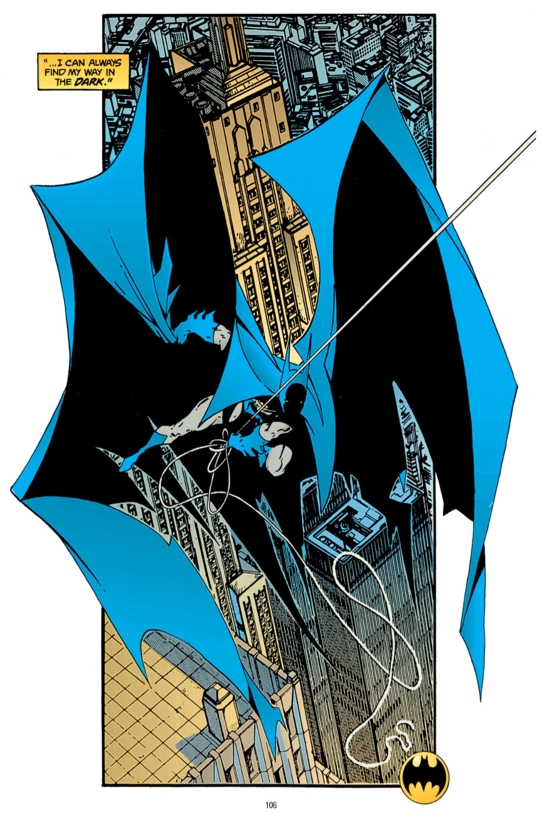 Spider-Bat-Spawn-Man. Spider-Bat-Spawn-Man. Kev Yeh, that splash page is amazing though (Spider-Man reference, which was unintentional, but still valid, I reckon), and Bruce’s line of, “I can always find my way in the dark” ties in nicely to when Rachel expressed her concern about Bruce losing his way in the darkness earlier in this story. Again, it’s sad and tragic though. Bruce is a man who is at home in the dark, whether he wants to be, or not. He can exist within it, but also he must never let it consume him. Dave Yeah, I know what you mean, but it's what makes Batman who he is though. A miserable sod! Kev Ha, ha! True. But he's our miserable sod. Dave Very true. The tortured hero. Kev Indeed. This is a bit of an odd issue for me. I like it, but I do feel it’s a bit rushed, both in terms of the pacing of the story, and the look of McFarlane’s artwork as well, if I’m being honest. It’s maybe a bit too Todd McFarlane for me. Like I said earlier, I’ve often preferred his work when someone else is doing the inking, and reigning in some of his idiosyncrasies a little. Dave You can see this was an issue where Todd McFarlane was cutting his teeth and getting a real feel for spreading his wings, so to speak. And of course the latter work speaks for itself in his ‘Amazing Spider-Man’ run. Kev Yeh, it certainly does. It made him a comic book superstar, and ultimately a multi-millionaire. This is an immensely enjoyable series. It’s maybe not on par with ‘Year One,’ let’s face it, few things are, but I think it’s a bit of an underrated, and underappreciated, gem. I still don’t think it gets the respect, or the coverage, it deserves. Particularly considering its influence on Batman stories in other media. One of which I am very much looking forward to covering. Dave ‘Year One’ and ‘Year Two’ are completely different stories, but have to say, ‘Year Two’ was still enjoyable. I wasn't expecting the last part to be the best, they seldom are in these stories, it's usually one of the earlier issues that are the best issue of the series, but in general, it was a good follow up to ‘Year One,’ and it certainly whet my appetite for ‘Year Three,’ which I have not read at all. Kev Interestingly enough, ‘Year Three’ is completely different to both ‘Year One’ AND ‘Year Two.’ It's very much its own animal when compared to both its predecessors. Dave I really liked the contrast in styles between ‘Year One’ and ‘Year Two,’ and for that I have to commend those involved in making them so different. Kev Absolutely. There would have been no point in trying to top, or even copy, 'Year One,' so it was a smart move for Mike W. Barr (who we've barely mentioned this chapter) and Co. to try for something completely different. Dave Mr. Barr has to take equal credit to McFarlane for his writing, for there can be no pictures without a story behind it. I guess McFarlane really was a superstar in waiting of the comic book world at this point. His artwork draws so much attention to it, but Barr is an equally excellent talent. Kev Yeah, Barr has written two Batman tales that we've covered, 'Son of the Demon,' and now 'Year Two.' Both of which are amongst my favourite Batman stories. The end. (D) & (K) 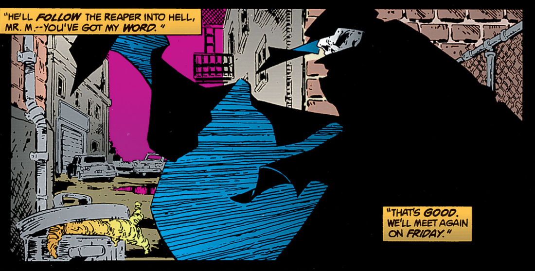
0 Comments
|
Back issues
April 2024
|
 RSS Feed