|
by Dave Scrimgeour & Kevin McCluskey   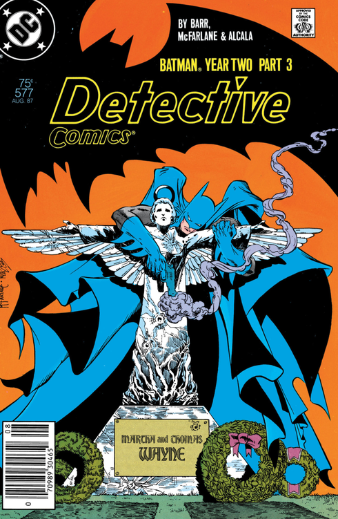 Written by- Mike W. Barr Pencils by- Todd McFarlane Inks by- Alfredo Alcala Letters by- John Costanza Colours by- Steve Oliff with Gloria Vasquez/Olyoptics SynopsisMeanwhile, in Gotham City; 'Deadly Allies,' Batman and Joe Chill continue a will they, won't they (kill each other) that Sam and Rebecca rip off in a few month's time, Bruce and Rachel's relationship also hurtles towards its inevitable doom, Jim Gordon acts like a betrayed girlfriend, even going so far as to clock Bats with a mean left cross, and The Caped Crusader and The Reaper have a quick exchange in the ongoing build to their main event in a month's time. Jeez, it's almost like this stuff is an ongoing soap opera of a saga. Dave So, part 3 of 4, 'Deadly Allies. It's an interesting cover. I like the simplicity of it, with it's mournful looking Batman holding onto this statue, and that cape again, stealing most of the coverage. It's very stylized looking. Kev Yeah, we’re into proper operatic levels of melodrama now (and I realise just how ridiculous that sounds about a comic in which the central premise is the protagonist dressing up as a bat to fight crime); but Bats and his ridiculously oversized cape, forlornly draped over that bullet ridden, angelic statue, the smoking gun, the wreaths, I love it. Also, it's interesting that there are three wreaths there. Is the small one intended to represent that Bruce Wayne died that night too, and Batman was born in his wake? Dave It is a very symbolic image kind of reminds me of the inner turmoils of Daredevil with the religious aspect to it. Kev Absolutely. Couldn't agree more. Dave If you look at the first page; it is great how it is split up by what is essentially a long shot of Batman in the cemetery. 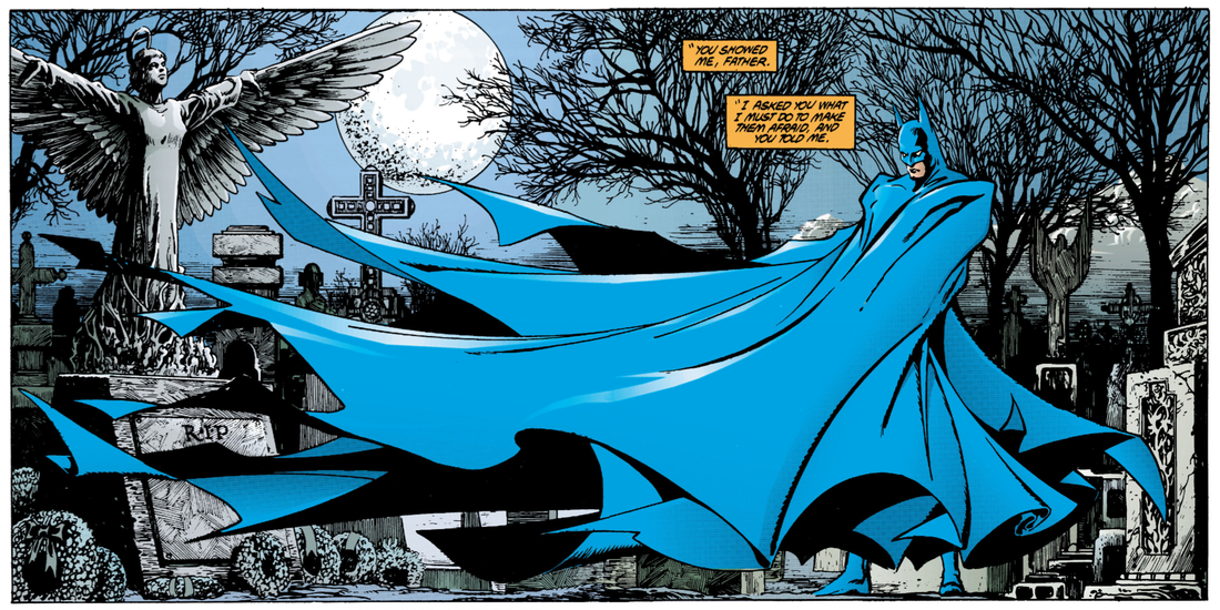 If only someone would make a statue/toy of this. Kev Yeah, the big spread that has since become iconic. Not least because McFarlane himself has released toys of it. Dave Sometimes the narrative box tends to repeat what we already know, but I guess it's his thoughts, and his justifications for what he's doing, and how emotionally trapped he is by this, and how he cannot make the choice to walk away. Which is why he is always butting heads with Leslie. Even she is telling him he belongs among the dead. Kev I really like Leslie as a voice of conscience for Bruce. I think the character needs more of that. They should bring her back. Dave She is very much a maternal figure but unfortunately she can't get through to him. Kev Yeh, we get a bit of a recap here. Just to bring us up to speed as we forge on into the second half. Barr also uses the caption boxes to make it clear that Bruce is still relatively early in his career as Batman. This is only his sophomore year, so it makes sense that he would be questioning himself, and just how far he needs to go in his crusade. Dave Plus, it has been proven that alone he is no match for The Reaper. Kev He's definitely behind on points, that's for sure. He lost the first two rounds, no question. Dave I love the use of the colours where Batman meets up with Chill, the purple/pink nightlight in contrast with the blues and the shadows cuts a very clean and interesting looking visual. Batman is constantly shadowed out, with only hints of the blue costume. It adds a nice extra touch to it. I wonder if that led to the decision for the movies to make his costume all black. 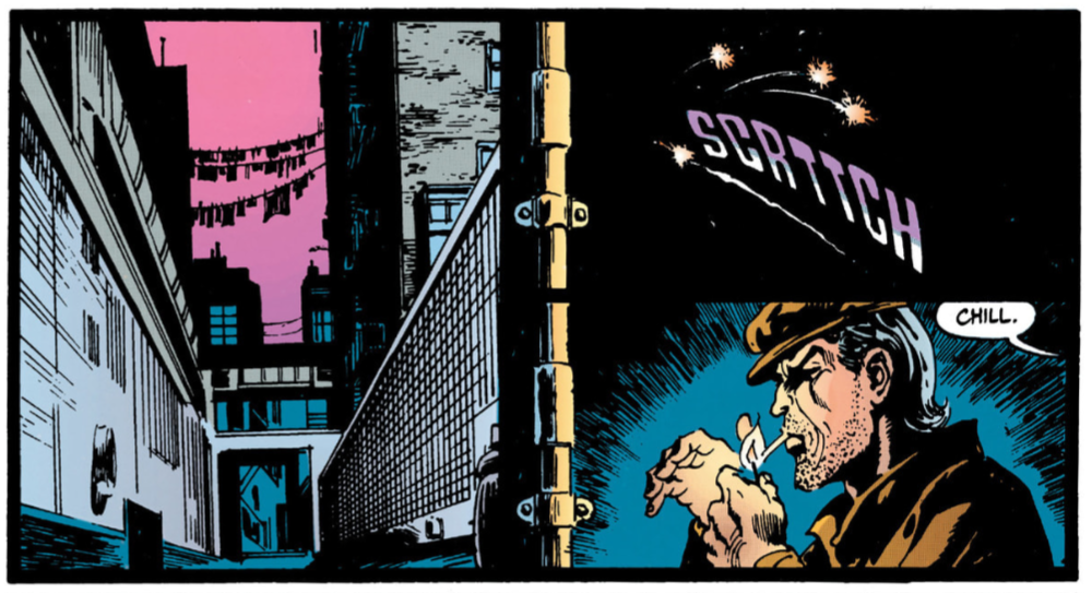 Netflix & Kev The colours in this issue are excellent. Movie costumes had to be black for many, many years, for whatever reason. McFarlane is such an odd, sometimes wildly inconsistent artist. For example, on page 64, panel 4, he draws Batman like some terrifying, "elemental" force of nature, like something out of a horror movie. Then on panel 5, he draws him like something out of the 60’s TV show, cheesy grin and everything, as he punches some guy’s lights out. That bottom panel of Joe Chill is excellent though. As is the top one of page 65. The sense of force in that throw, and movement of that rifle is fantastic. I also like the flashback panel to the orphaned Bruce Wayne, full of rage, with vengeance in his eyes, clutching the very gun that has just been used to kill his parents, when Joe Chill says, “I used to carry that piece.” That’s an evocative storytelling choice.  Holy good shot, Batman. You just took out Abe Lincoln with the butt of that rifle. Dave Also, I like how he has depicted Chill as still quite fit for his (older) age, and he kind-of has this almost charismatic way about him. His expressions are very playful looking. Yeah, MacFarlane's art seems to change a lot, even with an inconsistency to drawing to someone the same way. "Like shootin' fish in a barrel--!" That's a great panel. Especially the way Chill is just hanging there, enjoying his work. 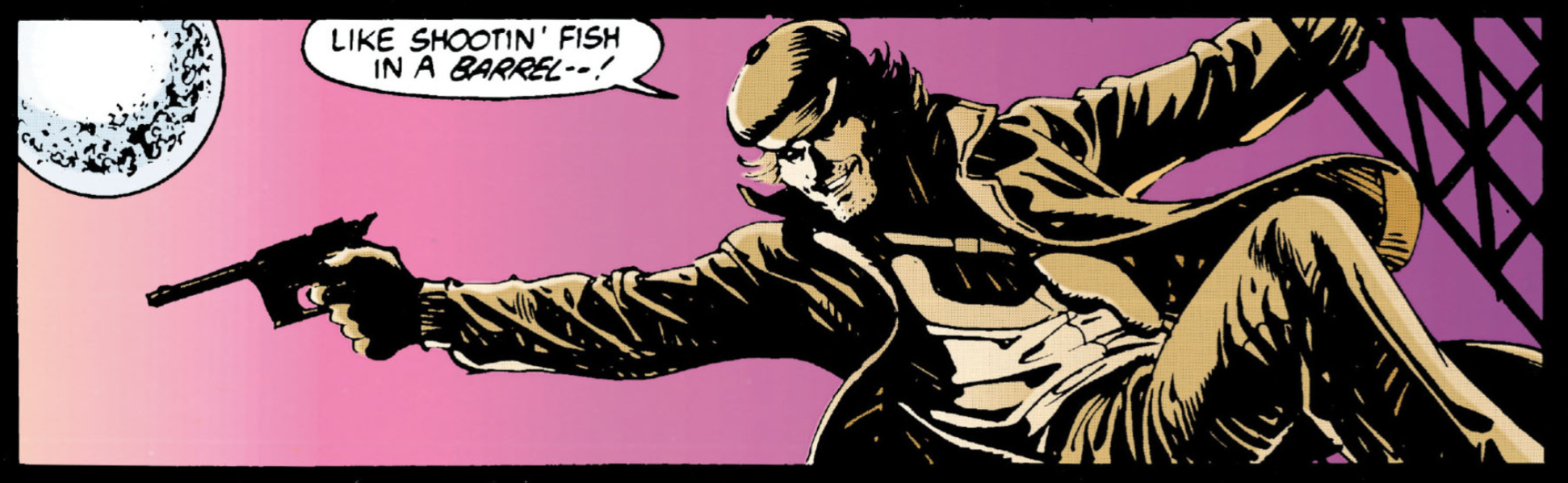 Ageing hipster, Joe Chill. Kev Yep. I love that one. How old do you reckon Chill is supposed to be here? Mid-40s to mid-50s? So, around our age. Ha, ha! Dave I'm not really sure. Probably around that, yeah. Plus, the little trigger that Chill says to Bruce when he mentions that he used to carry a piece like that. The internal rage that causes Bruce to go through. Kev I like how Bruce calls the thug guarding the door, “Son,” even though he looks at least a decade older than Bruce has to be at this point. Dave Yeah, that threw me off as well. Kev That was more 'Dark Knight Returns' than 'Year Two.' Dave I do like the panel of the bar with all the hippies/bikers partying, where we see the blonde woman, who is a precursor to McFarlane's M.J. drawings, with him emphasising that figures and those curves. Kev Yeh, he seemed to quite enjoy drawing a womanly figure, did old Todd. Dave Nice elbow by Chill. This guy can handle himself without a piece in his hand as well. Kev Yeh, Chill's portrayed as being a tough guy in this. He's very capable, and can clearly look after himself. Dave Which makes him a more interesting adversary for The Bat. Kev Yeah. Particularly considering he describes Bats as ".....soft, inside, where it counts." And states, "I can take him out." Is this hood bravado, or does he genuinely believe he has Batman's number? Dave Probably sussing him out cause even the feral people in life can spot their own kind, and he probably knows Batman isn't like him. I also like how Chill uses the excuse of killing the guy as it was to save Batman's life when in fact Chill is just a cold blooded murderer. Kev Ha, ha! Yeah, it's not like he hasn't been just itching to take someone out since all this started, is it? Dave I like how he says that him and The Bat make a pretty good team, he seems very relaxed around him. Kev I like that 4th panel on page 67, of Batman’s and Joe Chill’s eyes. Just gazing into each other’s souls. It’s very romantic. The 4th panel on page 68 is good too. The silhouette of Batman, and the washing hanging on the line against the dusky sunset are particularly good. 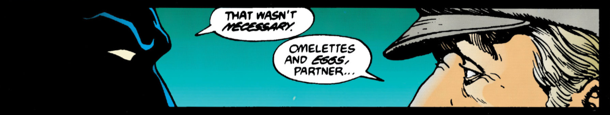 You could cut this sexual tension with a knife. Dave That's another good panel on page 68, of Batman leaping off the building, shown from a long shot perspective. He knows Batman isn't a killer, so I guess that's why he thinks of him as soft. Kev That's a good point, man. I suppose not being capable of taking another person's life makes you "soft" in a guy like Chill's book. Now, generally, I like a scene break to occur at the top of a new page, I just like how neat and tidy it is, and it provides a little more decompression time as it takes longer to turn the page than to simply follow the eyeline to the next panel, but the way that McFarlane (and Barr?) have composed these pages allows for that mirroring of pages 67 and 68, particularly at the foot of the page. It’s excellent layout, like in TV or film when you hear a piece of dialogue from the next scene, playing over the end of the scene you're just wrapping up, before the shot cuts to the next one.  This sounds like a Joey Tribbiani audition story. 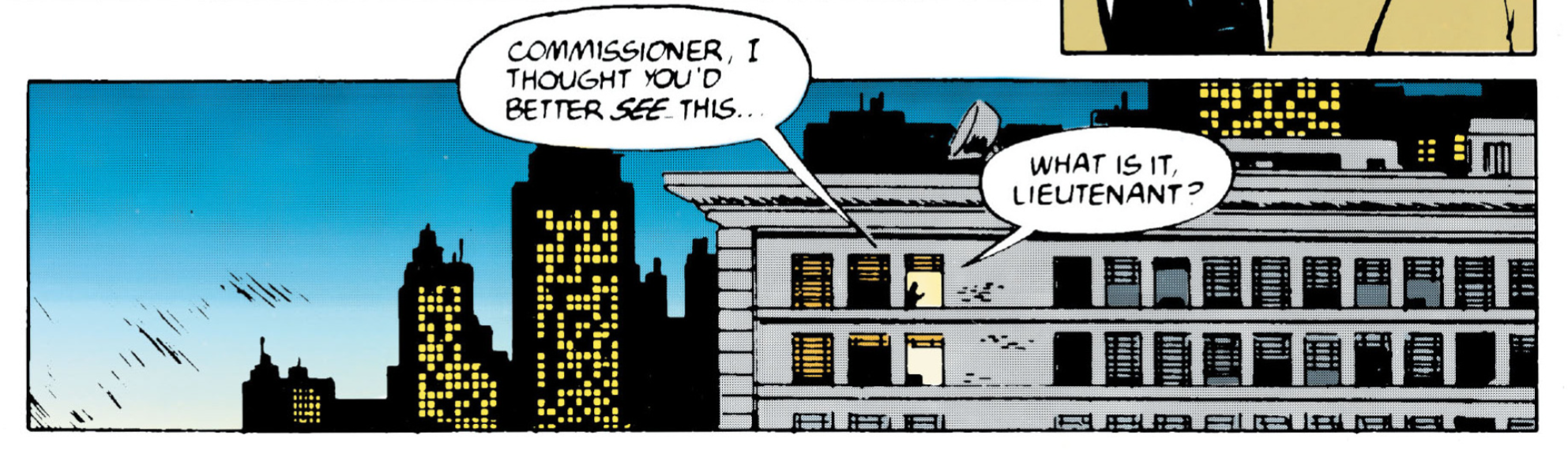 It's a massive drug deal, Jim. Dave Yeah, it's a quick change of scene. The 2nd panel on page 69, the close up of Gordon, is good. There is a lot of detail in this, and Gordon is getting that kind of haggard, veteran look about him. Much like the pacing, this issue is snappy but really cohesive, and not overly muddled at all. Kev I think the pacing of this issue is superb. It flows so well. It's a pleasure to read, actually. You can see the transition happening, from Davis and Neary’s artwork in chapter one, to what will be all McFarlane by next issue in chapter four. Alcala’s inks on McFarlane’s pencils are a lot less “restrictive,” (if that’s the right word) in this issue compared to the previous one, in that there seems to be less of a concerted effort to bring McFarlane’s more sketchy, expressive pencils in line with the cleaner, more composed work of Davis and Neary. That panel of Gordon that you're describing is a perfect example of this. I wonder if it was just the result of a time crunch, to get issue two out on schedule after the gun-on-the-cover of #575 falling out, or if it was a result in O’Neil’s confidence in McFarlane as his work on the story was progressing. I mean, look at pages 70 and 71. They look like the work of a different inker. In fact, I’m not so sure that they aren’t. Maybe it’s Alcala on 70 and McFarlane himself on 71? Either way, it takes a little bit of the edge off the jarring effect of changing artists mid story. I applaud it. Dave I think Bruce looks very youthful. Not too dissimilar looking to Peter Parker. McFarlane brings a youthful quality when needed to his work. Kev Yeh, the more youthful Bruce Wayne is a nice touch here, especially when taking into account that he's most likely still in his twenties and this point, and feeling the pull of youngish love. Dave Coming back to the point about Chill calling Batman soft; essentially Chill is a psychopath. Anyone who can kill two parents in front of a child and feel nothing has an absence of emotion and, for all his internal struggles, Bruce still has the decency of a human being so they are two contrasting personalities. This story really delves in to the contrasts and the similarities of people. Batman and The Reaper are similar, in that The Reaper is what Batman could have become, but Chill is not what Batman could ever be. Even The Reaper is suffering intensely with his loss, whereas Chill has been the one taking from others, so he has no suffering. Kev That's another excellent point, Sir. Is Chill at the very end of a spectrum that Bruce and Judson have found themselves on, because of people like Chill himself? Dave I like the contrast on page 71, it reflects the high society lifestyle very well, with this kind of white backdrop which could be a symbolic representation of the clean cut life on a superficial level. 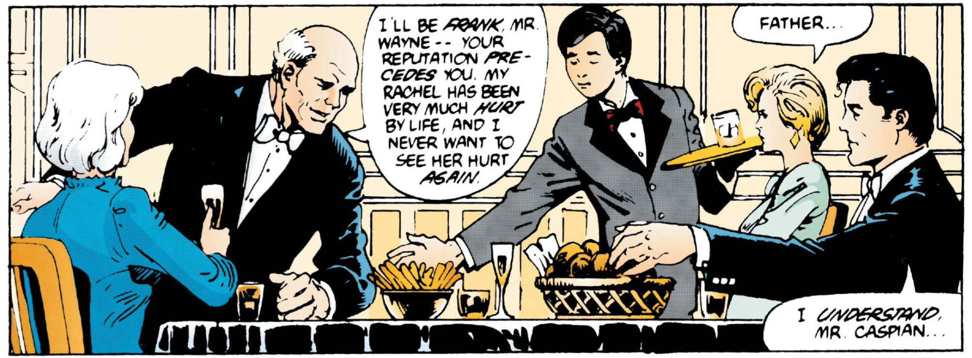 Frank?!?! I thought he said his name was Judson. (Police Squad joke there, if ever I made one) Kev Totally. I really like the composition of that dinner scene on page 71. It's an excellent range, and choice or, “shots.” Hats off to Todd. The colour work by Oliff and Vasquez is great too. This is the first time we’ve has any real “light” in this issue, and they’ve gone to town with it here. It looks so blown-up, oversaturated, and overexposed. There’s hope, and the potential of joy here. Pity, as it’s Batman, that we know it won’t last. Dave Yeah, it is a heightened depiction of high society we haven't really seen any of this in 'Year Two' up till now. Kev And it's such a simple way of showing the dichotomy of the character. The two worlds that Bruce and Batman are forced to operate in. Also, we find out here that Rachel has decided against joining the convent, as a result of her burgeoning relationship with Bruce. To misquote the late, great Caroline Aherne as Miss Merton, “So, Miss Caspian, what first attracted you to the billionaire, Bruce Wayne.” I suppose, who wants to live in poverty as a servant of God, when you can divorce a billionaire in a couple of years and be set for the rest of your life. That’s Wayne, one, God, nil. Yep, over the next couple of pages, it is, once again, made abundantly clear that Rachel is just dating a younger version of her father. Just with more, and darker, hair. Dave I've got to say; Alfred is giving Bruce a very suspect look, in the mirror, on page 70 as he drives him to dinner. Kev Ha, ha! Yeh, Alfred is thinking, "Master Bruce, I admire your youthful naivety, however you will be incapable of doing anything BUT hurt this poor woman!" Dave Alfred is giving that "You're talking a pile of shit" look. Kev Ha, ha! It's definitely that look. Dave Then, at the bottom of page 72, we have the panels of Batman and The Reaper getting suited up again. I see what you mean about the cheesy grin on Batman. And that panel on page 73 of The Reaper swinging through the air is such a familiar pose to when MacFarlane drew Spidey he seemed to go for the body pro-actively leaning forward a lot in his work. 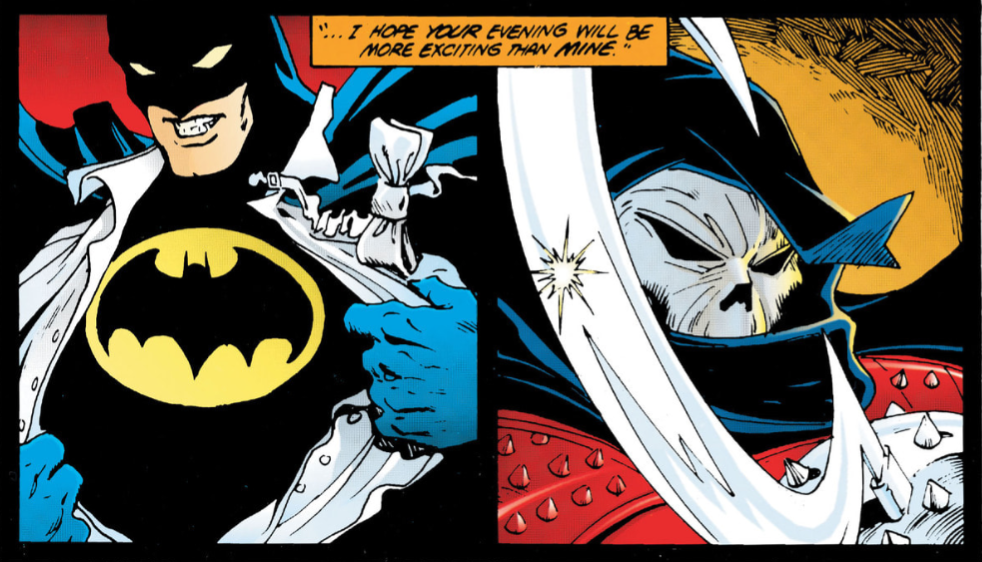 So, let's get this straight; Bruce put the cape and cowl on BEFORE he took the shirt off. Okay. Kev Definitely. You can totally see why the folks at Marvel would think that he'd be a good fit for Spidey. Those really are some cracking complimentary panels of Batman and The Reaper at the foot of page 72 and the top of page 73. Good stuff by McFarlane. When he’s on, he’s REALLY on. I’m being reminded of just how good looking this story is by all this. I mean, just look at those last two panels of page 73. You can taste the squalor of Gotham in those panels. 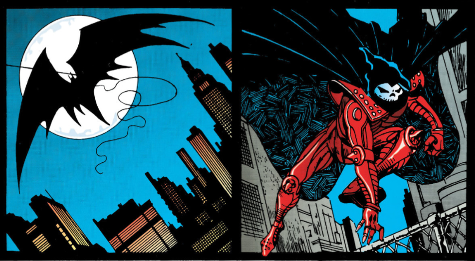 Just normal men. Dave I love page 73. Look at the stark contrast to page 72. That's probably why it was drawn in that clean, majestic looking way, to highlight the differences between those two worlds. 73 really is great visual work all round. Also, page 74 is great as well, not only with its vast array of colours, but also the change in tone. We have the horror element coming in again here, as The Reaper appears. Along with the close up of the eyes, it's kind-of a De Palma cinematic shot in many ways, when he tackled those types of stories in his movies. 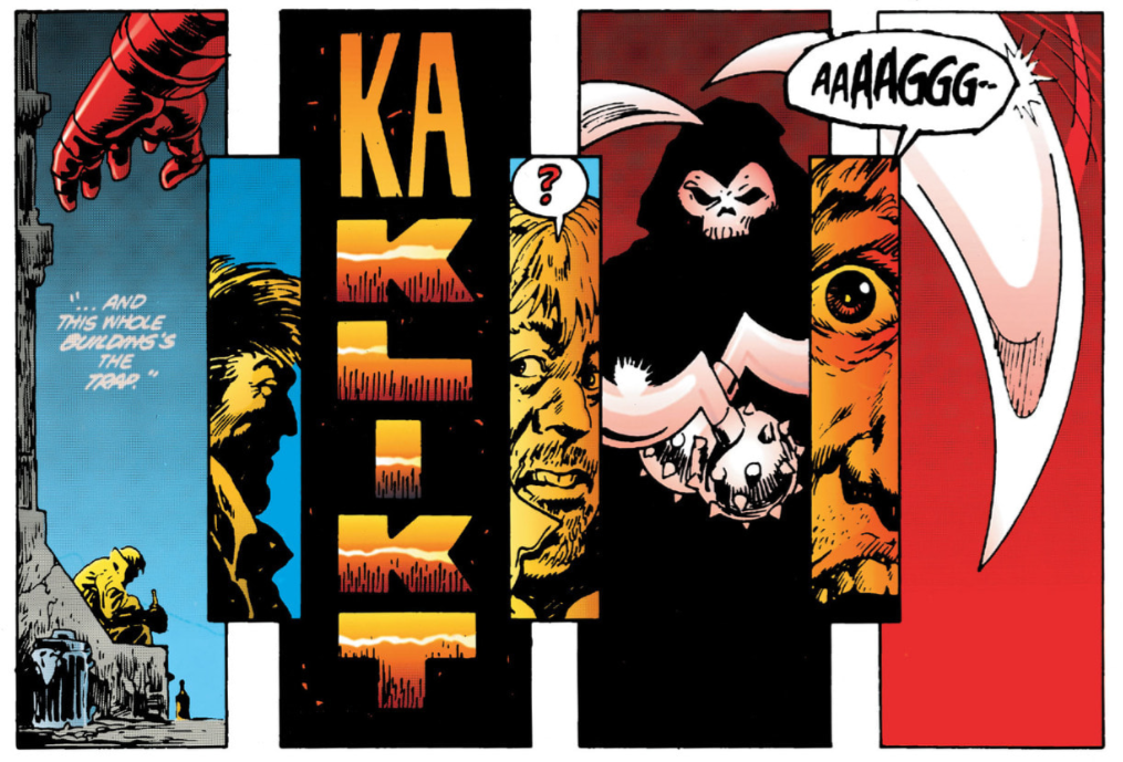 "You look and see a gun, a man with no face, a golden halo that could be the sun." Kev Yeh, pages 73, 74 and 75 are pretty outstanding work by all involved. McFarlane really does accentuate the slasher horror-inflected nature of this story, doesn’t he? That middle tier on page 74 is really good in that sense. And you're spot-on, those colours don’t hurt it either, do they? And here comes the gore at the top of page 76. 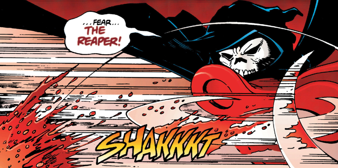 Look, Judson! Blue Oyster Cult told us NOT to fear The Reaper. You're giving us conflicting instructions here. Dave The composition on pages 75 and 76 is excellent. This is top tier storytelling, and it's starting to pace it up and crank up the gears. I love the colours used, there's quite a variety of them, but they're very effective. Also, the panel on the bottom of 76, of Batman and Chill about to go up the staircase, is great. Kev It looks weird seeing Judson’s jawline under the skull mask, as this is the first time we’ve seen him presented this way. It makes for yet another piece of The Reaper being presented as an analogue for Batman though, as we always get to see Bruce’s beautiful, square jaw. Dave Yeah, the jawline is shown from a different perspective, and not masked by the shadows. Plus, that's a neat little flip and kick by Batman on The Reaper. Some nice agility there. Kev Yep. That's a good panel of Batman dodging of the bullets on page 77. He looks like Neo in 'The Matrix.' Jim gets a good left in on Batman here, and starts to read him his rights, before Chill so rudely interrupts him with a rifle. "Gordon with the ground and pound." 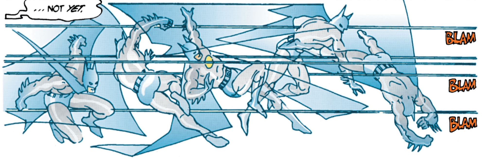 "I've never seen anyone move so fast." Dave That's true about 'The Matrix' scene. And this was before 'The Matrix' was out. It seems that Neo was not the "one", Bruce Wayne beat him to it. Jim was straight in there, he was itching to plant one on Batman, and a trigger happy Chill forgets there is ether in the vicinity. He's not the brightest at times. Kev No. He's a bit trigger happy, isn't he? Maybe if he wasn't, we wouldn't have a Batman, and Bruce would still have his mum and dad though. Dave t happened real quick, and then Chill needs Batman to save him.  ".....eyes lit by the fires of Hades' eternal damned kingdom....." Kev Jeez, there are 13 panels crammed into page 79. That's a lot of storytelling on one page. I love those panels of Batman’s eyes at the bottom of page 79 and the top of page 80 though. There's a lot of emotion, and storytelling contained within, what are essentially, two relatively simple panels. Dave Those panels of the eyes really show how much Batman is seething, and still not fully in control of what he's doing, yet Chill is kind-of "chill" about the time it took Batman to rescue him. You might have given the game away a bit there Bruce. Kev Yep. There's inner turmoil in them eyes. Dave Suppose that's why he is called Chill, he's a chilled guy, just with a few psychotic trigger happy tendencies, that's all. Kev Ha, ha! Could very well be. Dave There's also a lot guilt emerging for Bruce, what with this working relationship he now has with Chill. Kev Definitely. Dave The last two panels on page 80 are excellent as well. Just the mixture of those colours. The light and the shadows really blend in so well. I kind of get the sense that MacFarlane is really settling in to this story and is producing more and more great panels. He really was a highly skilled artist, and this issue is starting to showcase this well. Kev Yeh. Other than a couple of the inconsistencies you mentioned earlier, I think this has been a very aesthetically pleasing issue. Dave I've got to say; the Batman/Chill dynamic works really well, and as a team they kind-of function well together. It’s been an enjoyable aspect of this issue. It didn't go how I expected. I suppose I was expecting endless bickering, but it didn't go down that route, which is quite refreshing. Kev They play the oddball partnership surprisingly well, don't they? Dave Yeah. Jim Gordon was definitely a bit side lined in this issue though. Kev True. Whereas you could argue that it was both Batman and Jim Gordon's 'Year One,' it is certainly more just Batman's 'Year Two.' Dave Plus, there are more central characters in this story, so it's a lot to delve into from a writing perspective to give each of them much character development. Kev Yeh, there is a bit more of a supporting cast here in 'Year Two,' when compared to 'Year One,' isn't there? I really like this issue. A lot of it is just set-up for the finale, but it’s very skilfully done by Barr, and it’s very handsome. Barr gives us a little bit of cat ‘n’ mouse (or is that bat ‘n’ mouse) intrigue, he ratchets up the tension and the stakes, by actually giving Bruce something to lose in this instance, rather than just being a nihilist, and the pace was as breezy as ever. There was not a single panel where I was bored. And that’s a testament to it, considering I have read this to death over the years, including twice now over the last few years with a supposedly critical, adult eye for “review” purposes. My positive take on this as a somewhat overlooked gem is remaining intact. Dave It's good that it still stands up to the test of time, and to be fair, this has been my favourite issue of the series. There are hardly any flaws, and it's a great example of how good a Batman issue can be. So yeah, I really liked this issue, it's such an easy read, but it's also so enjoyable on may levels. It just flowed together so well. Kev In retrospect, I think it might have been my favourite of the series so far too. Which I doubt I would have said if you'd asked me before I read it again to do this review. Just shows you how you can get something new out of these comics each time you read them. Dave True, each read can lend a new perspective. (D) & (K) Next: 'So Shall Ye Reap.' 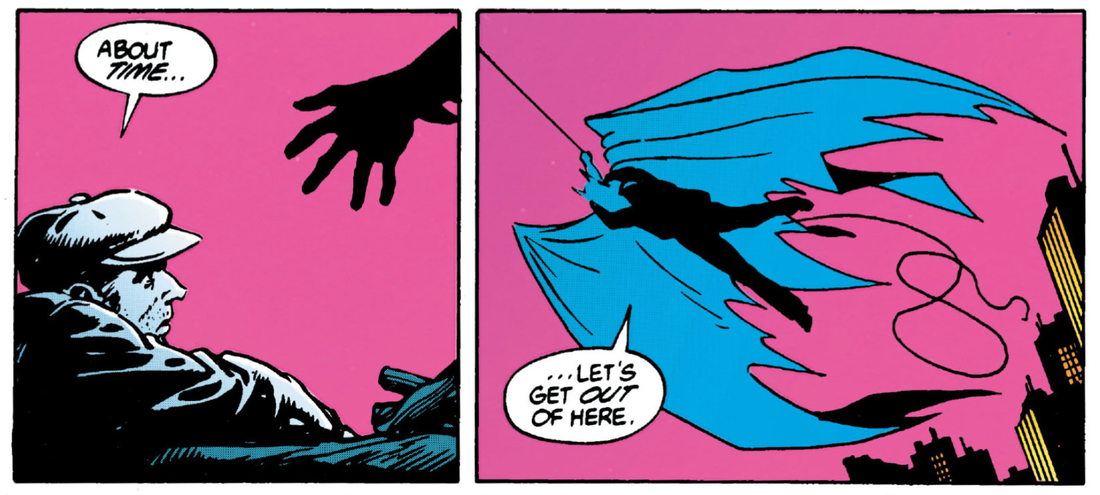
0 Comments
|
Back issues
April 2024
|
 RSS Feed