|
by Dave Scrimgeour and Kevin McCluskey   Written by Dennis O'Neil Illustrated by Jerry Ordway Coloured by Steve Oliff Lettered by John Costanza SynopsisVicki Vale uses her investigative photo journalist skills to tail her new paramore, the billionaire Bruce Wayne, and discovers that there's tragedy behind his playboy facade. Unfortunately for her, in doing so, she also puts herself in the crosshairs of another of Gotham's eligible ba(t)chelors, "the world's first fully functioning homicidal artist, The Joker. Inevitably, this love triangle finds itself on a collision course, resulting in a caped crusader rescue mission, a showdown in Miss Vale's spacious apartment, the aforementioned tragedy resurfacing, and a chemical plant going "FWA-KWOMB" in the night. Whatever that means. Dave So, here we are, on our part 2 of this adaptation. It's interesting how this has skipped the whole section of Bruce blowing her off for a meet-up, then Alfred inadvertently spilling the beans that they would not be out of town, and has gone straight into her tailing him. I like how those five panels tell it very simply what Bruce was doing. I actually think that this must have been a very difficult task to keep to the story in terms of reducing it down and it still making sense. 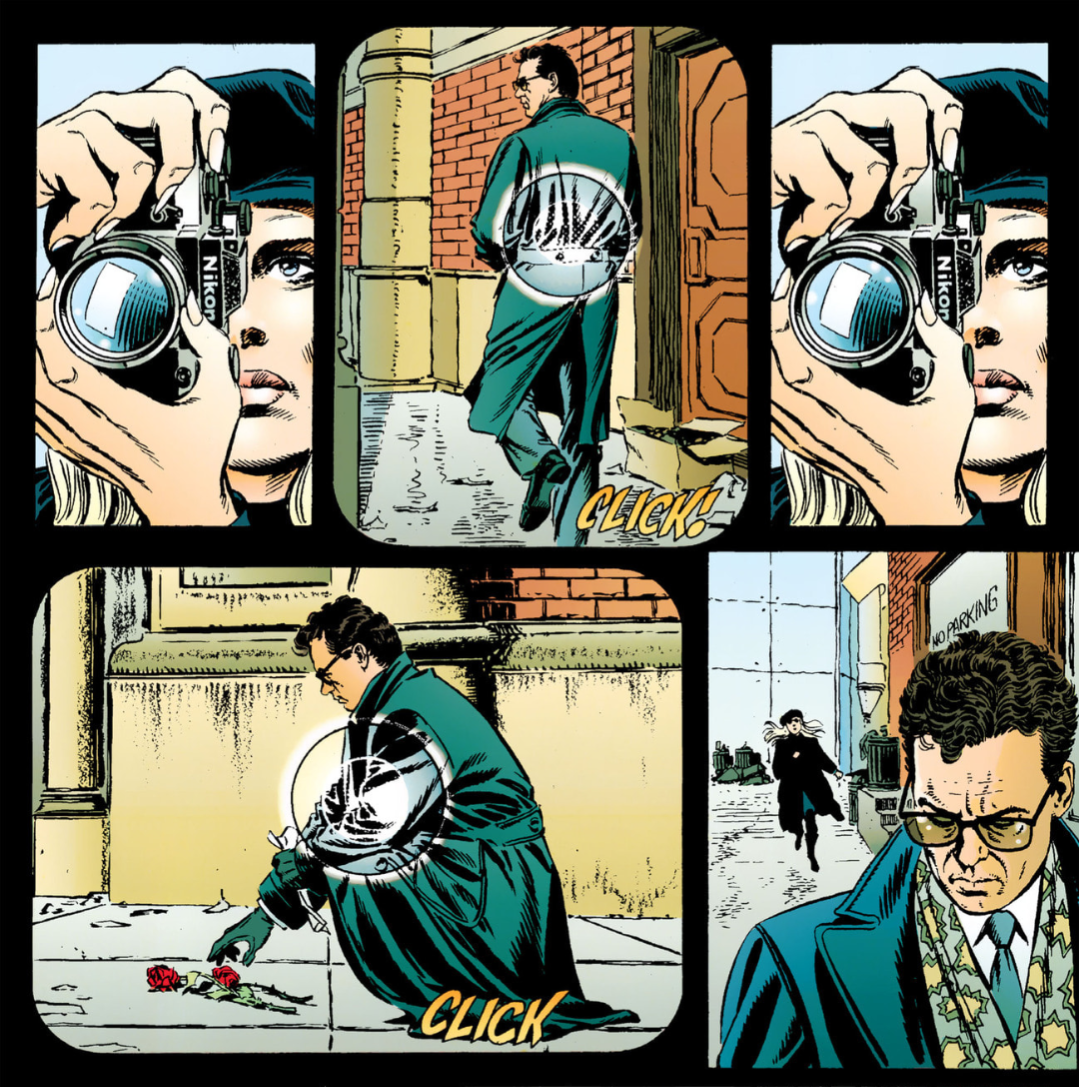 "Baby, I compare you to a kiss from a rose on the grey." Hold on, that's not for a couple of films yet. Kev Yeh, I’m becoming increasingly fascinated as we go on with this discussion, by the streamlining process that O’Neil and Ordway have gone through to make this readable as a comic. I would’ve loved to have been a fly on the wall, so to speak, when they were deciding, not only which scenes to omit, but also which beats, and which pieces of dialogue within scenes had to be left out too. Obviously if you adapted the movie beat by beat, scene by scene it would be unwieldy, probably 1000 pages long, and probably unreadable. Dave I've actually just noticed the colours on this page are quite bright and vibrant in comparison to the muted, noirish look of Burton's film. Kev Definitely. Steve Oliff has done an excellent job of adapting the, as you've said previously, "noirish," colour palette of Burton's movie, to a more "comic booky," colourful palette, without losing too much of the atmosphere of the film. I can also hear the Danny Elfman score in my head as I’m reading this scene where Vicky Vale is photographing Bruce Wayne placing the two roses at the scene of Thomas and Martha’s death. Dave Yep, me as well. That shows how much we know this movie. I watched it so often after I got it on VHS. It was practically on every day. Kev I think I had the VHS on every day for months on end as well. Dave Yeah, plus the fact that we could recite the lines. Kev Ha, ha! True. Those lines were quoted to death on the playground at my school as well. And I agree, Ordway deals with a scene with no dialogue incredibly well. Artists probably just feel like the word balloons are getting in the way of their art half the time anyway. Dave I like how this is really unfolding into an adaptation with a comic book feel to the story, and not a carbon copy of the film, with the more muted colours to it. And those differences in dialogue as well, all lend to this having a life of its own in terms of the story being told here. I like that there is no thought balloons used. I can see why the talents of O'Neil and Ordway were employed for this, quite frankly, difficult task. Kev That's a really good point, man. It all conspires to give this book a life of it's own, and justifies it's existence on its own merit, beyond it just being a money grab movie tie-in. Dave Page 24 is another excellent page of visuals. The top panel of the Joker in middle of everyone really catches the eye, and he looks really striking here. 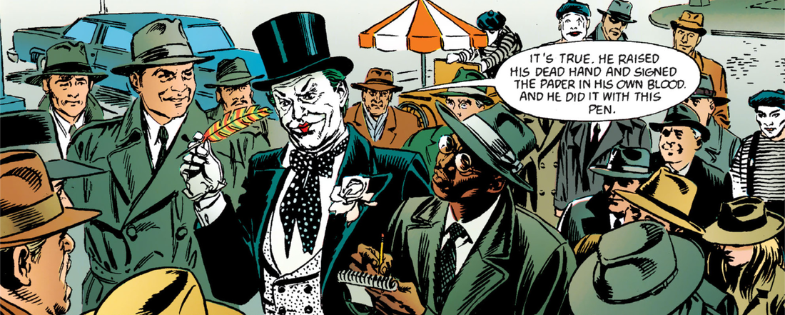 Look at those pouty, kissable lips. They're enough to make even Overlord jealous. Kev Yeh, I always wondered why they went with the slightly different look to The Joker here. Dave It's as real standout look, in my opinion. I think it's a great panel, again, lending to the comic book look. As we are getting further into this, I'm starting to view this through a comic book lens. Page 24 is another quick paced page, which is a trademark of O'Neil, as we have previously discussed when we covered his writing on Green Lantern. Kev Yep, and the best part of 20 years later than the Green Lantern stuff, as well. He was a legend alright. It's probably the viewpoint we should be looking at it from, to be honest, and something that I'll admit that I was struggling to do in our discussion of the first part. Dave I think it's just that it's clicked with me as I was looking through it, and how it is really starting to come together as a comic book story. Kev Conversely though, I actually put the movie on in the background while I was making my notes this time, and it really seemed to help. Odd. Dave That’s actually a good idea. On page 25 we get that top panel of Bruce recognising the Joker, "It's him.” A little teaser here to an unfolding story. 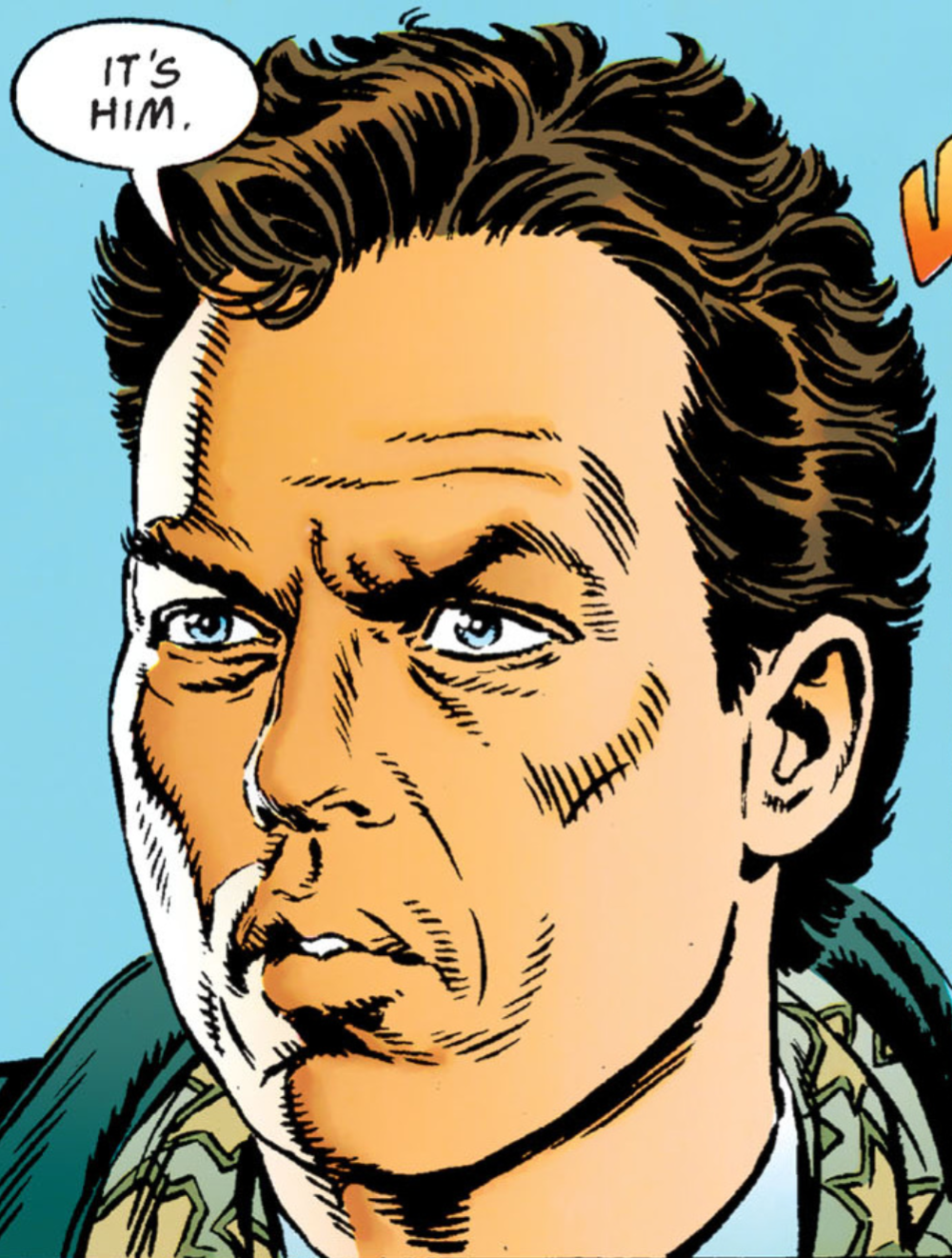 In your best Vince McMahon voice, "Pronouns, Pal!" In your best Vince McMahon voice, "Pronouns, Pal!" Kev There was no, "It's him," line at this point in the film though, am I right? Dave Yeah, Keaton was just silent. Kev Bit of a change here as well, with Vicki being interviewed by the news being what brings her to The Joker’s attention, versus the photos that Bob took at the steps of the courthouse. And “This city needs an enema” versus Jack Nicholson’s well used “This TOWN needs an enema!” Dave And the dog next to him wasn't there. Kev Ha, ha! Right enough. I'd never noticed that here. Dave Yeah, I'm really starting to like those little changes, like the ones made made here. They actually change the dynamic of the story slightly, and also the dynamic of the relationship between Bruce and Vicki, but they still manage to stick to the storyline. I'm also liking the colours here, I really think this adds to making this adaptation its own thing. Yeah, the Vicki Vale interview also is giving her more of an active role here. Kev Good point. Vicki in the movie is a little bit passive, and plays the role of the stereotypical damsel in distress more at times. I love that line from The Joker about Vicki Vale trading up from Bruce Wayne to him as a suitor. Ha, ha! Dave And the mention of Alicia taking a header out of the window was obviously saved till later in the film. Kev Yep. They kept that particular ace up their sleeve until later. Dave I'm starting to notice O'Neil’s ability to tell stories at a pacy speed again, something, as you said, we probably struggled with in part one, as we were just looking upon this as a comparison and nothing else, but the pacing of his writing here, is reminiscent of his Green Lantern writing, and as we know this story, I can almost see the movie as the draft for this, and we are seeing how he breaks it down and cuts down the unnecessary. Kev Absolutely. Him and Ordway have had to be brutal with the knife in editing this down to a readable comic size. Dave But also brilliant in being able to keep to the story as well, without deviating off path. Kev Oh yeh, it's lean as anything. Dave Then it jumps straight into the newsroom scene again, it's quick and gets straight to the point. Also, the way The Joker advert is drawn is great. There is a sense of this not trying to copy Nicholson’s performance precisely, but give us, the reader, a Joker character as well. Kev Yeh, Nicholson's probably done a load of different takes of these scenes with improvisations, right? Dave Possibly. Still, the facial likeness are great. Kev Yeh, I think Ordway's likenesses are outstanding. Dave Even the likeness on page 29, in the panel as Vicki enters the museum and is speaking to the front of house manager, the resemblance to the actor who plays this part is incredible. And this page is another section that is done out of order in comparison to the movie as, in this story, Alicia is already dead at this point, whereas she wasn't in the film as she accompanies him to the museum. I wonder how much O'Neil enjoys mixing these things up. He's certainly not one for sticking to the conventional story draft. 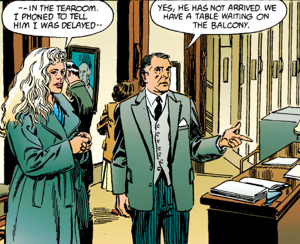 Nothing quite like a Gotham high tea. Nothing quite like a Gotham high tea. Kev I thought the exact same thing about that likeness. Ordway didn't even skimp on the minor characters. What a pro. Yep, she accompanies him to the museum, then gets shoved out the window later. Dave I love that panel on page 29 of Wayne manor, it is another visually striking panel. Kev Totally. And not a big, splashy panel either. Again, testament to the pride Ordway took in his work, and his professionalism. Dave Adds a nice little touch to the issue. Kev Definitely. Excellent scene setting. His panel layout on page 28, when Becky, the newsreader, succumbs to the Smilex is superb as well. The use of the rounded edges of the television screens, for the panels, is such a good touch. And again, I love how O’Neil and Ordway move some of the pieces of this puzzle around to get the most bang for their buck out of the real estate of the page. For example, the setting up of the Museum scene here. Dave And it is unfolding at breakneck speed, such as the first couple of panels on page 30, which shows the gas knocking everyone out, then we get a great panel of the Jokers entrance. He also skipped the whole 'Partyman' dance scene where they ruin the paintings. 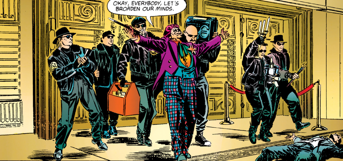 "Laurence!" Kev Yeh, “Okay, everybody, let’s broaden our minds,” as opposed to “Gentlemen, let’s broaden our minds. Laurence!” I think I only remember these so well because Prince used them in his soundtrack to the film. I suppose that scene would've been difficult to pull off without it taking up a couple of much needed pages. And it is just a bit of a musical set piece number. Pretty tall order for a "silent" medium like comics. Dave Plus, it was probably deemed not necessary for this condensed version. Kev I reckon so, yeh. Dave Yeah. And again, the likeness to the actors is incredible. What do you make of this Joker's outfit in comparison to the comic book version of this time? Obviously height wise he is shorter, and slightly bigger built. Kev Nicholson didn't exactly match up to the tall, skinny, body type of the comics, but he managed to capture a version of the character that totally worked within the adaptation he was working in. Dave That second panel on page 31 is practically the spitting image of Nicholson with his trademark devilish grin. 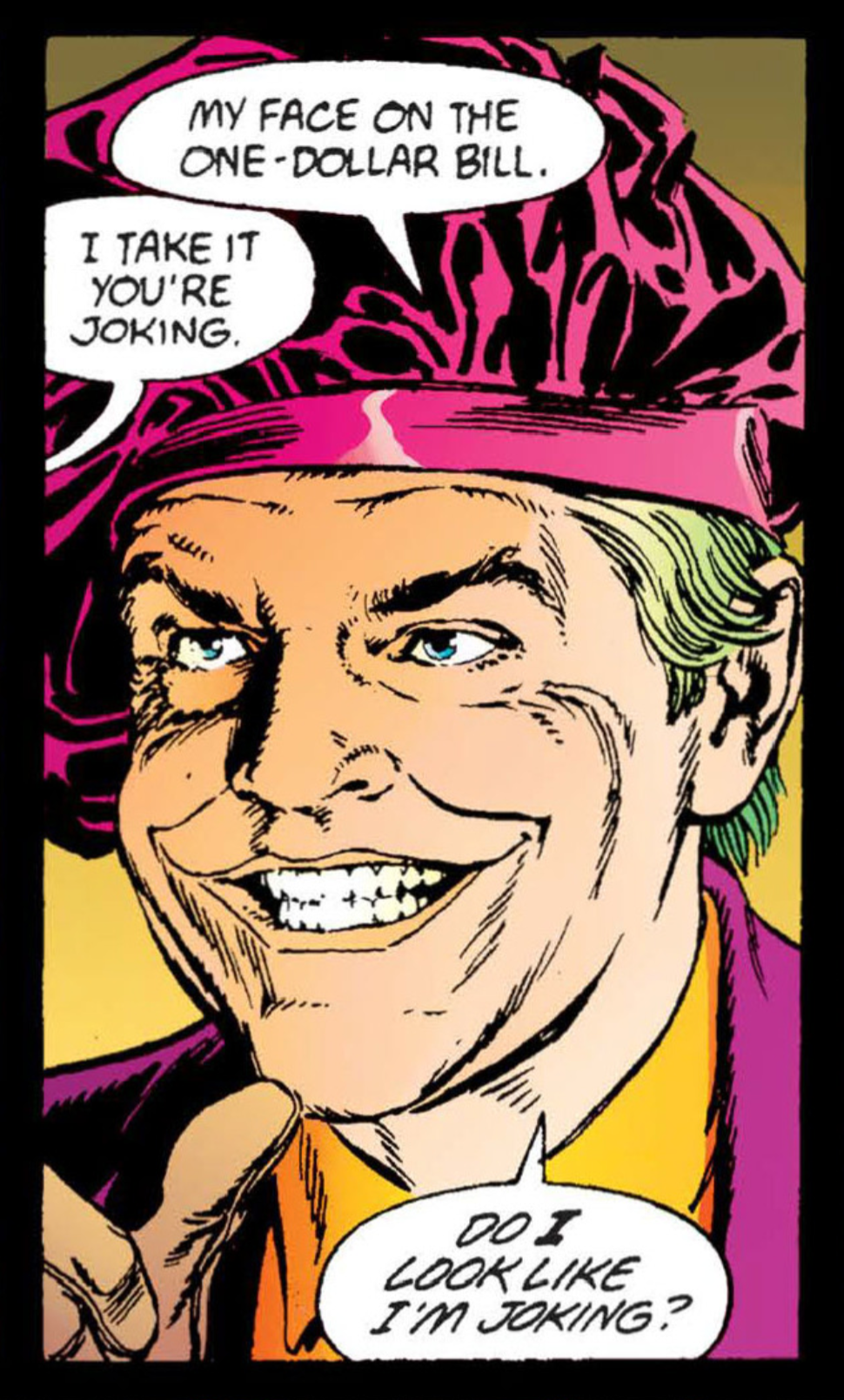 "Everybody hail the new king in town." "Everybody hail the new king in town." Kev It's pretty uncanny, eh? Dave And the whole scene of him trying to spray her face with acid is missing. I'm really getting into this version now, as it is continually keeping to a fast pace with no unnecessary time wasting, and keeping it engrossing as well. Kev That's what I was thinking as well, yeh. Because of you making the point earlier, I'm starting to appreciate just how well it works as a comic, and not just an straight adaptation of a movie. And let's be honest, you can't say that about a lot of movie adaptations.b In fact, I'd go as far as to say that you couldn't say that about MOST movie adaptations. They're usually pretty redundant. Dave Plus, no Alicia either, maybe some of the 12 rated stuff had to be cut for mass comic book consumption? Kev Could be, yeh. This was the first 12 rated film, over here in the UK, after all. Maybe they wanted to keep some of those "darker," more adult orientated elements out of the kids comic book. Dave The movie novelization was really enjoyable as well, given that it hadthe opportunity to elaborate on this story purely with the use of words. Kev I would say we could review that too, but at the pace I read a novel, we'd be doing it until the day I die. Dave Oh yeah, it would take us forever to work through that. Big, grand Batman entrance here. That's a great panel. And the small panel of him aiming his zip line gun at the Joker is brilliant as well. There's a likeness to the movie outfit, but it's also combined with the comic book colour look as well. Kev Yeh, I’m also fascinated by the way that Ordway has to impart more movement into his panels, compositionally, so that they don’t just come over as stilted images, or stills from the movie. For example, when Batman crashes through the skylight here, he puts more lines and shapes into Batman’s body, to present the illusion of movement within the panel, whereas the film can afford to have Batman be a lot more, linear, more straight up and down, because there is the physical movement of the human body, as well as the camera, and that is where they can pull their dynamic and kinetic energy from. Ordway, on the other hand, has to find ways of conveying this in a medium that does not move. Well, certainly the images WITHIN the panels do not move. Your eye still moves across the page, and you still have to physically turn the pages, but let’s not go all Scott McCloud on ourselves here. Dave Well, I think because the medium of comic book storytelling is here, there is the leeway to try and tell this in a more comic book-oriented way. Plus, Keaton is stuck in a rubber outfit that was very limiting to his physical mobility, so there was a kind of stiffness to his movement because of this, but Ordway is giving this Batman a more loose, and freedom-of-movement look. Kev Yeh, that suit was a nightmare for Keaton, apparently, but the rigidity of it gave his Batman a certain presence that I still love to this day. Dave I thought Keaton handled the rigidity so well, and he brought that into his characterisation. Also, there could've been a number of readers who still hadn't seen the film, so keeping this exciting for them is also key. The comic was another marketing tool to sell the movie. Kev That's true. So, so, very true. Dave Page 32 is superb as a physical piece of action, and I love the colouring as well, but also how the composition of the art is arranged too. 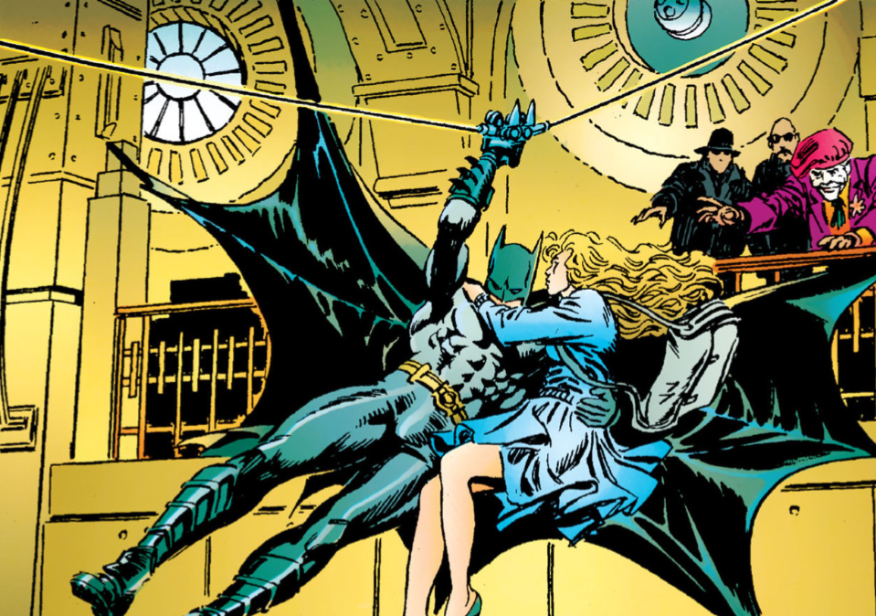 Bats 'R' Us. Kev Me too. Page 32 certainly gives us some of that kinetic energy. Dave Jeez, page 33 totally skips the whole car chase, the fight scene, and Vicki taking the photo of him. That's quite a big chunk to exclude, but there is some extra dialogue between Batman and Vicki in the car. There quite a bit of extra dialogue flung in, in general, and it takes away the silence and moodiness of the scene as it's presented in the movie. That's another wall art panel, the first one on page 33. 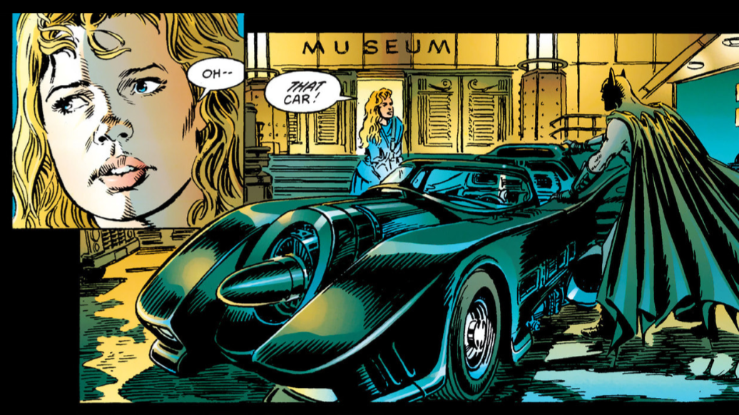 Oooh! Fast, and furious. Fancy! Kev Totally. Big introduction for Anton Furst's iconic Batmobile design here. Yeh, I reckon there’s been a later draft or, at the very least, a dialogue polish done on the screenplay after O’Neil and Ordway have put pen to paper on this. That exchange between Batman and Vicki Vale about the Batmobile is much tighter, snappier, and amusing in the final cut. “Get in the car!” “What car? Oh- - THAT car” is a bit clunkier than having her say, “Which one?” and then getting the shot of her reaction. Although, we don’t necessarily need the action scene, but we do need the exposition scene in the Batcave for plot purposes. See? I could never have whittled this down. Dave Batman is far more talkative on page 34. Kev He is a bit chatty here, isn't he? I like a more stoic Batman, myself. More of a strong, silent type. A bit Clint Eastwood. Without the proclivity for guns, of course. Less is more, y'know? Plus, it helps mitigate the questionable choices that certain actors make with the Batvoice. Cough! Christian Bale. Cough! Dave And on page 35, the panel where he grabs her like he's going to kiss her, but ends-up giving her the gas; just looking at this from the comic book adaptation perspective, this Batman seems less detached, almost like he's been doing this a lot longer as a superhero, whereas Keaton's characterisation was more emotionally detached, and trying to keep himself unavailable from human contact. Kev Yeh, I agree. He seems much more human here, eh? More "man," less "bat." So to speak. Dave I like that bottom panel on page 35 with the Joker looking at us, the reader. 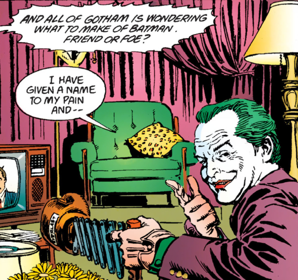 Foe! No, friend. No, no, foe! Definitely foe! Foe! No, friend. No, no, foe! Definitely foe! Kev He's almost breaking the fourth wall there, isn't he? Ah, the boxing glove destroying the TV bit is here in this adaptation, whereas it was at the “This town needs an enema” scene in the film. Joker uses a gun on the TV at this point in the movie. Escalation I suppose. Dave Yeah, I was going to mention that earlier, but I forgot what scene it was on. I'm starting to think O'Neil is really enjoying mixing up all the ingredients, to cook up his own recipe for a story. I always liked the whole gag by Bruce and Joker about Vicki's apartment in the film, "Lots of space', but it's not in this on page 36. Kev I love that gag as well. Dave There is a lot more dialogue though. In saying that, as we've discovered in the previous work of his that we have discussed, O'Neil’s writing has always been very wordy. Kev Yeh, Denny liked to "write," that's for sure. Probably better that this doesn’t have the jack-in-a-box with the hand holding the dead flowers, causing Vicki to faint, damsel in distress bit from the film. It’s not great, I don't think. I've always found it to be a bit of a cheap laugh. Dave Right enough, on page 38, the joke with the hand in the box is missing. I don't mind it. It is the Joker after all. On page 37, most of the film dialogue has been kept in, but this page, and this scene, seem rather clunky, in my opinion. It could have been expanded a little bit with a few more panels. It kind-of loses any tension. Kev Yeh, if I have one criticism of this adaptation, it's that the page breaks aren't the best. There are a lot of scenes that end within the pages rather than between the pages. Maybe you're right, maybe this scene would have benefited from a couple of more panels, or even an extra page. Dave That middle panel on page 38, the street shot of the Gotham Globe, kind-of reminds me of the crispy freshness of the animated 'Batman Year One' we watched recently, not a dark, moody Gotham, or a noirish, cinematic look. 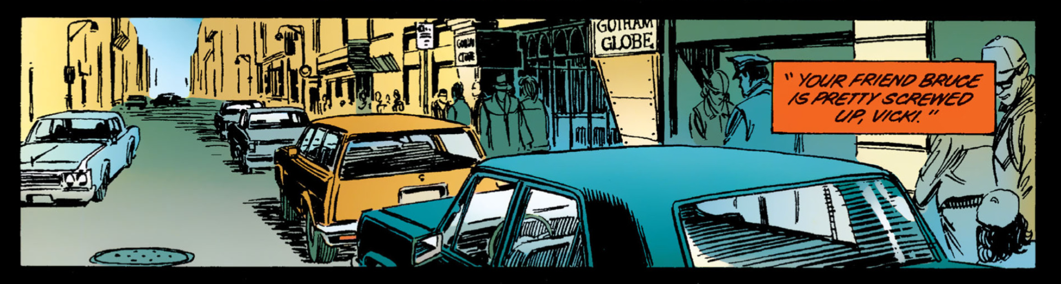 Ladies and gentlemen, presenting to you, Captain Effing Obvious, Mr. Alexander Knox. Kev Ah, good point. It does have that look, doesn't it? It's got that spring morning look about it. It's certainly not "gothic." Dave There has been a lot of exposition over the past few pages, but it is leading us up into the third and final act. Bruce is much more conversive here than he is in the movie, but it keeps the tone of the character. We are treated to more dialogue about his parents' murder. He is far more expressive. Kev He is a lot more open, definitely. Especially around Vicki. It hadn’t really dawned on me before just how mundane a conversation this is between Vicki and Bruce, if you take the Batman element out of it. It really is just two people trying to establish what they each want out of their new relationship, and setting the boundaries needed to move forward within it. Except one of them dresses up at a bat every night and goes out punching other mentally unwell people in the face. Dave The movie set it up like the two of them were really struggling to find their connection with each other, but in this they seem to have a stronger bond, which wouldn't fit in with why they eventually split before 'Batman Returns.' In which you could see why it didn't work out in the long run. Kev Yeh, they don't really address the split in 'Returns' at all, do they? I remember being quite disappointed that Kim Basinger and Vicki Vale didn't come back for the sequel. They had to make space for Selina, I suppose. Dave Keaton's Bruce Wayne and Batman were far more disconnected from Vicki's openness, I guess. Kev Yeh, it's the classic doomed relationship, I suppose. Dave If you look at page 41 they are standing closer, Bruce is touching her on the shoulder, they are talking while walking, whereas in the movie Bruce kind of froze up when confronted with Vicki, he was very rigid. Kev Although, in the movie Bruce replies, "I'd like that" when she asks if they are "...gonna try to love each other," whereas in this, he just says, "He's out there tonight...and I've got to go to work." I prefer, "He's out there right now." For all the reasons I've mentioned before. Dave Those dialogue changes can really shift the scene, eh? Kev Definitely. It's amazing how even changing a single word can make such a difference. Dave And then, the flashback follows on nicely from him looking at the photo album. Kev Yeh, that's a nice little storytelling device. Dave I kind-of like how, on page 40, this whole murder scene is depicted with a drawing of Bruce at the bottom. That's quite well done. As is Bruce showing her his Bat wardrobe. That is an interesting panel as well. You can tell this was done in '89, even millionaires wore polo neck jumpers. Kev Ha, ha! Polo necks do nothing for me. They just make me look like I'm being strangled. Dave Then straight into page 42 with a literal crash, as Batman quickly demolishes Axis Chemicals in 5 panels. it's a very brightly coloured page, which is something I'm really digging about the comic adaptation, are the colours. 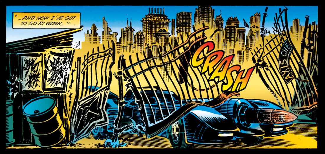 Sex toy, on wheels. Kev Yeh, there’s a fair bit of judicious editing again here, with the Batmobile's destruction of Axis. I suppose, it doesn't really justify much more than a page, in terms of how much it actually advances the story. Kev Still, it's a good representation of the scene by Ordway though. Dave The editing, as you say, is brutal. Dave I do like that bottom panel on page 42, of the Batmobile speeding off as Axis Chemicals explodes. 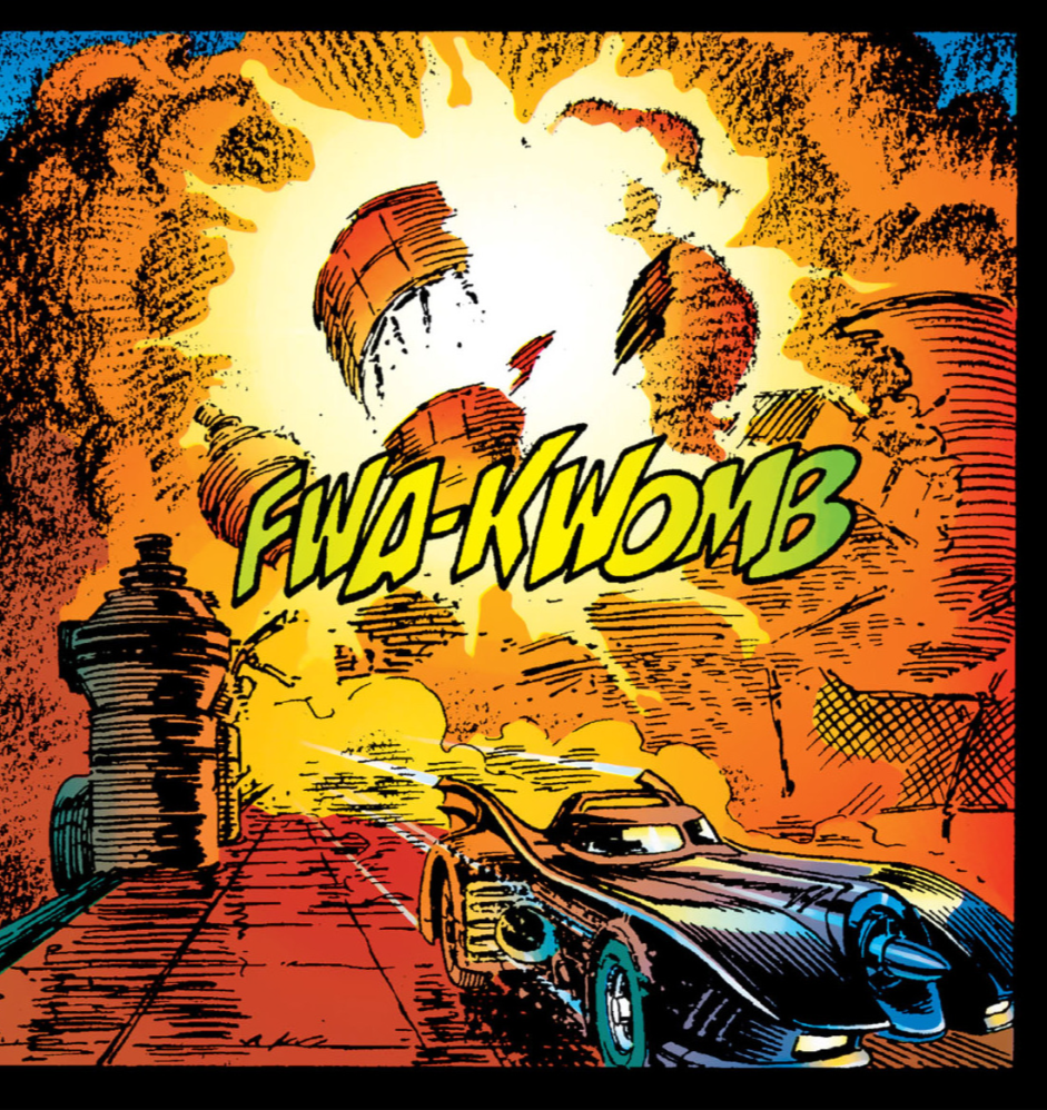 Fwa-Kwomb?!?! Fwa-Kwomb?!?! Kev Yeh, that's a class panel. Dave And so we have reached the end of our part 2, it's certainly had a pace and a half to it, especially when you look at how much was chopped out of it. I feel that more should have been kept in, but it hasn't knocked the story off track at all. It'll be interesting to see how the third act is dealt with, as that is literally around the last half hour of the film, so maybe there will be less cuts on that section. Kev For me, the only problem with keeping more in, would've been the question of the page count. How many pages would it have ended-up, how long would it have taken Ordway and Oliff to draw and colour, and how expensive would it have been to produce, and ultimately, to buy.Yeh, I'm looking forward to seeing how the third act compares, movie to adaptation. Dave As a comic book story, on its own terms, its been of supremely high quality, and has taken on a life of its own. Kev Yep, couldn't agree more. It really is a bit of a classic in its own right. (D) & (K)  He got what he wanted.
0 Comments
|
Back issues
July 2024
|
 RSS Feed