|
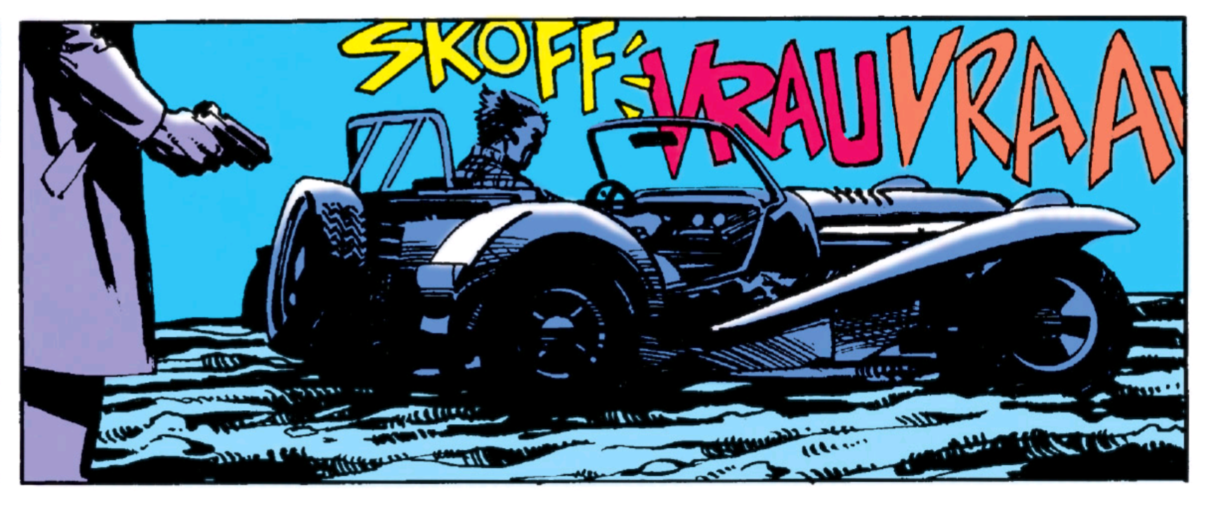
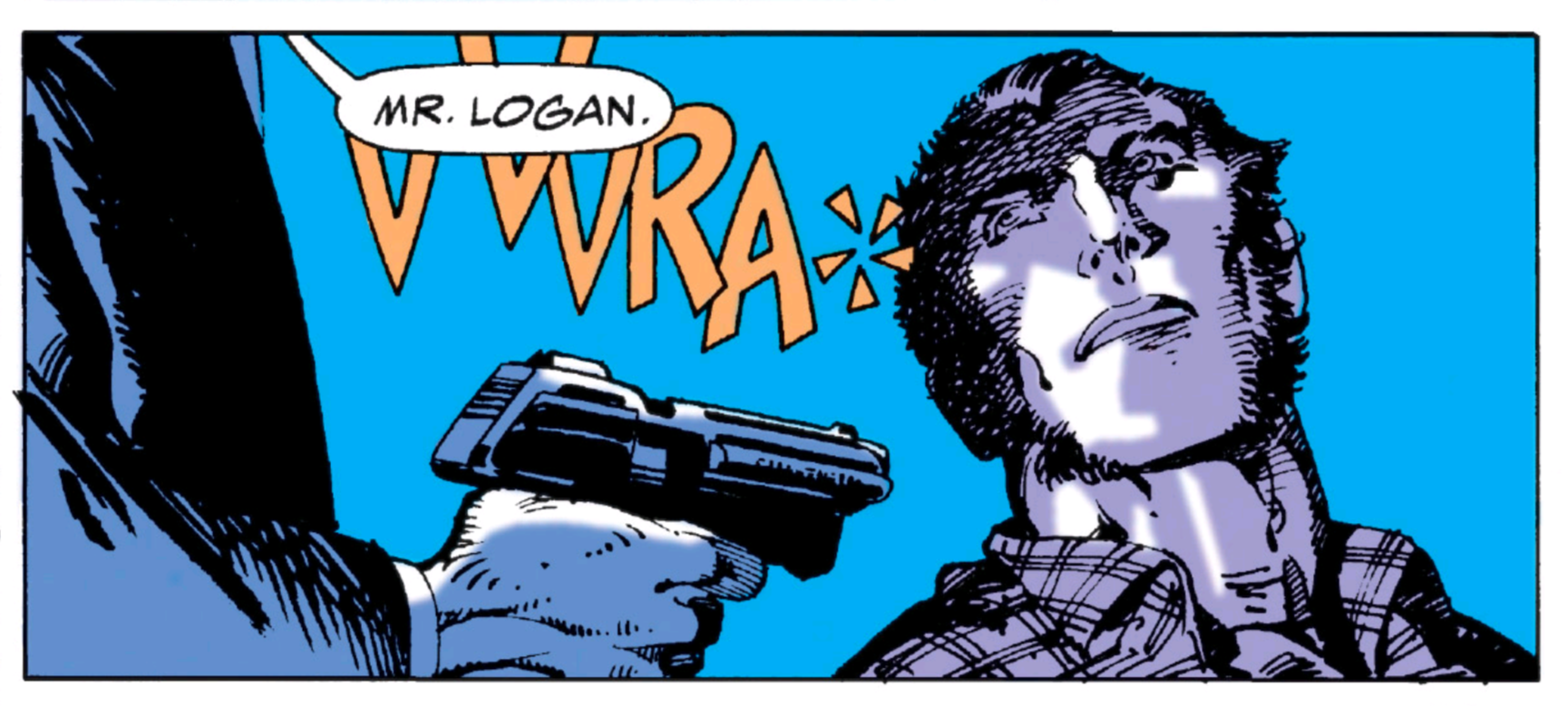
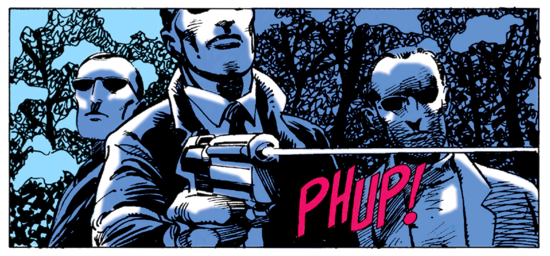
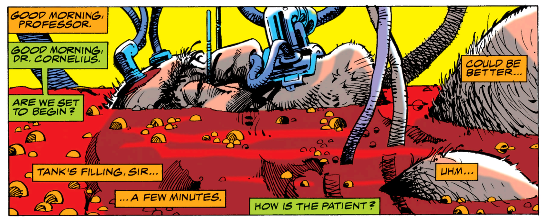
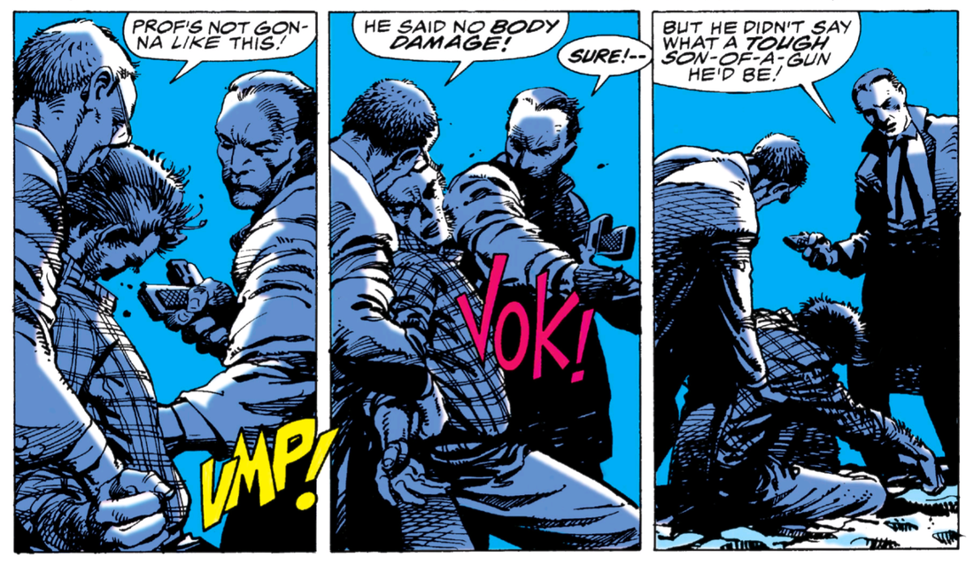
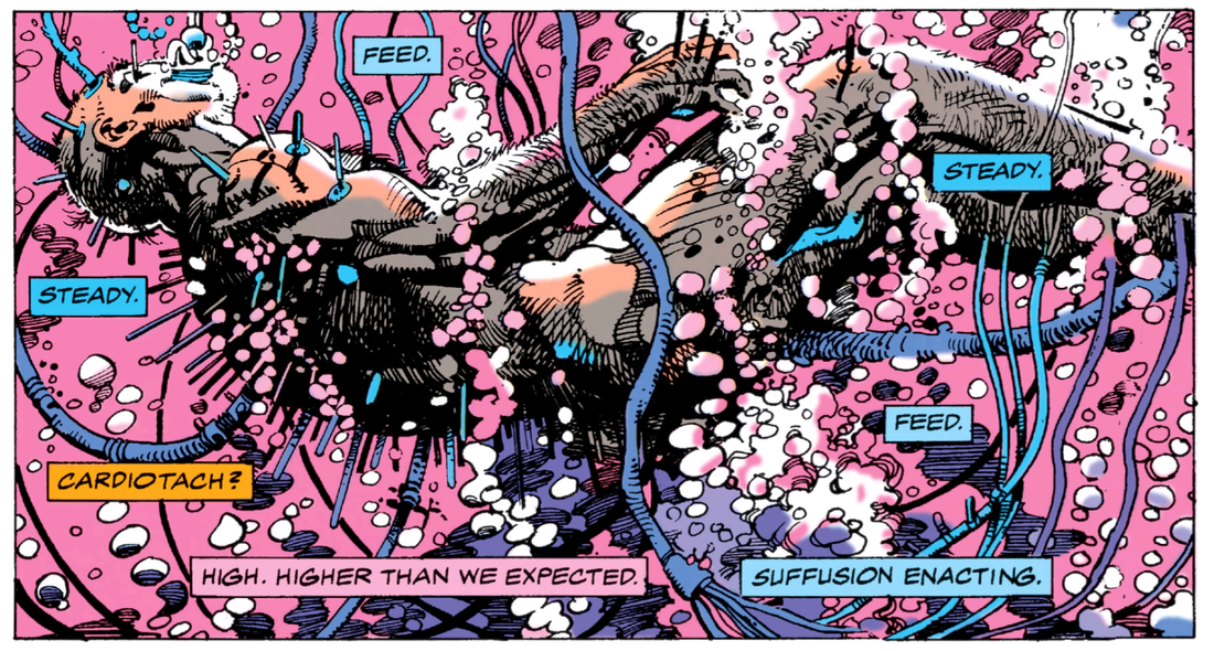
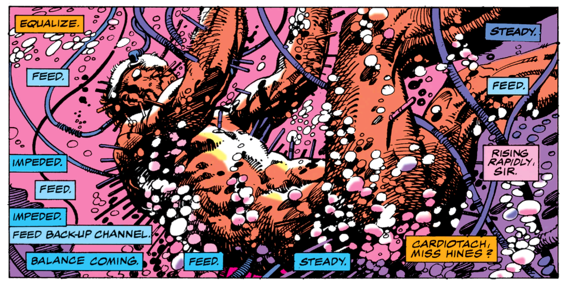
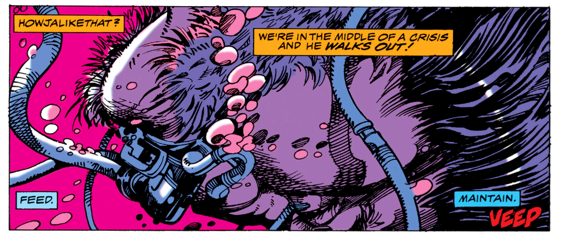
by Dave Scrimgeour and Kevin McCluskey 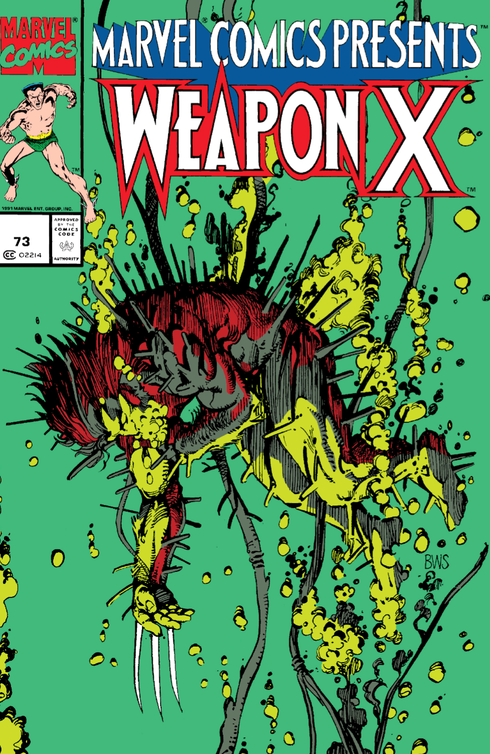 Writer- Barry Windsor-Smith Artist- Barry Windsor-Smith Letterers- Jim Novak & Barry Windsor-Smith Editor- Terry Kavanagh synopsisAs the Weapon X program begins to take its effect of Logan's body, his mind flashes back to how he found himself in this predicament. Dave So, Part 2. I like the cover. It has a real gruesome element to it, coupled with the green tone of colour. It really does have a manga feel to it. Seeing as manga was becoming more popular in the west at this stage, it makes sense to darken the mood of this story with the manga look. Kev Yeh man, it's a cracking cover. Dave I always felt that ‘Weapon X’ was heavily influenced, in terms of visuals, by the upsurge of manga and anime. Kev The manga and anime influence hadn't really occurred to me, until you started to mention it, but I think you're spot on. The artwork is nothing if not immensely detailed. I’m loving the pacing and the structure of this. It’s immensely satisfying the way the story is unfolding and I think the eight page format has a lot to do with this. Dave There is a noirish feel to the first three panels, as Logan walks to his car and is confronted with a gun. The colouring is great, using the grey, coupled with other colours, and the back and forth of mid-experiment and flashbacks works well with the narrative of this issue. Kev Yeah, the dual narrative, putting us in the near future to what we’re currently reading, is extremely effective, and I'm totally with you on the noir-ish feel to the flashback panels of Logan being captured. They remind me of 'A History Of Violence,' or something like that. Dave The dialogue in the panel with Logan in the present moment, submerging into the vat of chemicals is very confusing to follow. Though I reckon that was intentional to add to the chaotic tone of this story. Kev Yeh, I reckon it's deliberate. I think it's excellent. The way the reading order of it flows around Logan’s head, like the spinning, swirling nature of the viscous material he’s submerged in, as well as the confused nature of his drugged and semi-conscious state. Dave I like how the flashback panels on the first couple of pages stick to the darker, more muted colours, which contrast with the present, bright colours. It’s very distinguishable. Kev I love that too. It's a well worn, tried and tested technique for flashbacks, but it is so for a reason, 'cause it just works so well. “I shaved him 20 minutes ago... and he was as smooth as an 8-ball.” Logan is nothing if not hirsute. Dave Yeah, this is a very clever build up to them realising Logan is just no ordinary "human." Kev Totally. The hair, his density and weight, the fact that he's so resistant to the tranquilizer, his toughness and his stamina, it's all adding up to them that he's something more than your average person. Dave Those experiment scenes totally remind me of manga stuff. Kev I wonder if this was in black and white and if I was reading it from right to left, would the manga thing have occurred to me without you having to hold my hand and lead me to the water like "a jittery, glassy-eyed dinosaur?" And still, would I actually drink? It's debatable. Dave I just see a kind-of a gruesome element, with the torture and the experiment and the bright colours, which was in stuff like ‘Akira’ and ‘Fist of the North Star,’ to name but a few. Kev That's very true, actually. The body horror and the viscera of it are reminiscent of 'Akira' and 'Fist Of The North Star,' yeh. Dave The first few pages are very hard hitting. No punches pulled. No pun intended. Logan is really getting put through the mill. Kev Yeh, man. He takes a bit of a hiding. Dave I guess they had to blank out the swearing. Kev Yeh, how do you feel about the old "#!%@!" instead of the swears? Dave I suppose, technically, the comics were still aimed at a wider audience, including kids, and there would have been an uproar if they had kept in the swears, regardless of the content of the story. I still find it vaguely amusing that they bleeped them out in that way. Kev Yeh, it used to bother me a lot more when I was younger. I used to think, why bother blanking it out? Or if you weren't going to print it anyway, why bother even writing it into the script in the first place? But looking at it now, with fresher, allegedly more mature eyes, I think it's the smart move. Dave Yeah, I remember that used to bug us as kids, the blanking out of the swearies. Kev It probably bugged me because I was trying so hard to be "edgy." Dave Logan is certainly a fighter. The dialogue throughout the experiment shows how tough he is. Kev Yeh, the fact that he is resisting the treatment, plus the fact that they realise that the damage he came in with the night before seems to have just disappeared, is an indication of his toughness, alright. All the panels of Logan in the tank are stunning. Dave Totally. The colours are mesmerising. The muted pink and the dark red work so well, and the physical agony Logan is clearly in is very disturbing looking. Kev True, you've got the warm, fleshy colours of the pinks and the blood red, contrasting with the cold blues and concrete grey tones of the flashbacks. Dave Yeah, the contrast to the flashbacks is equally impressive. It’s top notch artwork. Funnily enough, I remember thinking that this was a big, messy looking story as a kid. Shows what I knew back then. No appreciation for the quality of the artwork, and the aesthetics of the colours. Kev Nah, I know what you mean. I was kind-of the same. I remember thinking it looked a bit cluttered back in the day. Which is strange, because I was a bit of a McFarlane mark back then, and his art style was pretty detailed too. Maybe not to the extent that Windsor-Smith's is, to be fair, but still, not a million miles off. I suppose he was maybe just a bit ahead of his time at this point. Dave The first four pages take us to the present very quickly, with the intercutting of Logan being overpowered eventually, and the experimentation process. And it's a pretty brutal experimentation process, at that. Plus, they’re very much dialogue oriented, and it is weighty again. I am realising, like yourself, why this was done as small, eight page chapters. Yet it still has the same weight as a full-size comic story. Kev Totally. It's as dense as Wolverine's post-Weapon process physical make-up. Dave Windsor-Smith has done a good job with the medical terminology. Or just done a good job at being creatively convincing with it. Kev Yeh, you're right. The experiment itself is believable enough, in a sci-fi sort of way. Dave At this stage, I would have to say ‘X-Men Origins: Wolverine’ was obviously influenced by this story. The movie was not very good at all though, and would have benifitted from the dark, horror/noirish feel, brilliantly done here by Windsor-Smith. But again, the mainstream audiences of 2009 wouldn't have accepted it, and certainly the studios would never have given it the greenlight. Maybe a 2022 film audience would appreciate it more now. Kev Couldn't agree with you more, man. All those X-Men movies, but particularly 'Origins,' borrow quite heavily from this in their treatment of Wolverine. I certainly don't think audiences would have accepted this over a decade ago. They'd maybe be a bit more open to it now, but back then, no chance. The way his hair is growing between each panel is a great touch. I love that. Dave The pace of the story is relentless, with us being introduced to the scientists in the second half of this issue, who are all very technical in their jargon. Also, all these images have a dream like quality to them. Kev That's an excellent point, man, it really does have a dream-like, drugged-out, woozy feel to it. And the flashbacks only serve to heighten that feel. Dave Also, the eyes are not visible (even though they are wearing glasses) on The Professor and Cornelius, so as to give a slight mystery to these characters. Kev Yeh, it helps provide them with an air of intrigue, doesn't it? Actually, come to think of it, this has a bit of a David Cronenberg vibe to it, with the mind-bending, body horror stuff as well. Dave Good point. I like the half page panel on page 6 of Professor and Cornelius. It’s highly detailed, with a great mixture of colours used. Also, the Superman reference is quite good on that panel. Kev Ha, ha! Yeh, I liked the little nod to Superman as well. Just thinking about it; I wonder if the lenses in the glasses, and not seeing the eyes, is a way of depersonalising and dehumanising the Professor and Cornelius. Y'know, if "the eyes are the windows to the soul" and all that, them not having eyes that are visible, makes them seem soulless to us, the reader. Certainly their treatment of Logan would suggest that they were lacking something in that department. Dave Yep, another intentional ploy to make them government drones. Just numbers themselves, serving a higher purpose. Completely instutionalised. Kev Yeh, Ms. Hines seems to be the only one there who has any suggestion of humanity about her. Dave She looks like the newest of them. Maybe she's still not been brainwashed yet. Kev That's a good point. She's maybe just not been indoctrinated quite yet. Dave That’s a great panel on page 6, of Logan submerged, with more technical jargon being flung around by his captors. The red is so eye-catching. Logan looks totally buffed up there. 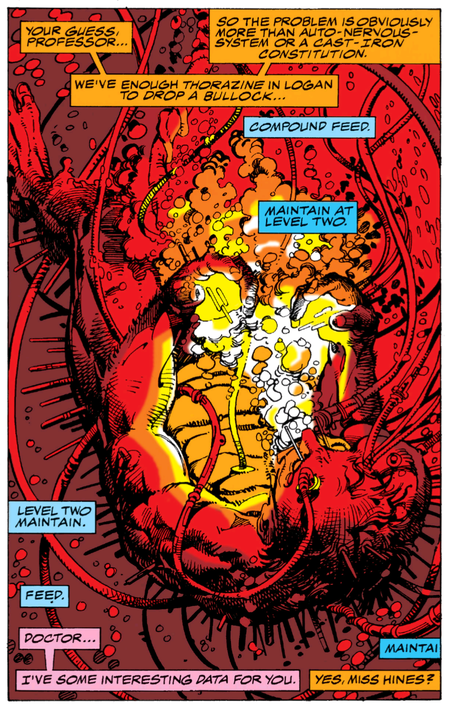 Moaning Myrtle told Logan to open the Golden Egg under the water. Moaning Myrtle told Logan to open the Golden Egg under the water. Kev He really does, yeh. Windsor-Smith's use of light is amazing here too. Dave It isn't until the second last page that we finally get a glimpse of Cornelius’ eyes, and what he actually looks like. Yet the Professor's eyes are still hidden. In the second panel on that page the Professor has an almost villainous look to him. Kev That's true. We get to see a little bit of humanity creep into Cornelius towards the end of this chapter here. Unlike the Professor, who just bails as soon as it all starts to go south. Dave Then they really start to realise that there is far more to this Logan character than they thought, when talking about how his wounds and injuries have healed. Kev Yeh, they're starting to understand that this may not end well for them. Dave Yep, and in that scene of the introduction of the adamantium, as The Professor ditches them, the red background is a brilliant, blood red, which is very fitting for the tone of this issue. I also like that panel of The Professor talking to Hines, where his face is shadowed-out a bit, but his glasses are highlighted strongly. I kind of see a bald Lee Van Cleef as The Professor here. Kev That would’ve been a good bit of fantasy casting there, with Lee Van Cleef, man. Yeh, that panel really does give him a bit of an evil scientist look. Again, it's kind-of dehumanising him. Dave Oh, I forgot to mention the Marvel logo on the cover, it is the Sub-Mariner, isn't it? I like how each issue is a different character. Kev Yeh, it's Namor for this issue. Dave So, how would you sum up this issue? Kev Man, I really like this part. It sets-up the rest of the story really nicely. I feel like it's unfurling, and it ends on a couple of great plot points, with the introduction of the adamantium, and The Professor walking out. It's almost like a cliffhanger. Dave Yeah, it is a cracking, self-contained issue. It still has plenty in it, and it is nicely carrying the story along without any dullness in it. The 8 page format is a great idea. I just wonder if it went through a few longer drafts. Kev It's a great format, and it suits this story down to the ground. It feels like a graphic novel that they're publishing in a serialised form. Which, I suppose is exactly what it is. So just like any modern comic, in this made-for-the-trade era. Ha, ha! Dave Good point there, it has all the elements of a graphic novel. (D) & (K) Next: Chapter 2.
0 Comments
|
Back issues
July 2024
|



 RSS Feed