|
by Dave Scrimgeour & Kevin McCluskey  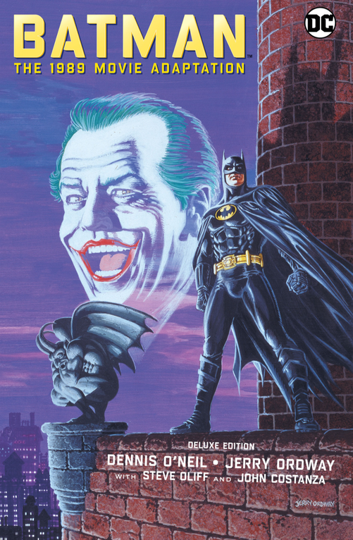 Written by Dennis O'Neil Illustrated by Jerry Ordway Coloured by Steve Oliff Lettered by John Costanza SynopsisThere's a "six foot bat in Gotham City," and Jack Napier is about to find out what happens when you "rub another man's rhubarb." Vicki Vale finds herself caught in this Bermuda love Triangle. Lucky woman. Dave Back to the summer of '89 again, this time it's the movie adaptation of favourite Batman movie of the 80's. In keeping with our Green Lantern theme, we have Denny O'Neil back on the writing credits as well. Kev Yep, we’ve been covering quite a lot of Mr. O’Neil’s work of late and, I suppose, if you wanted to put your adaptation of the biggest thing of the year in a safe, reliable, pair of hands, Denny O’Neil is your man. Dave Yeah, it's a nice tie-in to our Ben-Day Dots run this year. Do you remember when this originally came out? Was it before the cinema release? Kev Yeh. According to the back of this edition, it came out around about the time of the VHS release, but I could have sworn it came out at the time of the cinema release. Maybe it's my memory playing tricks on me though. It was nearly 34 years ago, and I am getting on a bit. Dave Interestingly enough, many of these movie novelisations and comic book adaptations at the time were based on a copy of the script, and I wonder if O'Neil had been given a copy of an early draft to work from and, if so, how much of the dialogue had been changed from the early draft version to the finished product. Kev O'Neil is doing a cracking job of the dialogue here, some of which, obviously, has to be dropped simply to fit the spatial limitations of the page, but I too wonder which draft of the script, and which cut of the movie, he and Ordway were working from. Dave The cover is still superb. I remember being stunned by this the first time I saw it on the shelf in RS McColls. Kev Yeh, the cover is outstanding. Jerry Ordway managed to capture the likeness of the cast so well in this. They’re fantastic. RS McColl, where I was probably just starting doing my paper round at this point. Dave And it's been a long time since I read through this, but yeah, obviously there has been some big cutting down in order to tell this story in comic book form. Even when Batman arrives he is on foot, not the silhouette you see in the film, and the changes in dialogue, "You're trespassing, Ratbreath" and "I am the night," not quite as effective as, "I'm Batman." Or as memorable. I wonder if that was an adlib by Keaton, or just a script change. In saying that, it must be a challenge to take something as big as this, script-wise, and be able to condense it down to a set number of pages. Kev Definitely. There's a fifth draft of the screenplay that is readily available online which still has the "I am the night" line, so maybe you're right, it could very well have been a Keaton line. The first page is superb. The film reel, back when the majority of films were still projected on film, is an excellent representation of the opening scene. I love the “...it’s just a movie, for heaven’s sake.” Batman was never just a movie though. It was an "event." And it wasn’t just the movie event of the summer, it was the event of the year. Not just the movie event, THE event. Nothing else even came close in ‘89. It’s difficult to convey that to people who weren’t around for it. Nowadays there’s a big superhero movie every couple of months, so folks have become a bit nonplussed by it all, but back then, this film was everywhere. Dave It was the event of the year. They didn't call it “Batmania” for nothing. Especially in ‘89, cinema was not comic book orientated like nowadays, and there was a broader selection of movies in term of genres to watch. But let's be fair, ‘89 still had its fair share of crap films made as well. I remember there being a movie poster magazine coming out before the movie itself. The excitement and buzz were heightened because there was no internet to promote this, no clips on Youtube, or trailers to download, no videos being made with all the easter eggs in it. Adverts on TV and random clips were our sources, and it was a case of catching them at the right time. Kev That's an excellent point, man. The scarcity of images of, and information about this film, made seeing even the briefest glimpse of it feel like a real find. I remember buying the Fleetway Batman comic purely because it had an image of Keaton in the batsuit on the cover. Dave Also, visually, at the time, it was so impressive. We were still used to the Adam West stuff which, in itself, is actually great, but it wasn't what Batman was, so this darker image, and cool looking costume, contrasted with a colourful Joker, really stood out. Kev I also love the background of the patrons in the movie theatre. Are these the people watching the movie that the family here have just left, or are they watching this Batman movie that we’re now reading the adaptation of? It feels like we’re being drawn into a comic book, through the movie that it’s adapting, back into the actual comic book adaptation itself. Very meta. Dave As a comic book, it's taken on a style of it's own, but it's still sticking to the format of the story. That's a great panel at the top of 4 and 5 of Batman confronting our two hoods. 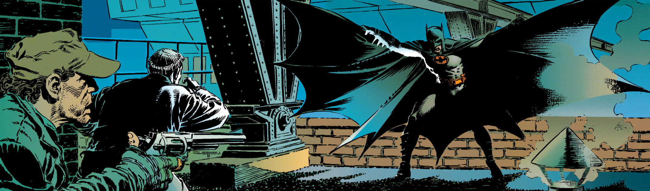 A simple mac is not flashy enough for a billionaire like Bruce Wayne when it comes to the old flashing. Kev It's a cracking panel. Although, Ordway’s reveal of Batman, oddly, isn’t as striking as Burton’s, despite Ordway's Batman having a lot more mobility and dynamism than poor Michael Keaton did in that rubber suit. Dave It's changed the whole action scene, as Batman in this story kicks one of them, then punches the other, and then holds him over the wall. Kev They kept that sweet side thrust kick in there, of course. Dave Cinematically, Burton's was great, and visually a lot darker than the comic panels we're looking at. Kev Yeh, although Steve Oliff’s colours are also managing to capture that Burton-esque, gothic palette, and yet also making it work on the page as a comic book. That is no mean feat. He’s managing to serve many masters here, and do it with style. Kudos to him for that. Excellent work, Sir. And I honestly can’t say enough good things about Ordway, and his ability to capture those likenesses. Jack Nicholson, Robert Wuhl, William Hootkins, they’re all instantly recognisable. Dave The likeness really was something else wasn't it. Kev It's incredible. But still has the motion of a comic. There's still movement in, and more importantly perhaps, between those panels. That style of photo realistic work often ends up looking so static, stilted, and stiff. Like those photo comics that used to make up part of the agony aunt columns in the tabloids back then. Dave Even the chunks of dialogue between Knox and Eckhardt are giving you a sense of the relationship between them, regardless of whether they were in the script at the time. It's important to show how each of the characters relate to each other, and O'Neil and Ordway are doing a sterling job of, again, keeping it faithful to the movie. I love that panel on the bottom of page 7, of Napier and Eckhardt, where Napier tells Eckhardt he should be "...thinking about the future." He really captures the look of Nicholson. 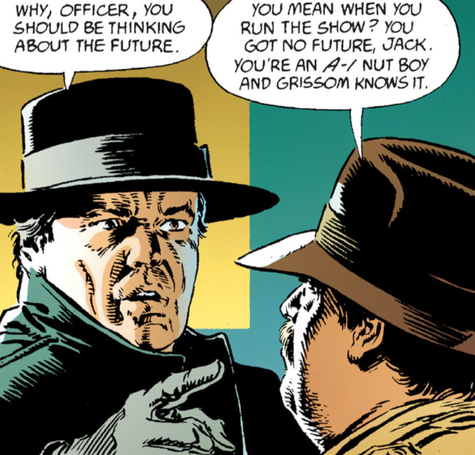 "I've seen the future and it will be, I've seen the future and it works." "I've seen the future and it will be, I've seen the future and it works." Kev Yeh, I think O'Neil does a fantastic job of keeping what is needed, and dropping what is not. Certainly for the main part. It really does almost put you in the movie, doesn't it? I can hear it as I'm reading it. Dave Again, there's a change here when Eckhardt pulls a gun on Napier, there's no sign of Bob, just a casual quip, "Watch the suit." Kev Right enough. No Bob The Goon. Dave And then we get the introduction to Vicki Vale. The dialogue is slightly different. It's probably because we know this movie dialogue inside out. Kev Ha, ha! Yeh, I think you're right. I think that's why we're maybe fixating on these minor changes of dialogue in the screenplay. Dave This adaptation really is just getting to the nitty gritty of each scene though, it looks like. Kev We're using the Deluxe Edition of this that came out in 2019 for the purpose of this retrospective, and looking at it again, I think DC missed a trick by not making this an IDW-style Artist's Edition-style format presentation. Can you imagine Ordway’s pencils reprinted in that oversized format? Especially with these black and white, pencils only pages. That would have been beautiful. Dave True. Even the scene with Grissom and Napier is only covered in a few panels, straight to the point. And Ordway's likeness to Jack Palance is absolutely amazing. Kev Yeh, and I had totally forgotten about Napier’s “luck” with the deck of cards, and how Grissom states that Napier’s “luck is about to change.” Dave The panel on the top of page 10 again is so layered in detail and looks great. 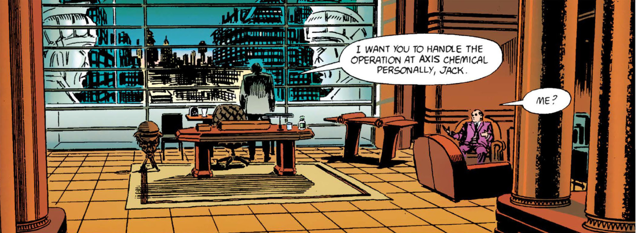 Cracking view from Grissom's office. Not sure about the two statue heads though. Kev Absolutely. The depth of field in it is outstanding. I always liked how Napier is portrayed as being vain. “You look fine.” “Watch the suit.” Considering what is about to happen to him, that’s some nice character work. Dave And, again, the scene in Wayne Manor is condensed, as it very swiftly moves onto the whole, "It's Japanese"...."Because I got it in Japan." It's creating a slight difference to the whole Bruce and Vicki dynamic by not having that moment where she asks him who Bruce Wayne was. Kev Yeh, right enough no, "Are you sure?" Their relationship is slightly different here as a result. Perhaps it was even slightly different in the screenplay too, and it just evolved somewhat by the time it got to the screen. Dave It's so different in terms of dialogue, it has thrown us off a bit, but it still works for the story being told here. After all it is an "adaptation." Kev Oh, yeh. It has to be different. As you mentioned earlier, there's no way you could reproduce the movie, beat for beat, in a comic book, and keep it interesting in any way, shape, or form. So much of it had to be let go, in order to just make it readable. I wonder how many "darlings" O'Neil and Ordway had to kill, just to make this work. Bruce on some 'Batfink' shit, using the cape to deflect Napier’s bullet, rather than the gauntlet. This is not the first time I’ve referenced 'Batfink' recently. The joys of school summer holiday, cartoon repeats. They stick with you. Dave "Your bullets cannot harm me, my wings are like a shield of steel." I always made a point to watch 'Batfink' even when it was on during school term time. Kev Ha, ha! Yeh, me too. Dave The panel on page 16 of Napier saying, "Eckhardt, think about the future!" is good. In fact, the whole page has that Cameron Blue 'Abyss/ T2' look to it. Great colours. Kev Absolutely. With a healthy dose of green in there as well, to represent the illness, the toxicity of Axis Chemical. That panel of Napier’s face exploding due to the deflected bullet is pretty gnarly. I love it. 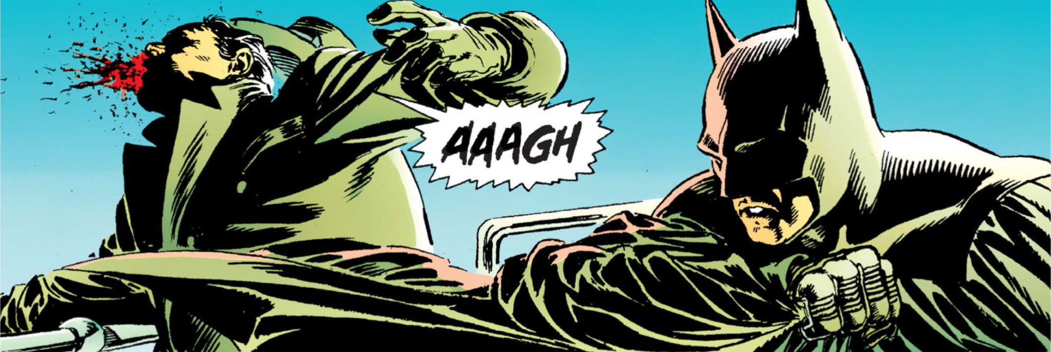 "Your bullets cannot harm me....." Dave Yeah, that colour blend works so well. Pretty much the whole of page has minimal dialogue. Then on page 18, the hand of Napier coming out of the water, with the cards floating next to him, is a lovely touch. 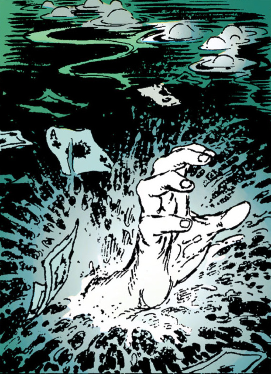 'Mannequin Two: On The Move.' 'Mannequin Two: On The Move.' Kev I would say that this panel here looks better on the page than the shot looked in the film. It always looked like a mannequin's hand, that had been painted white, just being pushed out of the water, in the movie to me. Those colours of Steve Oliff’s, on that Joker reveal, just pop right off the page. They’re outstanding. As you said before, the contrast between the muted colour palette of Batman, and the bright colour palette of The Joker is so eye-catching. Dave It just occurred to me the dialogue has been quite snappy, which is a testament to O'Neil’s writing, because we don't know how much direct access to the script he had, what he used or dropped etc. so he still keeps it going with his own way of writing. And on page 19, the dinner date between Bruce and Vicki is somehow less awkward than the scene in the movie was. And it skipped Alfred being brought in. O'Neil keeps enough dialogue in each panel to drive it in the direction you know the story is going in. Kev It's very skilfully done. There's no doubt about that. Dave The Joker reveal on page 20 is great. It's like Ordway just took a still of Nicholson, because, again, it really resembles him. 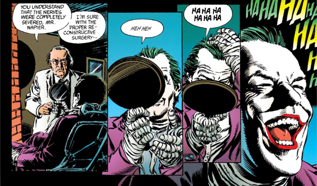 "Mirror. Mirror!" ".....on the wall, who's the fairest of them all?" Which is a misquote, apparently. Who knew?!?! Kev Definitely. There's no mistaking it for anyone else. Dave And on page 21, where he says the "Jack's dead my friend. You can call me Joker!" lines, that's another great resemblance panel. The likeness was a real selling point, and puts this above the bog standard comic book adaptation of a film. I remember there being an 'Indiana Jones and the Last Crusade' movie adaption, which was split into three comic book issues, and it certainly wasn't anywhere near as good as the quality of this 'Batman' one. 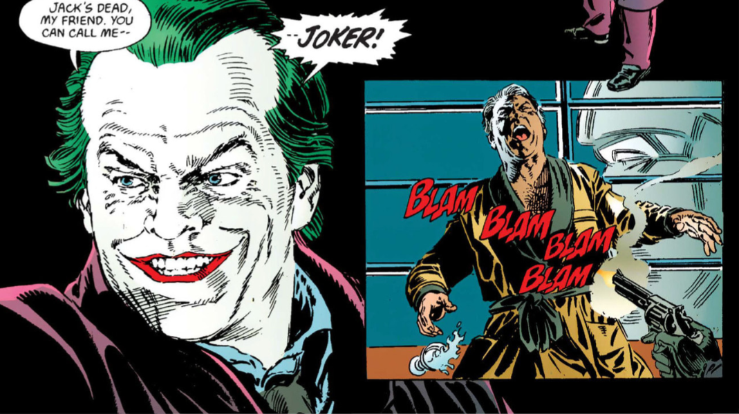 "And as you can see, I'm a lot happier." Kev I remember that one too. I wouldn't mind revisiting that one, actually. Dave On page 22, we see a very determined Vicki Vale going out to find out more about Bruce, much to the disapproval of a jealous Knox. I have noticed, in this adaptation, that we get to see the outside of Axis Chemical, and the Gotham Globe. Little touches that weren't, if I recall correctly, done in the film. O'Neil and Ordway are certainly creating their own look to this adaptation. Kev They certainly stand out a bit more here, than they do on screen. Perhaps, just because we, as the reader, have more control over how long we hold our gaze on a comic book panel, than we do on a frame of film. Kev Would you say that this was one of the best adaptations? Certainly visually? This felt like an event to me when it came out at the time. I mean, everything related to the movie felt like an event, but even this adaptation felt like a big deal in its own right. I remember it being in all the newsagents. Although, I never had a copy back in ‘89. I remember it being a wee bit expensive, all of £1.50, so I passed on it. Something that I regret. In my defence, you could get three or four comics for that price back then. Dave I think that this adaptation was of a higher quality, and I think I bought it when it came out. Kev Yeh, I can't think of many, if any, that were better. Dave Well, the movie was an event. It was our summer hype for sure. I remember the movie novelization coming out before the movie. There was also the audiobook as well, the poster magazine, so for sure there was so much memorabilia. Kev I must've read your copy then. Or maybe Mike's, if he had it too. There really was, wasn't there? Jeez, it was so big that having the bat emblem shaved into your head was fashionable. Dave Certainly for ‘89 it was anyway, but what did you make of rereading this again? Kev It's great. It's still great. I think it still stands up to this day. But, I must say that I’m actually finding this quite difficult to discuss, without just repeating a lot of what I said about the movie when we looked at that. Dave I forgot how different the dialogue in this was when compared to the movie, so this seems quite an interesting reread. I know what you mean as we are essentially comparing this scene by scene to the movie, but it's condensed everything down so much. so we probably should look at the next part just as a comic book issue. Kev You're right, we probably should. It's difficult not to compare though. Dave True, but that's part of it as well, the differences in the comic format and the movie. Kev Yeh, I suppose we were intending on it being a bit of a compare and contrast as well. Dave It's all it really is. (D) & (K) Next: Act 2 (or "Stop the press, who's THAT?")  "Auf Wiedersehen, Pet!"
0 Comments
|
Back issues
July 2024
|
 RSS Feed