|
review by Kevin McCluskey  Writer- André Lima Araújo Artist- André Lima Araújo Colourist- Arisa Rozegar Letterer- Tom Williams Editor- Tom Williams Designer- Andrew Leung Publisher- Titan Comics I can’t remember exactly where, or when, it was that I first became aware of ‘Man Plus’ by André Lima Araújo. It might have been an advertisement in fellow Titan Comics publication ‘Death Sentence: London,’ or it may have been through the listings of forthcoming comics on the Previews website. Either way it made enough of an impression on me to add it to my list of comics for that week. It’s worth pointing out that I’m forever attempting to cut down on the amount I spend on comics per month, so adding another title to the list, even a limited series such as this, is not a decision taken lightly. In these situations, I often defer to my girlfriend, as she is less easily swayed by new titles and has significantly greater impulse buying control than I do. However, in the time it took me to flick through the first few pages of issue one, I’d already made up my mind that this comic was worth taking the £2.85 gamble on. Cut to five weeks later and I’ve just finished the book I’ve been reading on my daily commutes. I have two weeks holiday time coming up and I need something to occupy myself for one more journey to and one more journey from work. This is the sort of situation in which single issue comics are ideal, so I used ‘Man Plus’ #1 to kill the return portion of the trip and was immediately hooked. So much so that I woke early the next morning, a Sunday morning no less, to ensure I could get my hands on the second issue as soon as I could. 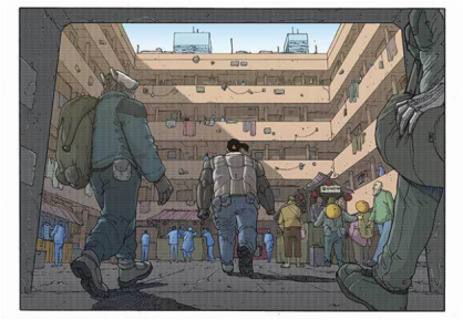 Set in the not-too-distant future of Araújo’s native Portugal, and more specifically the multinational conglomerate created Olissipo City, ‘Man Plus’ opens with an escaped Jiqirin Corporation android on the run, a crack team of cybernetically enhanced, ex-military mercenaries in pursuit of her and an ensuing bloodbath that paints the city’s streets red with the blood of its citizens. In the aftermath, Chief Elsa assembles her Special Operations Force, consisting of Josu, Ana, Lui and their captain, Rodrigo to investigate the incident. However, as the team fall further and further down a rabbit-hole of corporate and political corruption, it soon becomes apparent that the android herself is the only real, tangible lead in the case and thus begins a race against time, and the mercenaries, to track her down and uncover the conspiracy behind her very existence. 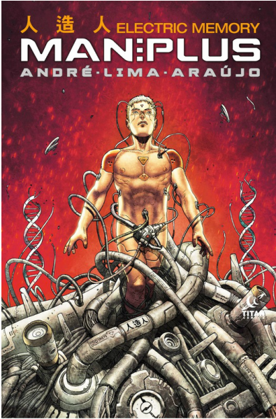 André Lima Araújo immediately immerses you in the world he has created. The cover to the first issue and also the collected edition by himself and Luis Guerro, shown to the left, features what appears to be an android version of Rodrigo, breaking free from, or perhaps struggling to resist, tentacle-like cables that are noticeably branded with the name of the Jiqiren Company, as well as shattering, metallic double-helixes that resemble cobras rearing in the background. Rodrigo is in many ways something of an old-fashioned protagonist, being presented as a throwback to a less technology reliant, digitised and computerised age. He possesses no visible cybernetic upgrades and he smokes, which in itself is something that immediately puts him out of step and at odds with the world around him. The technological elements of the cover image are used by Araújo to represent the interruption and the integration of computers and cybernetics into the very DNA of 'Man Plus's' society and culture. These potentially biotechnological elements are literally surrounding Rodrigo, snaking their way up and around him to strangle what remains of his human nature from him. He is also noticeably connected to the technology on a physical level via multiple interfaces over his body, most tellingly to his temples. Indeed, despite his apparent rejection of technological advances on a biological level, Rodrigo still remains bound in a symbiotic relationship with the technology that literally surrounds him, even within the sanctity of his own home. This is illustrated in the opening sequence of the series as he uses a tablet-like device to control his entire apartment, from his alarm clock that wakes him in the morning, to the blinds which open to reveal the dizzyingly sprawling, futuristic skyline of Olissipo City. This vast, expansive backdrop is then juxtaposed with panels that are tightly focussed on the escaped Jiqiren android, drawing the reader deep into the world and pulling focus on the characters and the conflicts between and within them. The integration of and possible over reliance on technology depicted in both the cover and the opening scene clearly mirrors our society. It has been well documented that science fiction doesn’t so much portray a futuristic world as much as reflect the current one and Araújo certainly plays upon contemporary fears, such as corporate global dominance, the blurring line between people and their machines and the widening gap between the rich and poor in our world. Yet despite the weight of some of the themes of the story, Araújo manages to inject some levity into the proceedings with smart dialogue that is snappily written yet possesses just enough of a hard-boiled, noiresque edge so as not to feel out of place within the world he has created. A common criticism of modern comics is the extent to which decompression is employed within their storytelling, but Araújo sets and maintains a pace that pushes a plot which crescendos in all-out mayhem in the third chapter. It's a particularly frenetic set piece that leaves the reader stunned, a triumph in shock and awe storytelling tactics. Araújo keeps the overall story arc progressing nicely, whilst always building towards a naturally occurring cliffhanger at the end of each issue. However, this doesn't have an adverse effect on the book as a whole, and whilst the series does, by the very nature of monthly comics, feel suitably episodic, it does not result in a jolting reading experience of the series as a singular piece of work. The pace does slow somewhat in the final chapter as the characters contend with the fall-out of the main plot and subsequently the forth issue does feel more reflective and contemplative, an epilogue of sorts, but it also opens Araújo's world to new storyline prospects. 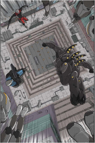 His artwork that brings his characters and the world they inhabit to life is, simply put, gorgeous. It’s clean, crisp and uncluttered, yet amazingly detailed. His depictions of facial expressions pull incredibly subtle and emotive performances from his superbly designed characters and his architectural renderings are nothing short of stunning. The latter is something that should come as no surprise however, considering his background in architecture. The skyscrapers and the cityscapes he constructs are virtually vertigo inducing in their scale and claustrophobic in their density. During scenes of action, his panels often become divergent in shape which suggesting a kinetic thrust of momentum and movement from an off-camera source. A huge amount of this energy can also be attributed to colourist Arsia Rozegar. His pallet is as clean as Araújo’s pencils, which helps give the finished product a vibrancy that at times leans towards minimalism. There is a particular sequence in the third issue of the collection, the drop-zone scene, where Rozegar himself said he “intentionally blurred the background to demonstrate the velocity and the depth of the height.” See the panel directly to the right for the illustration he was referring to. This technique also serves to pull focus onto the Special Ops team as they plummet to the earth, before they and the mercenaries turn the square into a war zone in their mutual attempts to apprehend the android. Araújo has stated that he originally intended to present the series in black and white, and whilst this would have allowed his pencils and inks to come to the forefront, as well as paying further homage to influences such as Otomo's 'Akira, the loss of what Rozegar has contributed would most definitely have been felt and, in my opinion at least, dearly missed. Growing up, as I did, reading Marvel UK comics in the 80s, I have a certain nostalgic appreciation for the design of ‘Man Plus.' This is something that Titan Comics seem to place great deal of stock in and I suspect much of this may be due to the influence of Senior Editor, Steve White. In the hands of Araújo and designer Rob Farmer, Araújo providing the extra content and Farmer's presentation of it, these additional elements become so much more than shallow, disposable, eye candy. From the quotes on humankind’s relationship with machines that precede each part of the story itself, carefully pulled from Araújo's research, that accentuate the themes he is exploring, through the character profiles on each of his main characters, that help give additional background information to both the protagonists and the antagonists, to the excerpts from the article detailing the creation and continued rise of the city itself, which instills a sense of history to the Jiqiren financed metropolis, these additional magazine journalism style extras all aid in investing the reader in Olissipo City itself and Araújo's wider world. 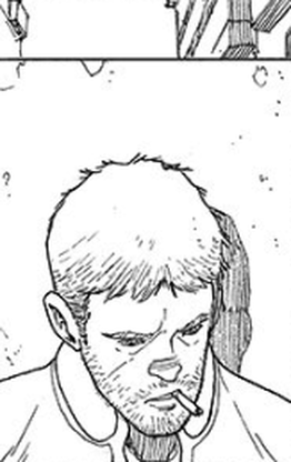 If I have anything negative to say about 'Man Plus,' and I have to confess that this almost feels like nit-picking, it is that it could be argued that none of its themes, settings, plots or characters are particularly original. All of the ideas contained within the series have featured, or have been covered in, many other, earlier works. However, in Araújo's defence, I believe that this is a carefully considered choice on his part. He has stated in interviews that many of the themes explored within 'Man Plus' were inspired by the research he carried out for his masters thesis in architecture, not necessarily by other works of fiction and it was not his intention to simply mimic them. In fact, many of the articles and quotes that enrich the comic as an overall reading experience are derived directly from the research he did for his thesis. This is also the case for the very title of the series itself, as 'Man Plus' is a term coined by John McHale in his work 'The Future of the Future.' Despite, or maybe because of this, he seems completely at ease working within the conventions, and using the tropes, of the multiple genres he has utilised to construct 'Man Plus.' Perhaps the fact that he made a conscious effect not to imitate other works within the genre, or rather genres he is working within is precisely what gave him the freedom to explore the tropes inherent within them with such love and care, because he did not feel bound by, or to them. Indeed, one of the aspects of this comic that makes it so enjoyable to read is the sense of how lovingly it has been created and how open and transparent Araújo feels as its creator. As a result, 'Man Plus' wears its heart and its influences on its sleeve and in doing so evokes classic works such as those by Isaac Asimov, Philip K. Dick and William Gibson. Imagine graphic novel adaptations of Ridley Scott’s ‘Blade Runner,’ Alex Proyas’s ‘I, Robot’ or Kathryn Bigelow’s ‘Strange Days’ illustrated by John Romita JR, Frank Quitely or John Burnham and you get a pretty good idea of the flavour of 'Man Plus.' Then of course, there’s Katsuhiro Otomo's ‘Akira’ and even more prominently, Masamune Shirow's ‘Ghost in the Shell.’ These influences in particular loom large over and appear to be woven into the very fabric of 'Man Plus's' DNA. From loving homages to entire scenes such as the opening of 'Ghost in the Shell,' to which the opening of this series is clearly influenced by, to the jacket that Rodrigo wears being a nod to Keneda's jacket from 'Akira.' By the time he gets to the fourth chapter in 'Man Plus,' Araújo is name-checking Shirow on one of the covers, by having his name present on the floor tiles behind the android, as well as including two unashamed visual references to him and his most famous work within the issue itself, which appear in signs on the wall of the police station office. Combining elements of classic science fiction, cyberpunk and a little body horror, with a modern police procedural family dynamic, a la CSI or NCIS, as well as just enough noir-esque hard-boiled dialogue to give the book a street-smart edge, 'Man Plus' is an thoroughly enjoyable, yet also incredibly thought provoking mash-up of genres and themes. For me, it's been a perfect example of serendipity, where you find the right comic in the right place at the right time. Or perhaps it finds you. At the conclusion of this story arc, rather than employing the closing pages of the book to tie-up any loose plot threads, Araújo instead uses them to open up the world he has created, suggesting that his world has much more to offer and as a result of this, I'd be more than happy to pay £2.85 again for another ticket to Olissipo City. (K)
0 Comments
|
Back issues
July 2024
|

 RSS Feed