|
by Dave Scrimgeour and Kevin McCluskey 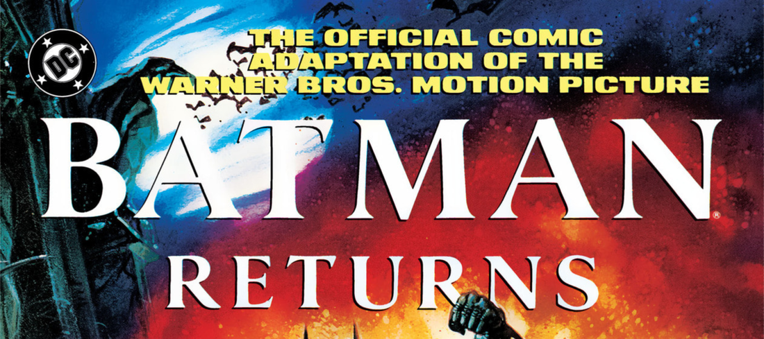  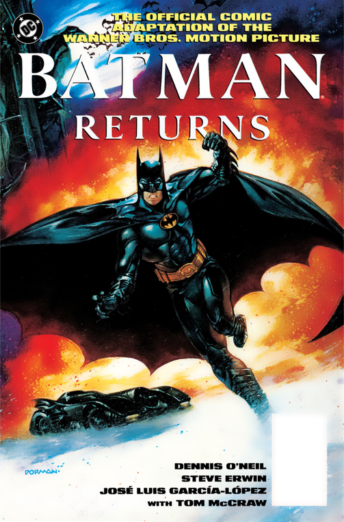 Writer- Denny O'Neil Penciller- Steve Erwin Inker- Jose Luis Garcia-Lopez Colorist- Tom McCraw Letterer- John Costanza Cover painting- Dave Dorman Assistant Editor- Scott Peterson Editor- Jonathan Peterson Batman created by Bob Kane SynopsisTucker and Esther Cobblepot discard their feral infant son in a Moses basket down a freezing river under the cover of the cold winter night, where he is rescued from certain death by a kindly group of penguins. Many years later, tycoon Max Shreck flexes his financial clout in an attempt to attain more political influence and drain the city of energy, but an attack by the Red Triangle Gang, albeit thwarted by a returning Batman, results in past and present colliding, when the now grown Cobblepot son strongarms Shreck into facilitating his ascension from the sewers to the bright lights of Gotham's glitterati. Meanwhile, Shreck's dull secretary, Selina Kyle, stumbles upon his nefarious plans for the city's power, which results in Shreck throwing her through a window, only for her to be revived by her loving feline friends, and ultimately her adopting their namesake. Hear her roar. Dave So, we're jumping back to 1992, for the second "Summer of the Bat," when, Batman Returned. Kev We are indeed. Did you get this one, back in ‘92? Dave It kind-of seemed familiar, so I may have. Or either you or Mike bought it and I read it. Or I suspect I probably just read through it in the shops. Kev Ha, ha! The cover for the prestige edition that I’ve got is by Dave Dorman, and being honest, I think I prefer the image on the back of the cover to the image on the front. It’s certainly not as iconic as Jerry Ordway’s for the first one, which, without revealing too much of my hand too early, is not only an issue for this adaptation, but also the movie itself. In that they can't help but be compared to their predecessors. Dave The cover does lend itself to looking more comic book-like, by not going for the life-like look that the first one did. I can't say I’m sold on it either. It could have been a cover for any random Batman issue. Kev They're definitely not leaning into the photo-realism as much in this one, are they? Dave No. It's interesting how those first two pages compress The Penguin's origin down so much, and there's absolutely no dialogue. Saying that, the movie had no dialogue in the opening. Or minimum screams anyway, and saying "Merry Christmas" to passers-by, before they do their midnight fly-tipping run. Kev Ha, ha! Yeh, I think it’s a fantastic adaptation of the opening scene of the movie though. Stellar stuff by Denny O’Neil, Steve Erwin, Jose Luis Garcia-Lopez and Tom McCraw. Dave I do like the colours on the first two pages. Kev Yeah, man. McCraw's blues sure are cold and wintery. Dave They match the ice-cold tone that the story is telling. 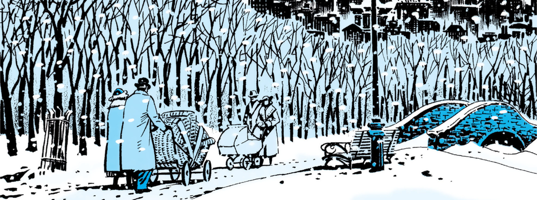 Walking in a winter Gothamland Kev They certainly do. Erwin’s art, like Doran’s on the cover, is not as memorable as Ordway's. Not that it’s the be-all and end-all of art, but it really doesn’t have that same level of photo-realism as Ordway’s, and as such, it feels more like a separate entity to the movie. It doesn’t evoke the movie as much, and, as you’ve said already, it feels more comic booky. Dave It's interesting that, as we jump to the present, there is no mention of how many years later the main story takes place, unlike the film where it clearly states that it is, in fact, “33 years later.” Kev Ah, true. We just get a "Present day" here, don't we? Dave Yep. The colours in the first scene in Shreck's office are quite interesting. Tom McCraw makes it brighter, even the characters' outfits are more colourful. For example, Selina Kyle doesn't look so downtrodden. She's wearing nice, bright colours, and even the Mayor has quite a bright blue suit. There is less of an oddness to how the characters look, in comparison to Burton's look to them in the film. Kev That's a really good point, man. They've toned down the Burtonisms in this adaptation a bit, and upped the brightness on the colour palette. Dave The characters are looking more normalised in this. I wonder if that was a conscious choice, or they didn't want to go for the life-like approach. It definitely seems more comic book-like here. Even on the next page, the panel with the Gotham square, those bright blue and red colours are randomly added in amongst the grey spectators standing there looking at the tree. 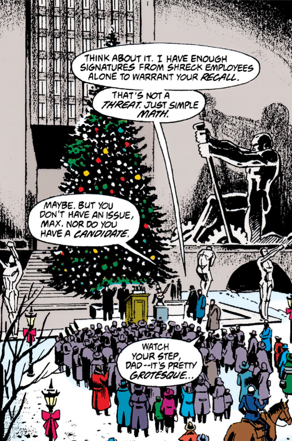 The crowds in Gotham are always pretty small in these movies. The crowds in Gotham are always pretty small in these movies. Kev Yeh, those reds in particular really pop off the page, eh? The pace of this is absolutely breakneck though, it’s positively motion sickness inducing. Dave True it feels like you can't pause for breath when reading this. Most of the story so far has been so condensed from the movie format. Kev It's really condensed, yeh. The script is really funny though, and I can absolutely hear that trademark Christopher Walken’s cadence as I’m reading the Max Shreck lines. Dave Even the Max Shrek look here is far less wacky looking than Walken's look in the movie. Though I suspect the creative input of Tim Burton was allowed to be taken too far with the oddness of it. It works for the movie though. Kev True. It's certainly much less of a Burton freak show, that's for sure. Dave Yep, Burton went to town with the whole freaks and outcast storyline. I feel that this scene, with The Penguin's hoods attacking, has just abruptly happened. Kev Pretty much everything so far in this adaptation, has just abruptly happened. We also get another example of movie Batmen flat-out murdering fools, as he incinerates that fire breather with the turbo jet of the Batmobie. Killing for the sake of a cheap laugh. Sounds like someone else in the Bat universe. Dave Batman's just gone full Mad Max on those pages. Kev Ha, ha! True. Dave I'm actually starting to like the brightness of these colours in this adaptation, it's set a tone for itself. Kev I agree. I wonder if not being so concerned with the photo-realism, has freed it from the confines of attempting to ape the movie exactly, and has allowed it to stand on its own two, webbed, feet, so to speak. Dave Could be. That's a good panel of Batman with Selina, when she exclaims, "Wow. The Batman." It's quite striking. Selina's flashing a bit of leg in that one as well. She doesn't really come across as of a a bumbling wreck on the next panel as she does in the movie. And notice the look in her eyes as she gazes into his. On the next panel, Batman has forgot to put his eye shadow on too. Haha! I like those two close up panels as well, they create a different mood to that interaction. 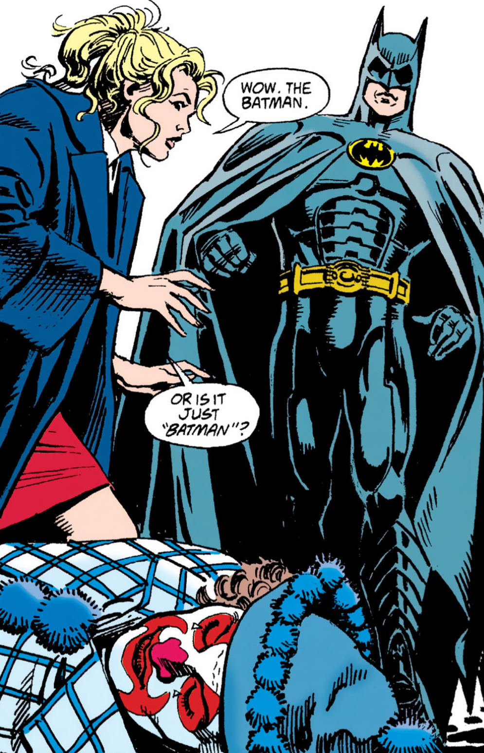 It's The Batman again these days. It's The Batman again these days. Kev Ha, ha! Yeh, he's forgotten to apply his make-up there. That bit with the grappling hook and the plaster to the back of the Red Triangle guy’s head is still really cool though. Dave Yeah, that's a cool bit indeed. Kev It’s funny how the Batman movies always seem to slide back to a more humorous tone akin to the 1960’s TV show. Even 'The Dark Knight Rises' did it, admittedly to a much lesser extent, but there were certainly echoes of it in there. The getting rid of the bomb scene, for example. I wonder if Matt Reeves’ 'The Batman' series of films will follow the same pattern. It certainly doesn’t seem like they will, so far. They are very serious. Some might say humourless, or even joyless. Dave I tell you what, this adaptation is good at the close up panels. In that bottom panel of the page, where Penguin and Shreck are talking and Shreck asks, "Exactly why am I gonna help you," the artwork and colours are really good. They create some good interactions and good images. Kev I totally agree. Erwin's storytelling is excellent. I know it sounds like I’m being a bit down on the art, but I still think it's pretty damn good. Plus, I think Erwin might be somewhat handcuffed by just how much he’s having to cram into each page, in order to keep this, frankly insane, pace that O’Neil’s adaptation of Daniel Waters’ screenplay has set. Dave I think having those sort of panels allows you to stop and focus on them just a bit. It kind-of breaks up the rapid sequences of events that this adaptation is literally throwing at you. That's the power of good artwork, even a single panel can hold your focus while you examine it. Kev Yeh, it really gives you a beat to breathe, and to take in the story. Dave Another panel I like is the one of Gotham Plaza from an aerial point of view. Again, with the use of that red flung in to brighten it up. It's a panel with some really good attention to detail. 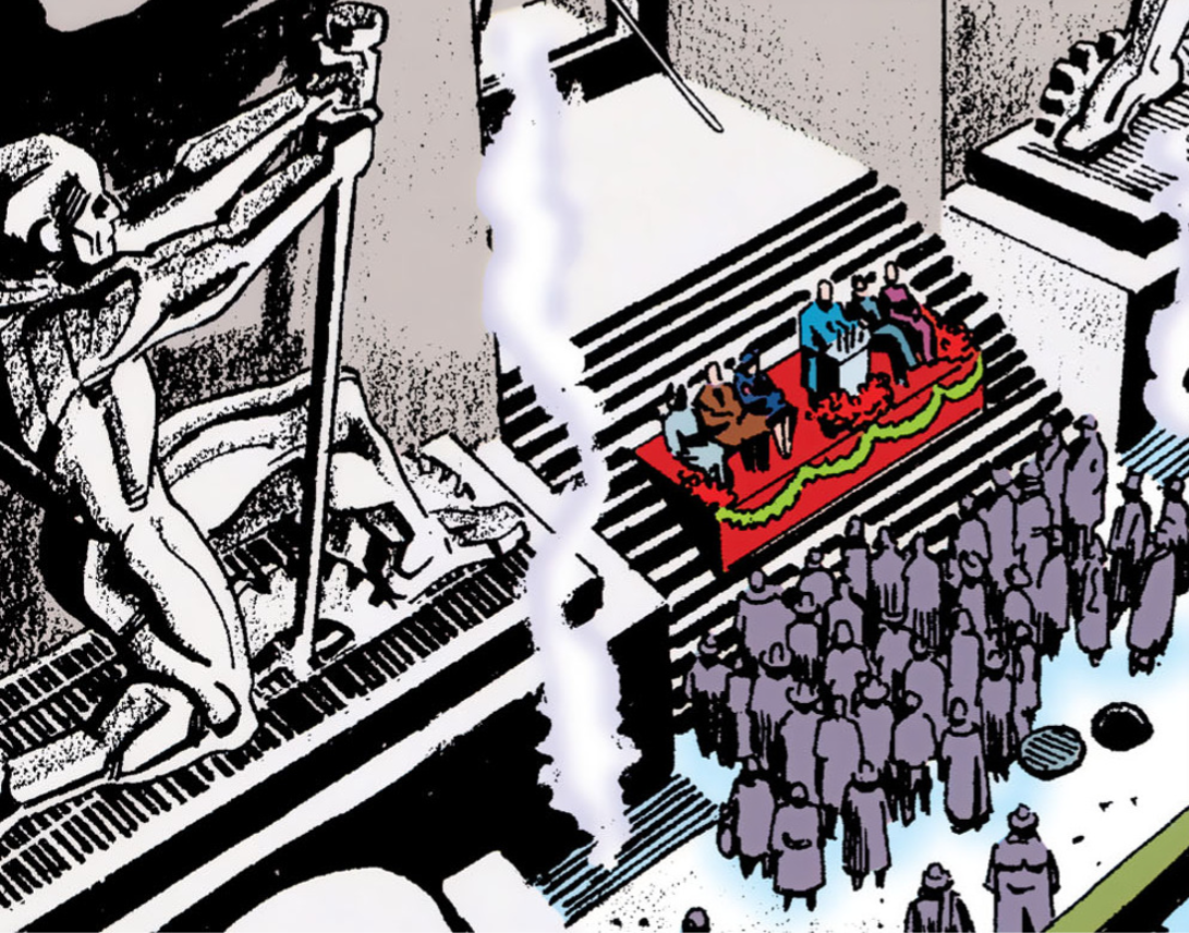 See what I mean. Poor turn-out. These press conferences couldn't draw a bath. Kev Yeh, those reds contrast with the blues so well. I always liked that line, “His parents… I hope he finds them,” AND Keaton’s delivery of it in the movie. I suppose having actors as good as Keaton doesn’t exactly hurt in those instances. Dave And that panel, of The Penguin in the hall of records, after Shreck says "Yes, he's a friend," is really good and detailed. 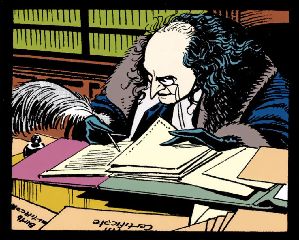 "The pen, is truly mightier than the sword." Shit, that was the last one, wan't it? Kev I love that panel too. And the one of Batman's head, a few panels later. Dave Is that the panel where he says, "Funny you should say that." Kev That's the one, yeh. Dave That is a Keaton-esque pose/pout panel. Kev It does have a bit of the Keaton pout about it, yes. 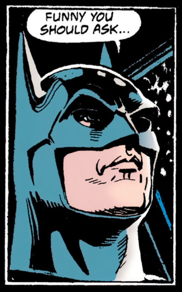 A kiss from the pouty lips on the grey mistletoe. A kiss from the pouty lips on the grey mistletoe. Dave If the story wasn't so condensed, and so chaotic, it would be easier to notice those standout panels at first glance. Kev It's a lot to take in, isn't it? Dave A hell of a lot. An assault on the senses nearly. The roller coaster of comic book adaptations. Kev This one is certainly a roller coaster, indeed. Page 15 also suffers from the manic pacing, as this scene where Max Shreck attempts to kill Selina loses some of the dark humour, and the tension, due to being compressed to the extent that it is. Maybe a few more panels, to give us a few more beats, would’ve addressed that issue. Dave Yeah, that scene with Shreck and Selina is way too quick. That's definitely been a common thread with this. It's written almost as if we know what is going to happen, as in like the creative team expect us to have already seen the movie. It's not written primarily as it's own story, with the necessary build up. Kev That's a good point. Almost like you'd read this as a reminder of the movie, between it's cinema and home video releases. I feel like I’m harping on about it, but the pacing of this is just insane. It’s so busy. Page 17 has twelve panels on it, and a fair amount of dialogue to boot. Dave It's kind-of doing its own thing, with the normalised artwork and colours, but then it's also seriously hindered by this breakneck pace. Kev I have to admit, I’d forgotten just how much Chip was in cahoots with Max. I remembered him as just a bit of a lunkheaded doofus. Dave Chip seems like less of a dip-shit in this version. Kev Ha, ha! He does, yeh. I love this interaction between Bruce Wayne and Max Shreck over pages 17 and 18. It’s really well written and acted, and it’s well rendered here too. The verbal jousting between the two of them is absolutely spot-on. I love Shrek’s line of, “.....Mayors come and go. And heirs tire easily.” Dave The Wayne/Shrek stuff is good. Again, it slows down to a normal pace. That's another visually good panel of Selina surrounded by the cats, but her going mad happens too quickly as well. 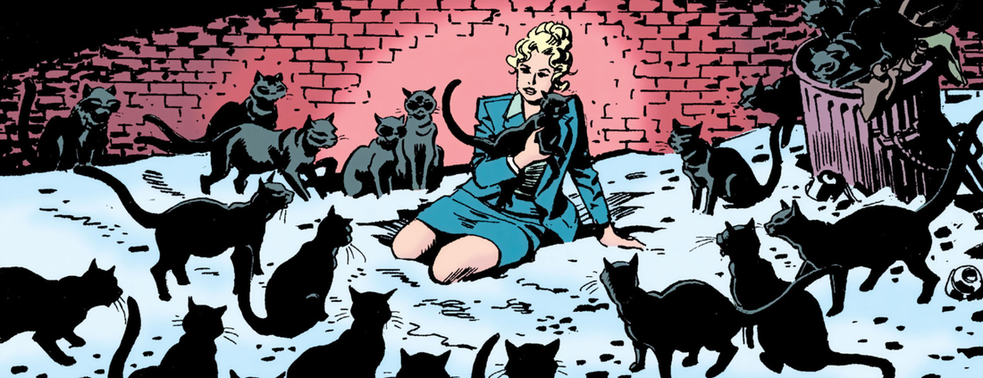 "You've got a lot of cats." I feel like I've used that quote before. Black cat deja vu in 'The Matrix.' Kev The pacing really is an issue, isn't it? When it slows down, even for a panel or two, it's a much more enjoyable reading experience. It feels like ten pounds of story crammed into a five pound bag. I also love the “I mistook me for somebody else” line. That's pretty clever. Dave I like those two panels on page 18, the close-ups of Bruce, then Shrek talking in his office. Again, these are noticeable and expressive. I have noticed the close-up of the faces are very expressive, and that is really interesting to see, and in that regard it is creating it's own look, which works on those panels. 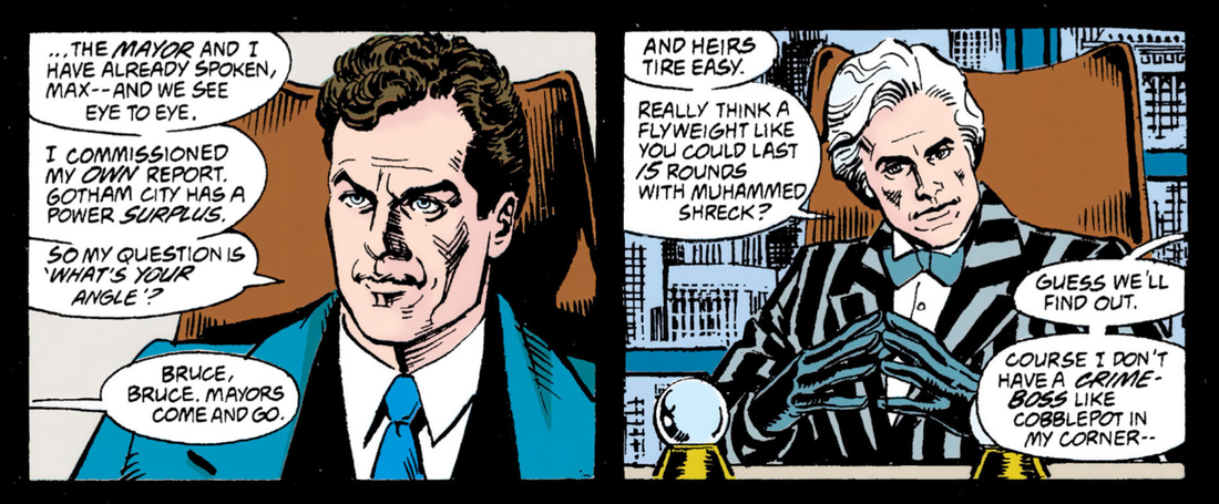 Shreck clearly wants this to be a catchweight bout. Kev Yeh, the last two panels on the previous page are fantastic as well. They're an excellent mirror of each other. Shrek's suit and gloves look great too. 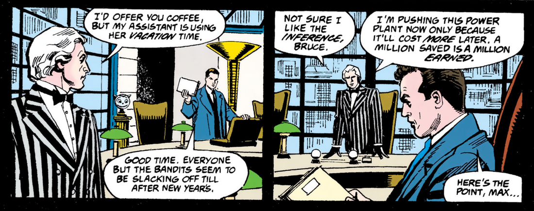 Is that not an implication, rather than an inference, Max? Dave It's a good mix of colours, and a great visual, I have to say. Had they paced this story out more, this would have been a really good adaptation. Even those four bottom panels of Bruce and Selina are great. Steve Erwin and Jose Luis Garcia Lopez are really good at doing those close up panels. I see a little hint of Pfeiifer where Selina does the head-tilt while talking to Bruce. She is way more flirtatious in this story. 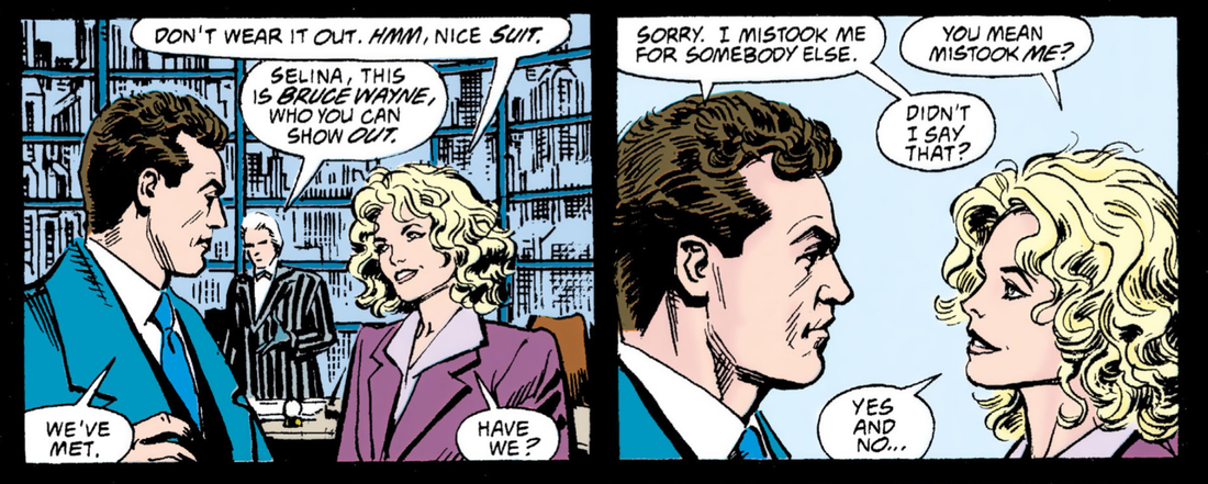 That bump on the head must've effected Selina if she thinks Bruce's suit is nicer than Max's. 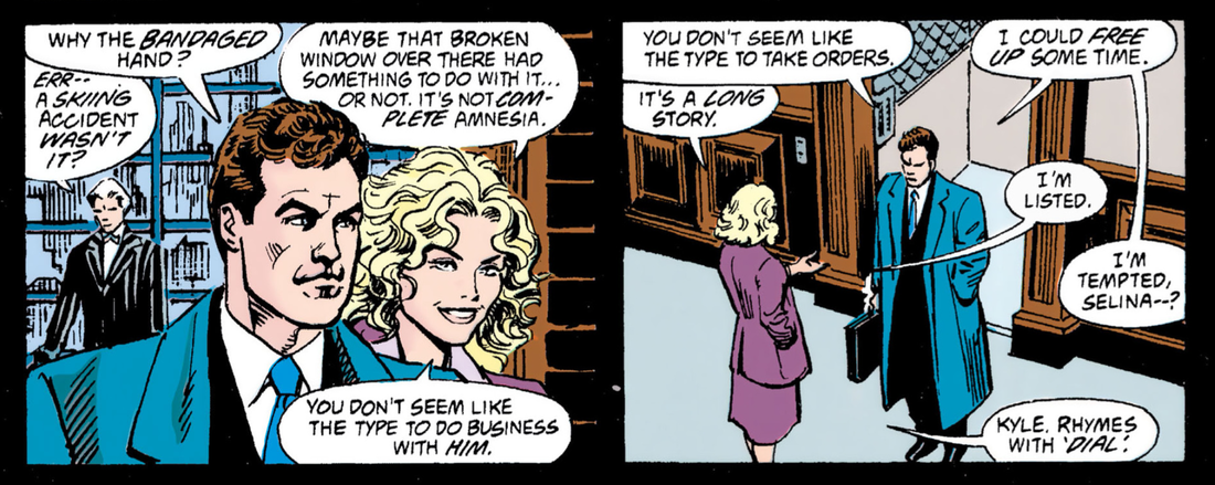 It's just part of her new gimmick, Bruce. Like Keith Lemon. Kev Yep. And that’s a really good panel of Catwoman at the foot of page 19. It’s a fine likeness for Michelle Pfieffer as well, who I had a massive thing for in this movie. Can’t think why. 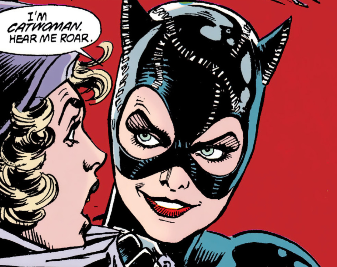 Meow! Meow! Dave Oh yeah, totally. For Pfeiffer in that film, the likeness is great on that panel. I'm probably going to overstate this, but the close panels do real justice to the artwork. And again, that page where Catwoman makes her debut is just another rapid mess of chaos happening. There's no build-up, just straight in there. I can see your point about the campness at times. That panel where she flings the woman against the wall before she says her well-known line is comical. Kev It's odd, I was wondering if this adaptation was maybe more rushed, or more crammed than the first adaptation, but the page count is about the same. The movies had the same run time too. Dave There's just a lot going on story wise. There's more relationship dynamics to explore in this one. Kev I guess you're right, 'Returns' must just be a lot more densely plotted. You got anything else you want to discuss on this first act? Dave No, I'm fine, but I'm glad that I have found stuff that I am starting to like about this adaptation, as in the colours and some very good close-up panels. I will say it does go down it's own route and seems to have a more comic book style. I'm also starting to like how this is not going for the wacky look to it, and keeps a level of normality in terms of how the characters look. It's making it it's own story in a way. At this stage, what are your thoughts on this first segment? Kev Yeh, man, I still like it a lot. The artwork maybe isn't as memorable as the first adaptation, and it's probably even better when taken on its own merit, but the pacing is really overwhelming. I feel like, at this rate, this adaptation could have weighed-in at 100 pages rather than 60 odd. Dave I reckon a lot of it had to be cut down. Maybe this is just the heavily edited version, in the end. Kev Could be, yeh. Maybe there was only enough in the budget for a 68 page count. Dave Or maybe they didn't realise how big the story was until they actually got into it and thought, "Holy shit, Batman! We need to edit this down." (D) & (K) 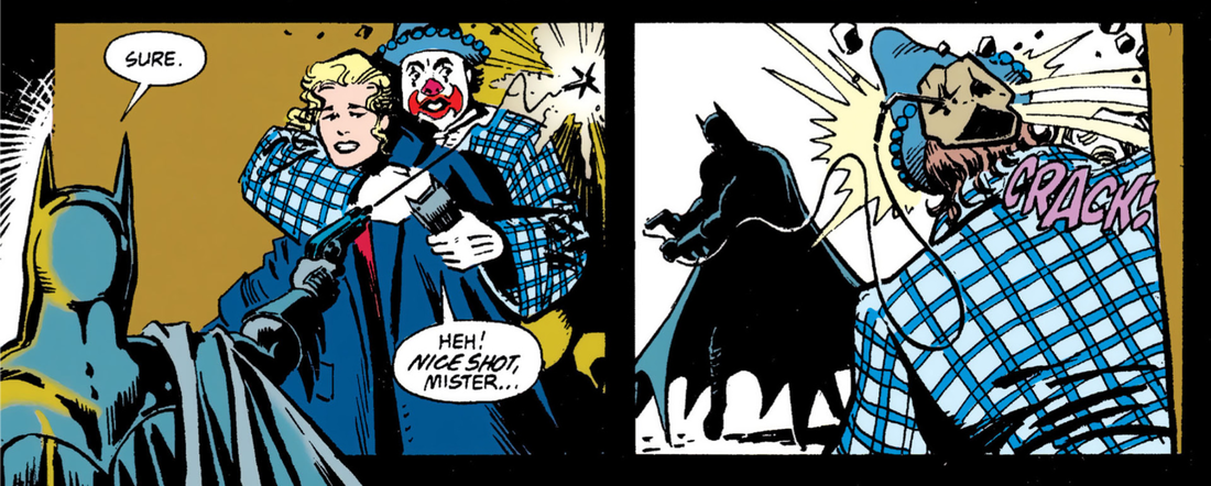 A little twist on Robocop's old shooting the abductor through the woman victim's skirt routine.
0 Comments
|
Back issues
July 2024
|
 RSS Feed