|
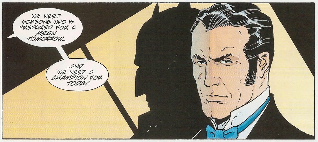
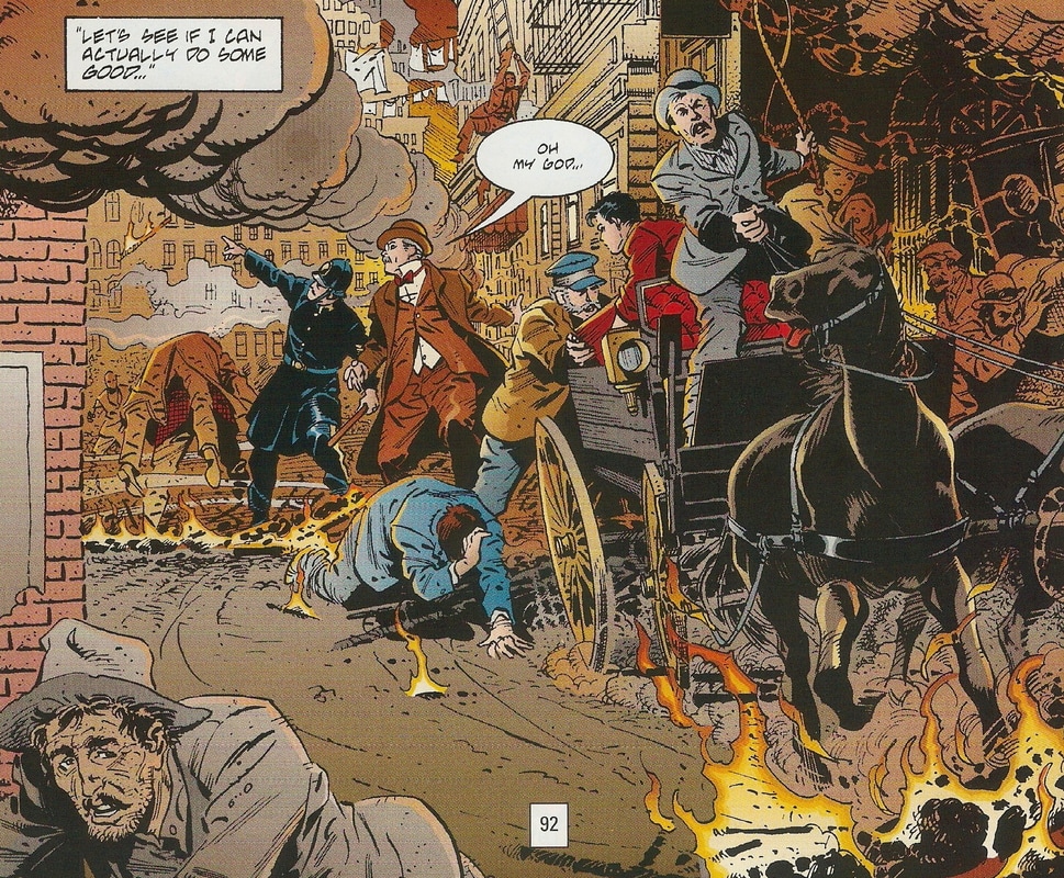
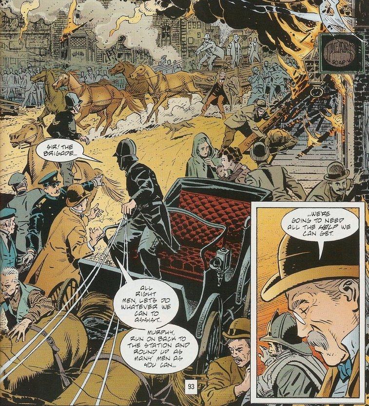
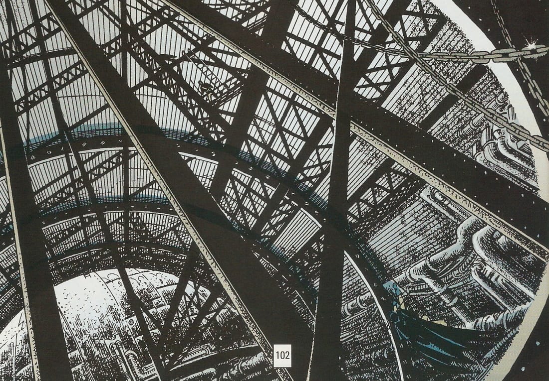
by Dave Scrimgeour & Kevin McCluskey 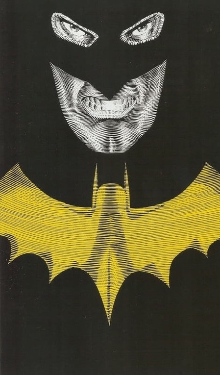 The lesser seen yellow bat The lesser seen yellow bat Publication date- December 1991 Writer- Brian Augustyn Artist- Eduardo Barreto Colourist- Steve Oliff Letterer- Willie Schubert Editors- Mark Waid/Dennis O'Neil Published by DC Comics synopsisAs Gotham City hurtles towards the twentieth century, Bruce Wayne questions the purpose of his mission as The Batman since avenging the death of his parents. However, Alexandre LeRoi, "The Master Of The Future," "The Man Of Tomorrow," descends upon the city and, enraged by what he perceives as their blind devotion to progress, threatens to burn the Gothamities to the ground, which in turn forces Bruce to don the cape and cowl once again. (K) Dave What do you make of 'Master of The Future?' Quite a visual contrast to 'Gotham By Gaslight.' Kev It's a much brighter, breezier story that is complimented by more colourful, tidier artwork. Dave Yeah. It's a lot cleaner as well and very bright, as you say. Gotham looks a brighter place, reflected in the stories tone, as if Batman has somehow lifted the murky, dirty tone of the city. Kev I wonder if it's intended to be a visual representation of progress. Dave I think so. Purposely taking us into the modern world. Notice how Batman's outfit has changed as well. It's more colourful and less clunky looking.  Key, wallet, phone, knives. Just your average night out in Gotham. Key, wallet, phone, knives. Just your average night out in Gotham. Kev Yep. Even the costume is brighter. Although Bruce now has a couple of knives in the utility belt. That's a bit stabby. This tale feels like more of a swashbuckler, what with the airship and the robot best friend for LeRoi and what not. Dave That's a great point. It does has a swashbuckler feel to it. Bruce Wayne is very much at home in the high class Victorian society, it suits his image. Kev Definitely. The Victorian era, old-money Bruce looks amazing. I like the opening. The voice-over considering the leaving of youthful ideals behind in the face of adult responsibilities as we see a disused Batcave and a cobwebbed bat suit is very effective. And the fact that Bruce has a fiancé in Julie is an interesting wrinkle in the Batman mythos. Dave It also wisely tackles the timeframe between this story and 'Gotham By Gaslight.' It's 18 months on and Bruce is willing to walk away from the Bat-life. It tells us where Bruce is emotionally when the story begins and how he still loves to channel his physical energy into a bare knuckle fight, taking on Dexter with a gleeful look. Yeah, he has settled down a bit, but still battling internally with the Batman and whether to truly walk away from it or not. Kev Definitely. His original mission statement, in avenging his parent's murder, is now fulfilled, but there's clearly a voice in his head that tells him that the avenging was only the first part of the mission. That voice very much belongs to Julie here. She wants him to fully commit to the mantle as Gotham's guardian. Dave It's interesting looking at the difference in artwork, it's as if 'Gotham By Gaslight' was purposely drawn as how a Victorian comic book would look like yet this one is more modern and also tails into a Swashbuckler era. Kev It's even as simple a thing as having much more of the story set during daylight hours, so there's more sunlight and it's brighter as a result. Plus, Eduardo Barreto's lines are much crisper and cleaner than Mignola's and Russells. Dave It gives Gotham a more gradiose look, as if over those 18 months there has been so much development that has taken place. Yeah, the artwork in this is really good and has a visually appealing to look at. Kev It gives Oliff much more freedom to broaden his colour palette, whereas Hornung was working in far more muted tones. Dave I think this story definately sets a good grounding point had there been a mini-series of this comic. Alexandre LeRol is straight out of the 1930's era of Hollywood swashbuckler villain. Kev He really is, isn't he? Baretto's artwork looks quite European in style, to me. Particularly French, perhaps. Which makes him a perfect fit to bring this story's antagonist to life. Dave Yeah, I think so. He knows how to portray the suave, flashiness of the piece. I like the frame, on page 69, where Julie and Bruce are talking about Batman and we see a picture of Bruce's face and his shadow is Batman's mask. A very nice compliment to the line, " And we need a champion for today!" Kev I had that in my notes as well. I love that visual. It's a classic. Arguably overused at this point, but I still love it. The theme of escalation is a pivotal one in the Batman cannon and it's carried on nicely from 'Gotham By Gaslight' here. For example, when Julie says, “The world is moving faster, getting...meaner, I think....We need a...guardian. If you will. Someone to keep us off the precipice...Away from the abyss...” Dave Yeah. There is also more of a sense of fun the writer is having doing this story. For example by using a far more extravagent villain, an intersting Batman nemesis with all his little gimmicks. Kev "Fun" is probably the perfect way to describe this story and you're right, that makes it a pretty stark contrast to 'Gaslight.' Yeh, it certainly feels like a much less dense story than 'Gaslight.' Fewer panels per page. Larger panels as a result, which give Barreto the real estate on the page to showcase his talents. Dave What do you make of the full page aerial view of the fare on page 72? It's a real testament to this artists ability, I think. Kev Yeh, man. That's a really nice image. That one, and the panel on page 102 with the interior of the airship speak volumes to the technical prowess of Barreto as a draughtsman. Dave He certainly has a great eye for attention to detail. Kev The sheer amount of perspective and line work involved in that panel must've been head bursting. Dave The panels where Gotham is in flames on page 92 and 93 are other examples of big frames with so much colour and detail in them, nothing is missed out. The man is a perfectionist, I think. Plenty of aerial shots throughout. The action scene on page 97, when Batman is atop the metal pylon is another good frame. I like this artists work a lot. Kev Yeh. Me too, actually. I'm not consciously aware of owning anything else that he worked on though. His Victorian era women are beautiful. Dave Yeah, he can really draw beautiful looking woman. I like the end fight between Batman and LeRoi. It's a well drawn action scene, with plenty going on, giving Batman a good opportunity to showcase his skills and the frame on page 101 where Batman blocks his sword strike with a grin is a real throwback to the 1930s Errol Flynn stuff. Kev Good point. I hadn't thought of the Errol Flynnesque swordsmanship. Dave The man has a great eye for aesthetics. He must be a real fan of this era, I think. I'm not familiar with any of his other work either. I've just Googled him he is from Uruguay and he worked for several years for DC. Also Marvel as well, I see. Kev He's no longer with us, as well. He died in 2011. He wasn't that old either. Shame. Anyway, at the risk of seeming insensitive, continuing on with the celebrity cameos of the era, I like the Thomas Edison one at the fair. Very good. Dave I like the iconic image on page 78 of Bruce returning to the Bat-outfit drawn in rather dramatic style. Kev Yeh. That's a pretty good version of that iconic Bat image. I love the cape. The cape looks amazing. You can feel the weight of that cape. Dave Do you notice on the page where LeRoi's airship is hovering over Gotham, we see the expansive size of Gotham bearing an uncanny resemble to New York? Puts me in mind of it somehow. Kev I hadn't really noticed the similarities to New York, but no, you're right. It's very much like New York. Like a view over the Hudson River. Going back to the shift in Bruce's mission, I like that panel when he goes back to the cobweb covered cowl and thinks to himself, “My personal quest is over, perhaps a public one awaits." 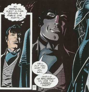 "When was the last time you dusted this Batsuit, Alfred?" "When was the last time you dusted this Batsuit, Alfred?" Dave Yeah, he seems more ready to embrace the Bruce Wayne life than we have ever seen him, as he has the love of a good woman and enjoys the lifestyle of the Victorian era so much, Kev Does Augustyn ever give us Julie's surname? Dave I don't think so. I never caught it reading through it. Well we know that she is a nurse. Kev That's odd, considering she's such an important part of this story and so important to this era's Bruce Wayne. I like her as a character. I really enjoyed the fact that Augustyn didn't feel the need to kill her off, or have her leave Bruce, or Bruce selflessly reject her in favour of his mission. As you said earlier, that points towards a more grown-up, a more mature, a married Bruce Wayne who can coexist with the Batman. I like how she calls him out on his secret identity. She reminds me of how Mary Jane evolved into Peter's wife in Spider-Man. Dave Yeah and it isn't dealt with in one of those ways of she wants to leave him or is unable to handle it, she realises that Batman is a necessity for Gotham, a Guardian of Justice who she is rooting for. Kev Exactly. Reflecting on it as we're discussing it, this is a really mature way of dealing with this element of the Batman character that Augustyn is putting forward here. Dave They have written a less troubled Batman in this version, he is more comfortable being in Bruce Wayne's shoes and doesn't use it so much to hide away. I like the closing full page frame of Batman atop another rooftop almost like the standard end credits of a TV show. It's a great image and again visually striking, with a great blend of colours and shades and attention to detail. Kev There really is a much greater level of comfort with the duality of Bruce Wayne/Batman at the end of this tale. It hints at a lighter, less brooding Batman that might've been a much more "fun" Batman going forward, if this was ever to be turned into an ongoing series. Dave Yeah, I think so too. Kev I also found the scene of Alfred bringing Bruce the batsuit in a briefcase and the “old friend,” as a continuation of the nods to the 60’s TV show from 'Gaslight.' Perhaps the tone of the 60's TV show was more of an influence on Augustyn's Batman than was at first apparent in the previous instalment. Dave Yeah, good point. There's not much of Alfred in this story and even Jim Gordon took a backseat too. It's very much a Bruce Wayne/Batman piece this, but it still works as his character is much more playful and charismatic. Kev And he's only really Batman in the climactic scene. I wonder if Augustyn was more interested in the setting more than he was of putting Batman in it. At this point anyway. Dave It seems like such a contrast to 'Gotham By Gaslight' that had this series took off this was kinda the pilot episode for the tone of this mini-series. Kev I'm surprised that it wasn't turned into an ongoing series. It seems like such a good premise for one. Dave Yeah, it would have made a good series. Kev If I have one criticism of this story, it's the reveal that Claypool was LeRoi's accomplice. It just felt a little tacked on at the end to me. I guess the reveal was to wrap it all up in one issue. It barely gets a panel as a set-up and the reveal/conclusion is only a couple of pages. Dave So, what did you make of it reading 'Master of the Future' again, through adult eyes? I have to say I totally overlooked this the first time I read it through as a kid, but looking at it now, it's a bit of a hidden gem of a story. Kev I like it enough. It's certainly overshadowed by it's more famous predecessor, but that's not to say that it doesn't have its own merits. It's so different, tonally to 'Gaslight' that to call it a sequel, almost feels inaccurate. It's lighter and more fun, but it doesn't have that WOW factor of having the real-world, historical tie of Jack the Ripper. 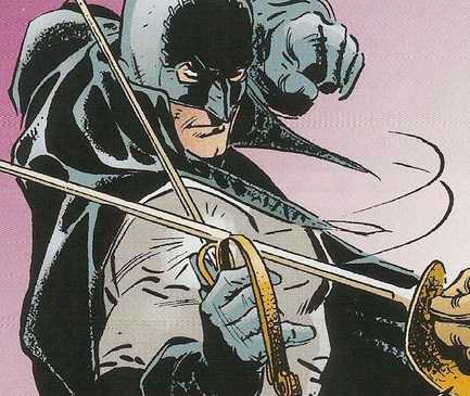 En garde. En garde. Dave No, you're right. It almost loses the gothic element of Batman. 'Gotham by Gaslight' is a much darker, sicker, depraved world that the Dark Knight can roam in. Kev But the swashbuckling, well-adjusted Batman functions much better in this one. In all fairness to it, it's just different and it's probably better to judge it on its own merit, rather than compare it to 'Gaslight.' Dave I like it as an alternative Batman story to "Gaslight" though. It is a good read and as I mentioned, I quite enjoyed the "fun" element of this story. Kev Me too. It's a much lighter read. Perhaps too light for some. Particularly those who like that darker, more gothic take on Batman. It's probably closer in tone to some of the 70's and early 80's stories. Fun, but without that overwhelming campiness of the 60's TV show. Dave It does have a feel of those eras to it, where the writers were trying out new directions to take the story in. Some are gonna be hit or miss. Some were a definite hit or miss, but I guess Batman is one of those characters with a slightly erratic tone though, ranging from dark to camp. Kev When you've been around for the best part of 80 years, you're going to have been open to a few different interpretations, I suppose. Dave Yeah, true. Any other points to round up with? I would like to see 'Gotham By Gaslight' and 'Master of the Future' done as an anime. It would be good to see that. Kev Good call, sir. These would make for a great animated double header. I reckon 'Gaslight' could even work as a live action movie. If they were ever brave enough to green light it.
0 Comments
Leave a Reply. |
Back issues
July 2024
|

 RSS Feed