|
by Dave Scrimgeour and Kevin McCluskey   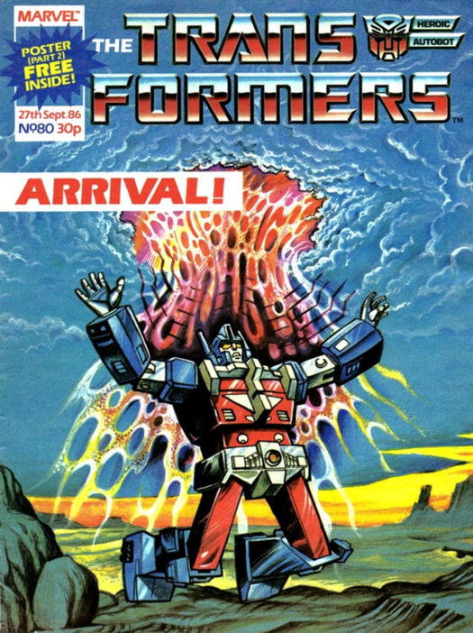 Script- Simon Furman Pencils- Will Simpson Inks- Tim Perkins Lettering- Annie Halfacree Colouring- Tony Jozwiak Editor- Ian Rimmer synopsisThe Constructicons do what they do better than anyone else, construct. This time it's Galvatron's solar powered weapon of mass destruction. Ultra Magnus arrives on Earth, just in time to save Hound from Cyclonus, and take him back to the Ark, where the bickering Autobots receive a Facetime message from Galvatron instructing them to come round and pick Jazz up. Dave So, issue 80, initial thoughts on the cover? Kev It’s the best cover of this run, so far, I reckon. It could just be my Magnus bias coming through though. John Stokes was probably my favourite artist on the series in the early days, pre-Senior. What do you think of it? Dave Oh, definitely the best cover so far. It is bright, and actually an engaging cover. Especially when compared to the previous two issues’ covers. Kev The previous two were a bit flat, weren't they? Dave Indeed. However in this issue there is a noticeable change in the artwork team, as Jeff Anderson has been replaced by Will Simpson. Kev Yeh, Will Simpson's about as far removed from Jeff Anderson as you could get, stylistically. Whereas Anderson’s characters were all very attractive, with clean lines, Simpson’s are sketchier, darker, with an almost horror inflection to them. I feel he touches on the terror aspect of just how frightening these giant, alien robots would be, in real life. I was never as keen on him as I was on the Jeffs (different spellings, so that doesn’t quite work in print. If only this was a podcast) when I was younger, but I’ve come to appreciate his style more and more as the years have gone on into my adulthood, and now middle-age. Dave Good point actually, as Jeff Anderson has created these dashing, kind-of handsome looking, ROBOTS which clearly look so human, but there is a grittier look from the very first page by Simpson, and Furman's writing quickly narrates at a quick pace. Kev Yeh, Furman's got a lot of his pieces in place now, so he's upping the pace somewhat. He's also still drip-feeding the reader hints of what's to come, not only later in 'Target: 2006,' but also 'The Movie' too. “A dish that size could generate enough juice to level a small planet--” Yes. Yes it could, Jazz. (Or Hound. I’m not entirely sure which of them is talking here.) That is the entire purpose of it. And no, it's not a "...power transmitting station..." You were right the first time. More hints towards Unicron here. Dave And of course the staple splash page panel here. There's a lot going on in this page, and I think a lot of the colours, especially the bright ones, are all clashing instead of blending. 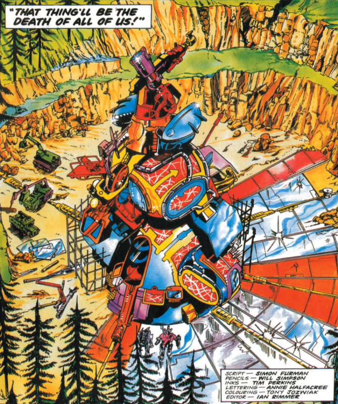 At least Galvatron used an environmentally friendly energy source. At least Galvatron used an environmentally friendly energy source. Kev Yeh, Tony Jozwiak seems to have totally changed up his style to fit Simpson's work here. It has an almost psychedelic, harsh, garish feel, but the two totally compliment each other, and it works. Dave It's got a look of its own for sure. So essentially, this issue is the arrival of Ultra Magnus. That panel of Magnus arriving is pretty trippy looking. It does have a psychedelic feel to it, yeah. Kev Furman and Simpson do a stellar job of making it feel like Magnus is tripping. They really sell you on just how scrambled his head is, as well as how much pain he's in. Dave It's like the original ‘Terminator’ movie, where travelling through time is really painful on arrival. Kev Absolutely. That film has definitely been an influence on Furman for this. Dave The jumping of back and forth in narrative to Cybertron, again, introduces a vast array of characters. Looking at the first four pages, there is a lot of dialogue, and narrative captions used. Furman certainly writes wordy stories. Kev He certainly does. One of the things I loved about Furman, back in the day, is that he gave you your money's worth. He always seemed very aware of the fact that he only had 11 pages of real estate to play with every week, so he made sure to pack in as much as he could. Actually, that's another nice little recap by Furman, using Magnus’s scrambled mind as a device to present it. Although his chestplate seems to be scrambled as well, 'cause it's not quite turned to its more traditional blue yet. Those guys are probably still working from early toy designs, rather than the animation models. Dave The Cybertron scene is basically giving us, the reader, the gist of essentially what will unfold at some point later. Then they suddenly cut back to a groggy looking Ultra Magnus. You're right about the robots not looking so clean cut in this. And then, out of nowhere, Furman introduces a quick, short action scene. Kev Furman does a great job of using Operation: Volcano, and the time constraints that it's putting Magnus under, to not only tie the Earth and Cybertron stories together, but also ramp up the tension. Dave That is a nice panel on page 5, "Your time's just run out, Autobot.” It is the starting point for where the story is essentially picking up from after the recap. 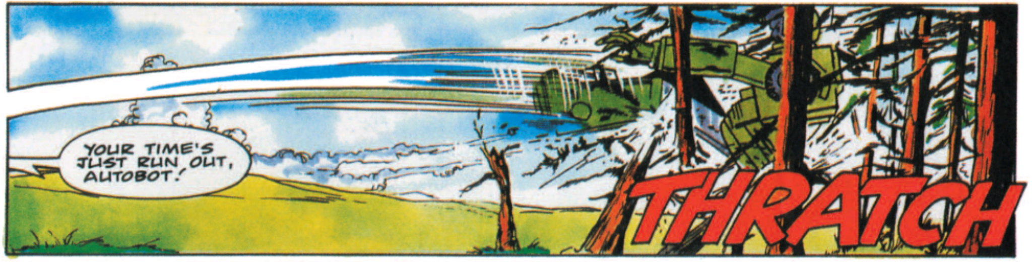 But more deforestation in 'Target: 2006.' Kev Yeh, Furman was also a fan of using plot elements, such as time here, as a linking device to transition between scenes. I like it. It’s effective. It works well. So “five solar cycles” is five days then. That’s how long Magnus has for his mission on Earth. Dave Sounds like it. Cyclonus is giving us the usual Decepticon’s speech about "all powerful" as well, but that's a nice punch he gets in. And look at his face on the last panel of that page, he does look quite menacing looking. This is kind-of reminding me of ‘Battle of the Planets.’ 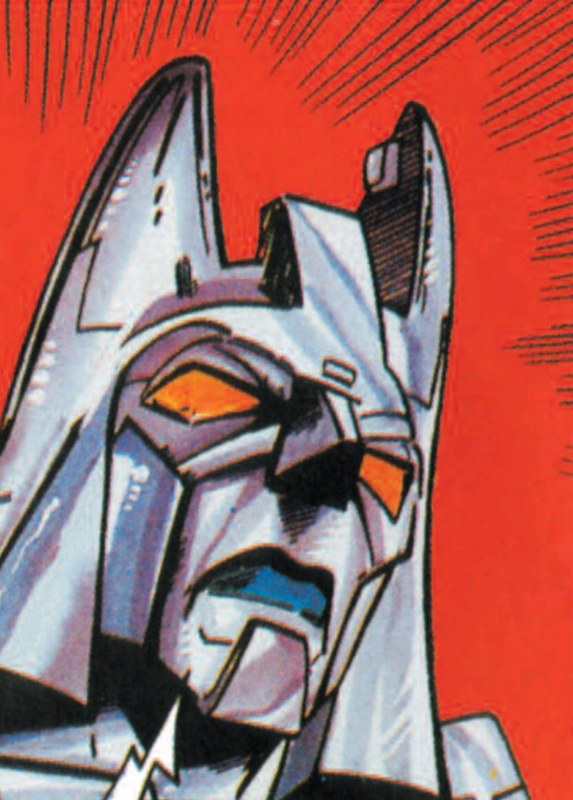 Battle of the Planets. Well, Earth and Cybertron. Battle of the Planets. Well, Earth and Cybertron. Kev Ah, that's a good point. That hadn't occurred to me before, but I see what you mean; Cyclonus does look like a character from 'Battle of the Planets.' Certainly with the way Simpson draws Cyclonus, who is expanding upon his creation by Unicron, in a typical, overconfident, arrogant-bad-guy-gives-away-too-much-information, manner. It’s exposition, but it’s done well, I feel. Again, in a drip-feeding the reader sort of way. It’s intriguing. And Furman, particularly when teamed with Simpson and Tim Perkins here, really portrays the three future Decepticons as a trio of callous bastards. Dave And on the next page, the full page panel of a mammoth looking Cyclonus, intercut with the three other panels on this page is a real eye catcher. The colours are bright, and it lends a slightly sinister tone to it by making them such bold colours. Muted colours are used far less in this issue. Maybe they had to use up what they had in order to get new supplies of inks and colours. Kev Ha, ha! Like a council's budget. I do like how it takes Cyclonus a second to differentiate between the world of 'The Movie,' and the world of 'Target: 2006' here. Dave It’s gone all ‘Back to the Future- Part 2,’ before ‘Back to the Future- Part 2’ came out. Again, that must have been tricky trying to write, with what knowledge they had of the film, and of course just a random draft of the script they had. Kev Definitely. There's a lot of dancing around plot points going on here, so as not to spoil too much of 'The Movie.' Well, certainly not yet. As we go on, all that goes right out the window, and Furman goes into full spoiler mode. Before spoilers were even a thing really. Dave It’s also interesting how Cyclonus, rather than squaring off against Magnus, decides he needs to immediately report this to Galvatron. Kev Yeh, as powerful as Cyclonus certainly seems to think he is, he knows he's outmatched when it comes to someone like Magnus. I love Simpson, Perkins and Jozwiak’s trees. Dave In saying that, he does get the drop on Magnus here. I suppose it could be put down Magnus’ time travel lag. The trees are straight out of the Bob Ross school of drawing trees. Kev Could be, yeh. I do like the way he just hurls Hound at Magnus though. Ha, ha! Nice Bob Ross reference. Dave Yeah man, Hound really gets a proper tanking in this issue. Kev He really is taking a bit of a hiding, isn't he? Dave This issue is not holding back on the grittiness in its action scenes. Kev No, man. It really was quite violent for a comic aimed at pre-teens. But they got away with a lot of it because it featured robot-on-robot violence, rather than people-on-people violence. Dave And Cyclonus is quick to get out of there. Kev Too right he is. He's not hanging around. The “Why not let Ultra Magnus take the strain” is pure toy advertisement though. Ha, ha! 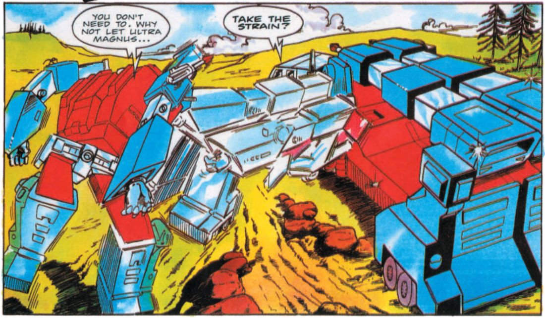 Did I mention that I can carry your other Autobot figures in vehicle mode? I'm toyetic. It's added play value. Dave I quite like the bottom panel on this page, of Magnus transforming. That wouldn't be the easiest of things to show visually. Kev No, I would imagine the transformations were a bit of a pain for the artists to depict. Particularly as, in order to save time and space, you often have to show it in a single panel. Dave "A short while later..." That's actually a nice and simple way of not putting an actual timescale on how long it took Magnus to arrive at the Ark. Kev That's a good point. It allows Furman to play around with the time limit he's placed on himself with the imminence of Operation: Volcano. Galvatron is completely different here, compared to how he would ultimately end-up. He’s level headed, calculating and tactical. As Furman’s saga with him evolves, he will become rash, irrational and emotionally unhinged. It’s interesting to see how he started out again. Although, in that panel of him, as he is about to grab Jazz, Simpson makes him look terrifying. 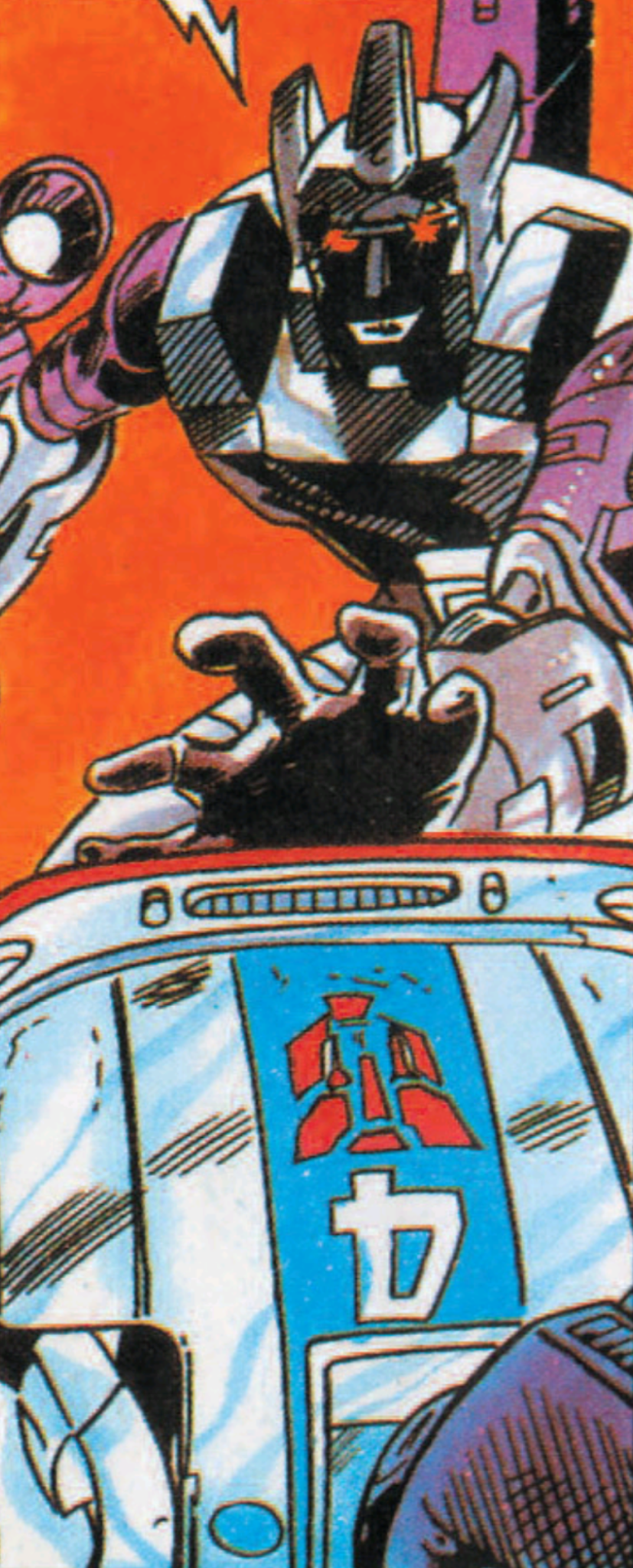 Jazz hands. Jazz hands. Dave Simpson’s drawings make the characters look older, more haggard. As if weather beaten by the toils of their on-going war. It’s a stark contrast to how Anderson draws them. It's like the clean-cut look, against more gritty, spaghetti western looking characters. Kev That's a really good way of looking at them, man. I like that. I daresay those movies were an influence on Furman too. In fact, there’s a particular scene in ‘Wanted: Galvatron- Dead Or Alive’ that would certainly suggest so. Dave You're right, that last panel of Galvatron’s face on page 9, is demonic looking. Especially with the use of shadows to hide most of his face. But the eyes are still visible, scary looking and evil. Kev Yeh, it's all shiny, light-up eyes, and teeth, isn't it? It's like something out of a horror flick. Dave Magnus isn't doing a very good job of convincing Jetfire of his plans anyway, and it's another chance for one of those psychedelic panels in the middle of page 10.  "Well, someone came and took the lamp away. I looked around, a lousy candle's all I found." Kev Yeh, I like that Furman has the Autobots rudderless, and bickering without Prime. Jetfire is clearly cracking under the pressure of trying to lead, and as a result snaps at Magnus, and quite rightly perhaps, claims not to trust him. And this is just another thinly disguised, but effective recap by Furman here. Just in case you had picked up the comic for the first time with this issue. But again, it works. Dave Yeah, the bickering among them adds to the building tension. And they would not naturally trust Magnus at the moment, especially with Prime, their leader, missing. Kev Yeh, you could definitely understand why they would be reluctant to trust him. Considering the coincidental nature of him showing-up as soon as Prime disappears. Dave And, of course, in terms of what happens to Prime in the movie. Kev True. That's even worse, I suppose. I always loved how Simpson drew the insides of the Transformers mouths, with their inner workings on display, for all to see. And he doesn’t half draw a cracking evil bastard Galvatron. Plus, the sheer agony he conveys, not only on Jazz’s face, but the pain wracking his whole body, is fantastic. 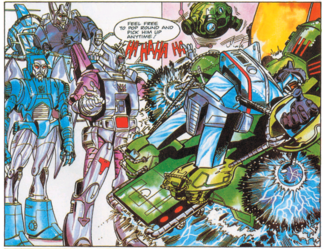 Nu Jazz fusion tronica. Dave Yeah, true. He is making them more mechanical, as opposed to Jeff Anderson's human looking robots. The touch of the mouth’s mechanics is nice, and the torture panel of Jazz is a great panel to end the issue on as well. The probe above Jazz on that panel looks straight out of a Death Star probe in Star Wars. Galvatron, on the last page, top panel, on the large monitor, looks sadistic looking, and like one scary looking robot. Kev It does look like something onboard the Death Star. Right enough. And yeh, I agree. Simpson's Transformers definitely look a lot more mechanical than Anderson's very humanised ones. How do you feel about the changes in the artists? Does it make the story feel disjointed to you, or are you digging the different styles? Dave Do you know what, when I first read through it earlier, I, initially, wasn't all that keen on the change in style. But I think you nailed it when you talked about how they are harsher and grittier looking, so I would probably say now, going through this issue, that it definitely grew on me. And actually, while I liked the work of Anderson, I would have liked to have seen Simpson continue on for another couple of issues, to tell this part of the story. How about yourself, what do you feel about this issue? Kev I definitely appreciate Simpson art more now than I did when I was younger, that's for sure. And as much as it breaks up the consistency a bit, the change of artists, in addition to being a necessary evil, due to the 11 page, weekly, format, gives this story a bit of an artistic buffet feel. Which I also appreciate a lot more now that I'm older. It's a good chapter of the story as well. There's not a huge amount that happens in it, but it properly introduces Magnus, and it sets up the conflict for the next issue, which is one of the highlights of the story, in my opinion. So it always makes me look forward to reading that as well. Dave It doesn't have a lot happening, as you said, but it feels like all this is just setting up for later issues. (D) & (K) Next: 'Defeat!' 
0 Comments
Leave a Reply. |
Back issues
July 2024
|
 RSS Feed